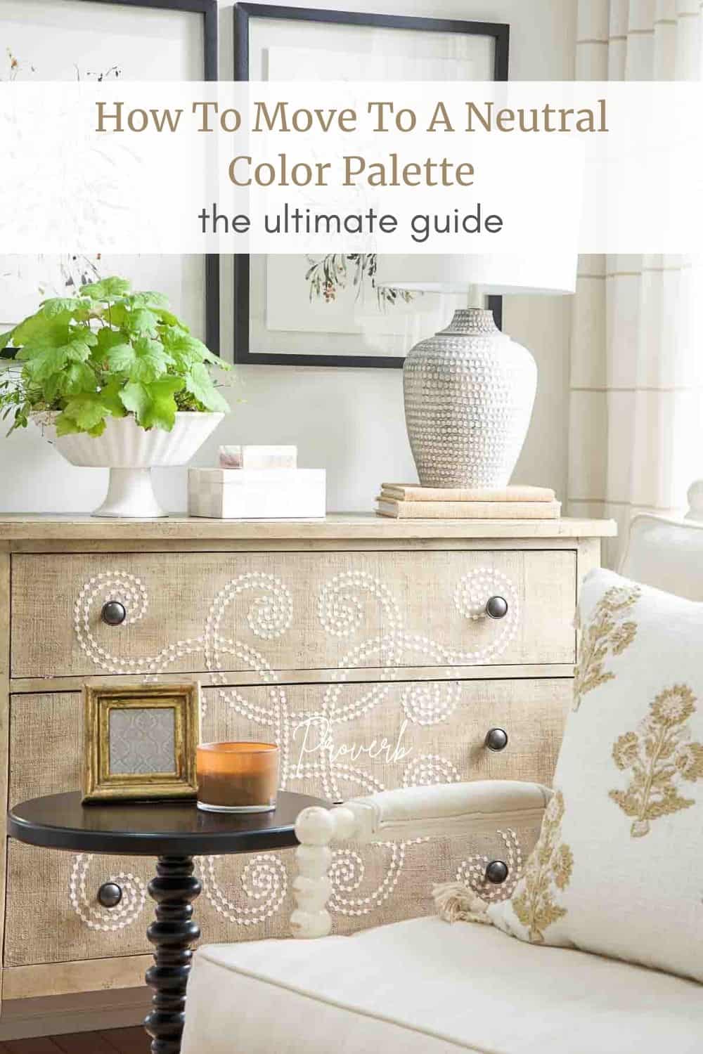
How To Make The Move To A Neutral Color Palette
Want to move to a neutral color palette but don’t know where to start? Here is a step-by-step blueprint for moving to a neutral color palette and creating a home you love.
Neutral decor is classic, clean, and easy to live in. But how do we move to a neutral color palette? Here are 13 steps to help you shift your decor to neutrals and create a room you love! However, no matter what your color palette, many of these ideas are such good advice to help you decorate your home.
You don’t need a professional to help you move to a neutral color palette. I can help you do just that! Remember, my goal is to help you create a beautiful home you love and break down Interior Design concepts into easy-to-understand, doable processes you can use.
Just follow these steps, and they will help you have a neutral room (or home) you love!
Changing your color palette is not an overnight process. It takes time, a budget, and patience! However, the result is so well worth it! Neutral and classic rooms have longevity! They stay in style longer than their colorful counterparts!
I often hear, “I would love a neutral color palette,” from my readers. So, this post is for you!
Let’s start by getting inspired!
What Inspired You?
Most of us need a bit of inspiration when we are shifting a room from one style to another or from one color scheme to another. Having a vision will help us make the dream of living in a home with beautiful neutral interiors come true! A vision is like a mission statement. It keeps us on track!
Let’s get inspired! Is there an image of a beautiful neutral room you love? Or is there a swatch of neutral upholstery fabric or a pillow with lots of neutral and natural texture you are holding on to because it inspires you?
Find something that you can use as a springboard or jumping-off point to start changing a room or your whole home to neutrals.
Choose The Right Neutral Color Palette
Choosing the right neutrals for your home is key to creating a cohesive and beautiful space. Not all neutrals are created equal. There are warm neutrals, cool neutrals, and everything in between.
Start by identifying the undertones you are drawn to. Do you prefer warm, creamy tones that feel cozy and inviting? Or do you love cooler grays and whites’ crisp, clean look? Knowing this will help you narrow down your options.
Once you’ve decided on your preferred undertones, consider how the lighting in your home will interact with those colors. Natural light can dramatically affect how a neutral looks in a space. A paint swatch that seems perfect in the store may appear much different on your walls.
Here’s a tip: Test paint samples in your space before committing. Paint large swatches on your walls and observe them at different times of the day. This will help you see how the colors change with the light.
Don’t forget to think about texture and variation. Layering different shades and finishes of neutrals can add depth and interest to your space. Combine matte walls with glossy accents, or pair a soft linen sofa with a textured wool throw.
By thoughtfully selecting the right neutrals, you’ll be well on your way to creating a timeless and harmonious home.
Be Aware Of Undertones

All colors have something called undertones. They are colors that “hide under” the main color. These undertones are super, super important! They can either create incredible beauty and harmony in a room or create color chaos!
Undertones are either cool or warm. And having a working knowledge of undertones is decorating gold!
To understand the amazing world of undertones, you should read CAN YOU MIX WARM AND COOL COLORS. This post will educate you about undertones so you can choose colors that work well together.
You won’t believe the difference a beautiful neutral decor with the right undertones will make in a room!
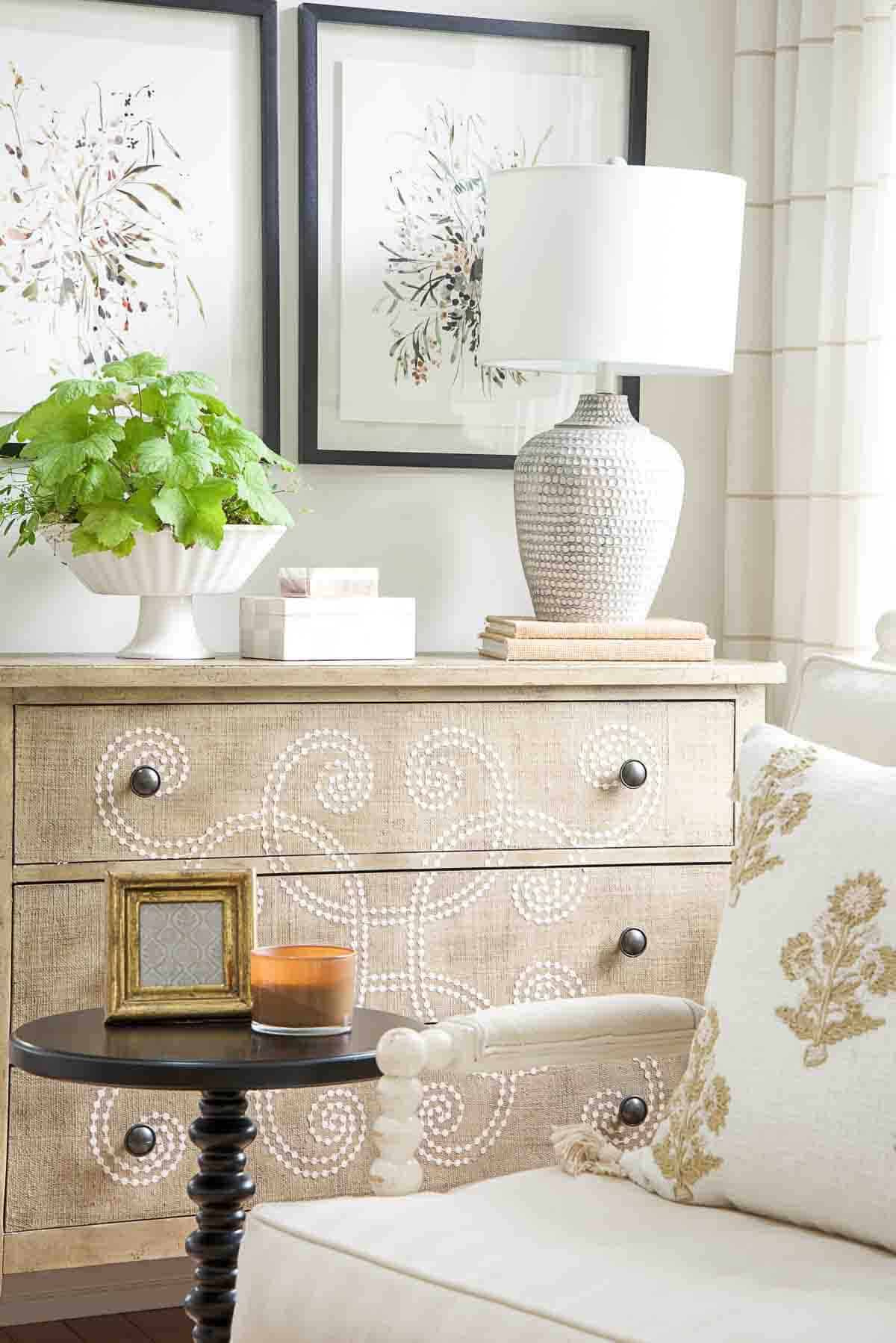
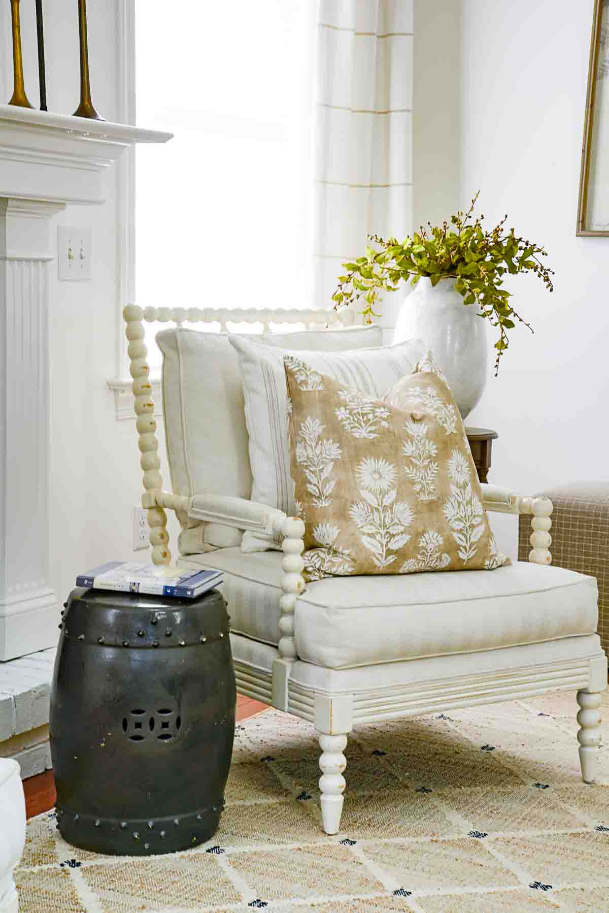
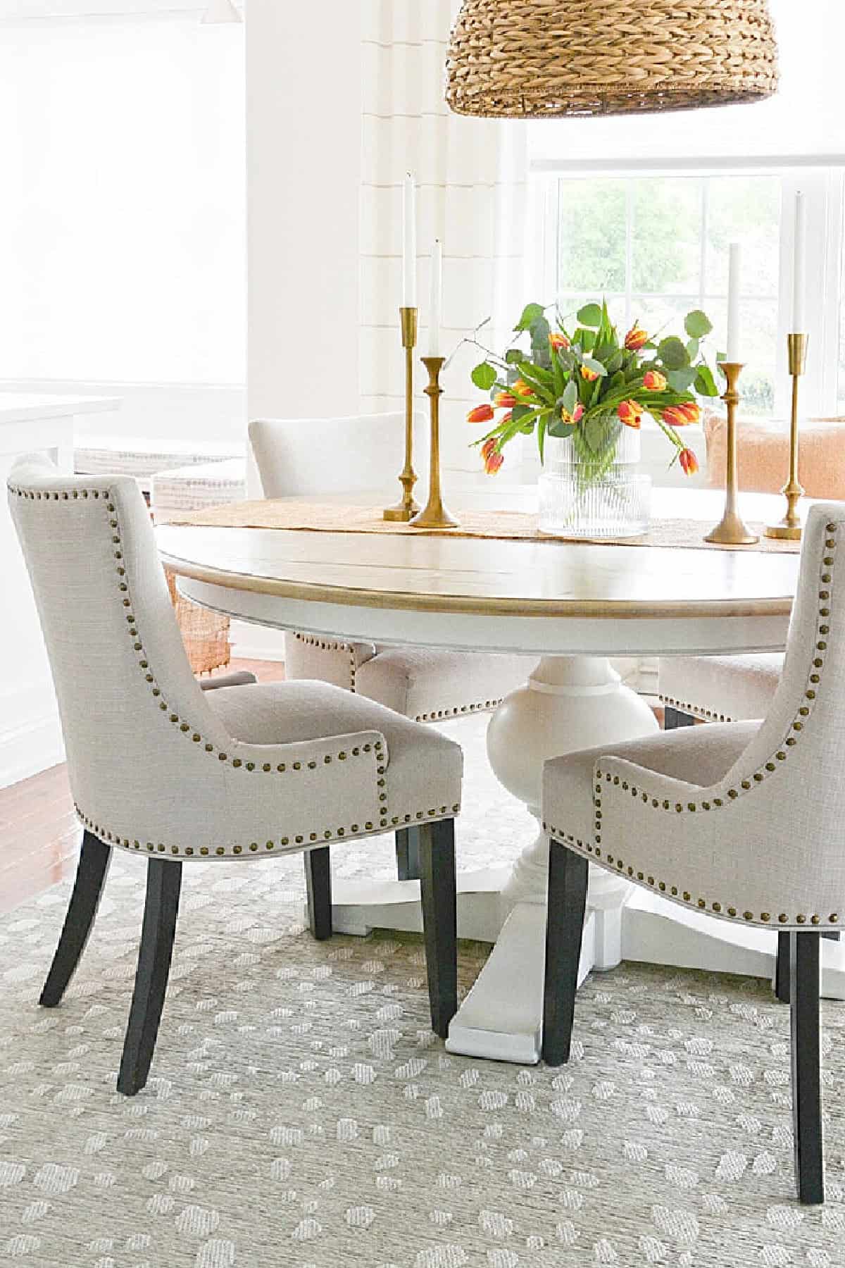
Use A Bit Of Black


I’ve been learning the importance of using a bit of black in a neutral room. Black adds visual weight and depth to a neutral room. It helps anchor the space, giving it a grounded and cohesive look. If black feels too heavy for your style, try softer alternatives like charcoal or espresso. These colors provide a similar grounding effect without being as stark.
Without a bit of contrast, a light-colored neutral room can feel flat or uninspiring. Black goes a long way, especially in a light-neutral room, creating visual interest and a sense of balance. However, remember that a little bit of black goes a long way! Too much black can tip the scale, making a neutral room feel moody or overwhelming.
Use the magic rule of three when adding grounding black to a room. Incorporate one black item, like a picture frame, a lamp base, or a throw pillow, to create a cohesive and visually appealing look. These touches will add the perfect amount of contrast and sophistication to your neutral space.
You might like to read about the MAGIC RULE OF THREE.
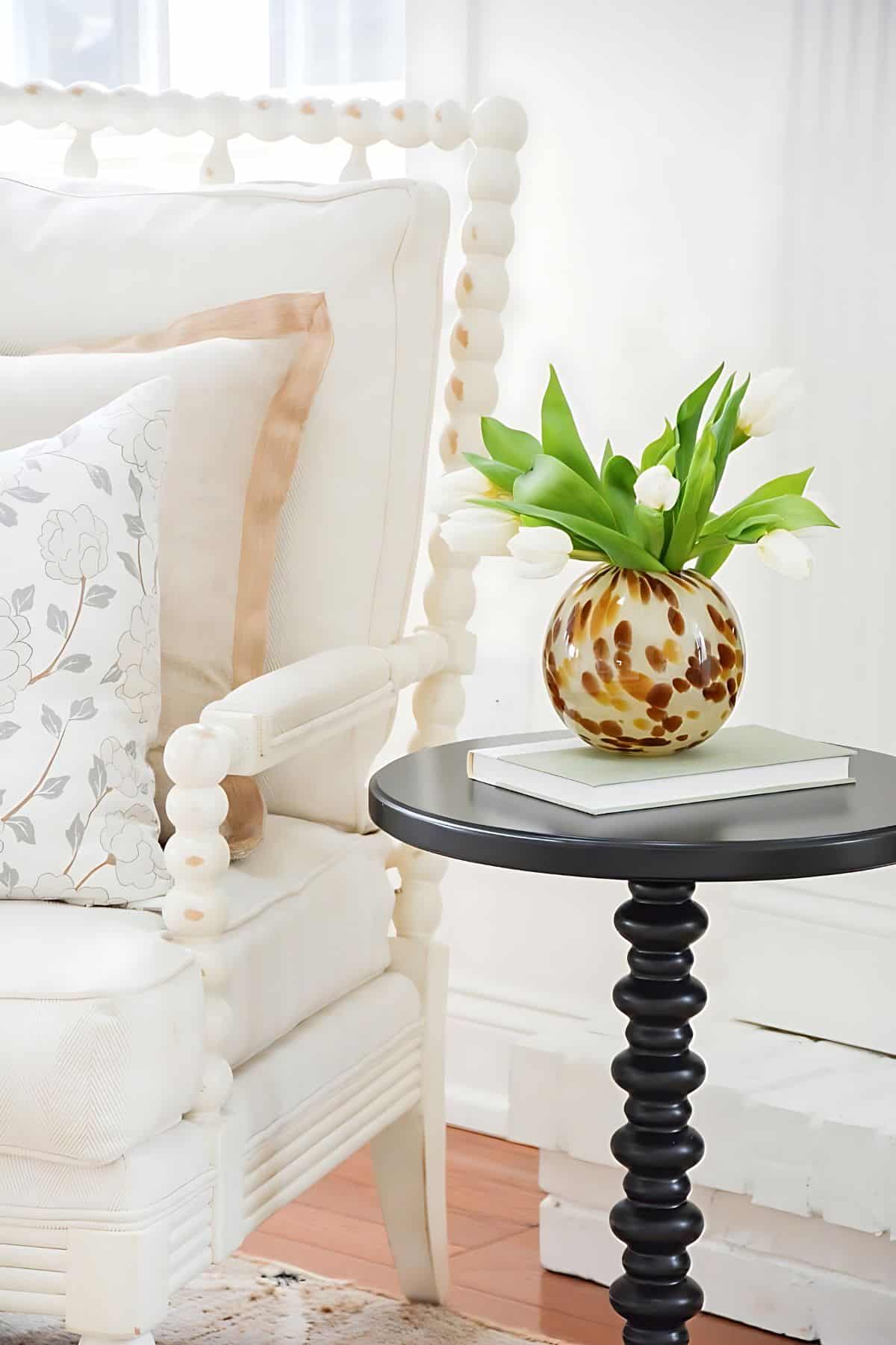
Accent Color

While a neutral color palette is timeless and versatile, adding a carefully chosen accent color can elevate your space and make it feel more interesting and attractive. An accent color is like the cherry on top—it adds personality, charm, and a layer of interest to your room.
When selecting an accent color, consider hues that complement your existing neutrals. Soft pastels like blush, sage, or powder blue can introduce a gentle touch of color, while bolder options like navy, emerald green, or deep rust can make a striking statement.
Remember to use your accent color sparingly. Incorporate it through accessories like throw pillows, artwork, vases, or a statement chair. These small touches can create a cohesive look without overwhelming the calm and serene feel of a neutral room.
Here’s a tip: Repeat your accent color in at least three places in the room to create a sense of balance and intentionality. For example, if you choose blue as your accent, consider a blue throw, a piece of art with blue it, and a blue book on a coffee. This repetition helps your room feel harmonious and polished.
Find The Perfect Wall Color
Once you have a neutral color scheme you love (remember 3-5 main colors), it’s time to find your perfect paint! Choose one of the colors from your color palette, or opt for a white with the right undertones for your walls. White walls can create a clean, airy look and allow your furniture and decor to take center stage.
You can also choose a tint of one of your main colors. To create a tint (a lighter version of a color), mix it with white. This can add a subtle, sophisticated touch while still keeping your walls neutral. Remember, your walls are a backdrop for the furnishings in your room, so they should complement rather than compete.
I am so partial to white walls. I love the way white paint lets neutral furniture shine and creates a bright, inviting space.
After choosing your wall paint, select your trim and ceiling paint. The trim color should complement the walls, while the ceiling can often be a slightly lighter version of the wall color to add height and openness.
Make sure to read THE ULTIMATE GUIDE FOR CHOOSING THE PERFECT WHITE PAINT COLOR. This post is very helpful, even if you are not painting your walls white.
Choosing the right paint is such an important step, so take your time making this decision. Test several options and see how they look in your space at different times of the day before committing. The perfect wall color will tie your neutral room together beautifully.
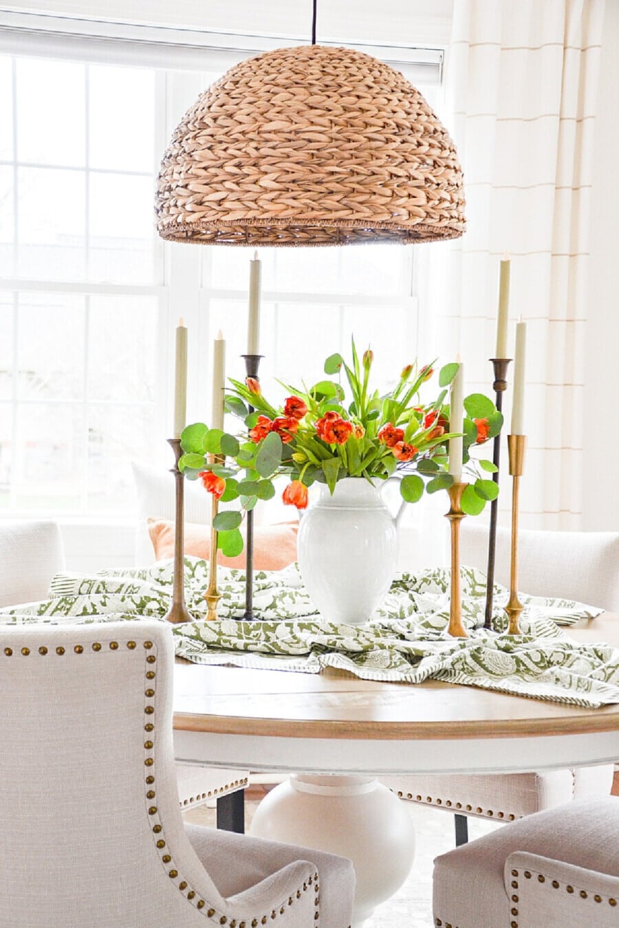
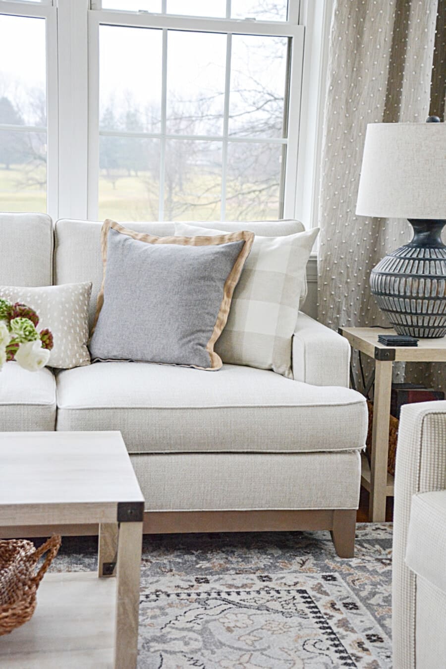
Patterns And Texture Counts
Texture and pattern become very important in a neutral room! Our eyes love interesting things, and in a monochromatic room, texture, and pattern make up for the lack of color. They add warmth, depth, and interest to a room.
Use texture liberally! If there is not enough texture in a neutral room, the room often looks flat and uninspiring. When you layer decor, make sure to use lots of texture. Think about materials like woven baskets, chunky knit throws, nubby linen pillows, and natural wood accents. Each element adds its unique tactile quality, bringing life to your space.
Pattern also plays a key role. Subtle patterns, like tone-on-tone stripes or a delicate geometric print, can add dimension without overpowering the serene feel of a neutral room. Even a large-scale patterned rug in neutral shades can anchor the room beautifully.
Layering different textures and patterns is an art but worth mastering. Start small and build up as you find the right balance for your space.
You might like to read THE BEST KEPT DECORATING SECRET. It will help you become a pro at using texture in your home and make your neutral spaces truly stunning.
Keeping Furniture You Already Have
Transitioning to a neutral color palette doesn’t mean you have to replace all your furniture. Often, you can work with what you already have and make it feel fresh and cohesive with your new design.
Look at your current furniture with a critical but creative eye. Pieces with classic lines or neutral finishes can easily fit into your new color scheme. Even furniture in darker wood tones or bold colors can be repurposed. Consider painting a piece in a neutral shade or reupholstering it in a soft, textured fabric.
Accessories and accents can also help tie your existing furniture into your new look. Layer throws and pillows in neutral tones over your sofa or chairs. Use a light area rug to anchor a darker coffee table or dining set.
Remember, blending the old with the new creates character and prevents your space from feeling overly staged. Mixing in your favorite, already-loved pieces adds a sense of authenticity and personal touch to your home.
Think About Foundational Furnishings

Foundational furnishings—like your sofa, dining table, or bed frame—play a key role in establishing the overall look of your neutral room. These are the pieces that set the tone and provide a base for your decorating.
When choosing or updating foundational furnishings, aim for timeless and versatile designs. Look for classic shapes and neutral finishes that will stand the test of time and adapt to future updates in your decor.
If you’re keeping your current foundational pieces, consider how they align with your new palette. A fresh coat of paint, a slipcover, or even a change in hardware can make a world of difference. For example, reupholster a traditional chair in a textured neutral fabric or refinish a wooden table to match your room’s new vibe.
Layering is also important when decorating around these pieces. Add dimension with rugs, throws, and pillows in coordinating neutral tones. This will help soften large furnishings and create a cohesive, inviting look.
Your foundational furnishings are the anchors of your room, so give them the attention they deserve. Choosing or adapting these pieces thoughtfully’ll create a solid base for your neutral design to shine.
Choosing More Foundational Furnishings, Rugs And Curtains

There is no special order to choose your pricier foundational pieces like sturdy chairs or bookcases for a room. Just make sure you work within your color palette to maintain cohesion and balance. This is also a great time to coordinate curtains and choose a rug. These elements help define the space and bring the room together.
When I decorate, I have a mantra I use all the time…
STAY IN YOUR LANE!
In other words, don’t veer off into other color palettes or styles that don’t align with your vision. This is so important! Choose each item you put in a room with your style and color palette in mind.
By staying focused and intentional, you’ll create a room that feels cohesive, polished, and true to your vision.
Mixing Metals
Mixing metals in a neutral room is so important. Metals add style, flair, contrast, and interest to the space. The key to successfully mixing metals is balance. Use the 70-20-10 rule: 70% of one metal, 20% of a second metal, and 10% of a third metal.
In other words, have a dominant metal color and then add other metal finishes in smaller doses. For example, you might choose brushed nickel as your primary metal, add a touch of matte black, and finish with a hint of antique brass for warmth.
Don’t be afraid to mix warm and cool metal tones. Combining warm metals like gold or brass with cooler ones like chrome or silver creates a dynamic and layered look.
When incorporating metals, think about placement. Use them in lighting fixtures, cabinet hardware, mirrors, frames, or decorative accents like trays or candleholders. This creates a cohesive and intentional design.
You might like to read 5 TIPS FOR MIXING METALS IN DECOR. It provides additional insights into achieving the perfect balance and harmony with metals in your space.
Finding Accents Furnishings
Accent furniture plays a pivotal role in enhancing the character and functionality of your neutral room. These are the pieces that add personality, style, and versatility without overwhelming your space. When choosing accent furniture, look for items that complement your foundational pieces while introducing an element of surprise or charm. A beautifully crafted side table, an upholstered bench, or a statement armchair in a textured or patterned neutral fabric can make all the difference. Remember to keep your color palette in mind and use accent furniture to add layers and dimension to your room.
After you have chosen your main furniture, start choosing accent furnishing like…
- accent chairs
- mirrors
- lamps
- art
- garden stools
- accent tables
- benches
- curtains
- a bar cart
- clocks
- and more
Here’s where you can use the tints and shades of your colors.
The Importance Of Accent Decor

Accessories and accent decor are really the same things. In my mind, however, accessories are smaller items that usually cost less.
Accessories can really update a room since they are not a big investment. Have fun with them, and let your personality shine! Choose lots of on-trend, inexpensive pieces to keep your decor fresh. I consider accessories the jewelry of a room!
Here are some accessories…
- throw pillows
- blankets and throws
- trays
- lanterns
- baskets
- small plants
- flowers
- vases
- lanterns
- candles and candleholders
- urns
- bowls
- poofs
- flowers, real and faux
- objects d’art
- more
These items are easily changed out seasonally. Think about collecting a stash so you have lots of decorating options. You can offroad a little bit with accessories, just keep a good balance between cool and warm colors in your room.
You might want to read ACCENT DECORATIONS EVERY HOME NEEDS.
I hope this post has given you a blueprint for moving to a more neutral color palette. Keep working on the process and remember that this is a worthwhile endeavor and it will take time.
Post To Read Alongs With This Post…
WHAT TO DO WHEN YOU FEEL STUCK WITH YOUR DECOR
7 TIPS FOR MIXING DECORATING STYLES
5 SAVVY WAYS TO FIND BUDGET-FRIENDLY DECOR
Neural Decor You Might Like

Happy Decorating!


I made the transition to more neutrals and whites several years ago. I already had 2 sofas in lighter neutral colors, so that was an expense I didn’t have. I then chose all new creamy white lined sheer drapery panels throughout the entire house. I bought good quality sheers, but it didn’t break the bank. I then purchased all white drum shades for throughout the house – more transitional and neutral. I did purchase a Pottery Barn area rug for our family room with a pattern that included soft blues, creams, etc. I used this as a jumping off point for all the home. Lastly, I started purchasing accent pieces in whites – ginger jars, bowls, lanterns, etc. We also had the interior painted in soft creamy white. I do like a bit of color in the home, but with the soft colors in the area rug I was able to pick several of the colors out of it for additional artwork, etc. All of our tables, etc. throughout the house are cherry that we have had for a long time, and that we still love. I love the changes, and so does my husband. Thanks for all the good tips for making our homes a place of comfort and peace. I also appreciate your posts on downsizing – very helpful.
Your home sounds beautiful, Lyn!
Good morning I would say a year ago I have found your blog I get the emails I never thought I would like to do neutral colors but I do and over the past 8 months I have changed my living room and my dining room to Linden and cream with white I live in South Texas and being in this colored field Everything feels more cool in the summer when you have triple digits. Just to say. Thank You and I really enjoy reading and reading Sundays post it gave me some things to think about and see things a little different from another point of view
Hi Eva, so glad you are part of our StoneGable family!
Hello Yvonne,
Every time I open my email and see a photo of that beautiful white credenza I swoon. I think of how wonderful it would look in my sunroom. I have searched high and low to find one that is as nice as yours. Do you think it would still be in stock from the company you purchased it from? Would at least like to give it try if you can tell me where you purchased it. Love your decor and decorating and I find my sense of style is very similar to yours.
Thanks so much–
Mary G.
Hi Mary, I found this buffet at Wayfair but I know they are out of stock right now. You can get on their mailing list and have them email you when it is in stock again. Here you go Mary:https://rstyle.me/n/gb7999b6by7
Your style is so elegantly comfortable and so pleasing to the eye!
I’ve been moving in this direction for quite a long while…probably since around 2015 when we had a fire that caused a lot of smoke damage and it forced us to paint the entire house!. However, turning EVERYthing to a neutral color palette is like trying to turn the Titanic on a dime! I am in the midst of de-cluttering and I am being extremely ruthless, but I have not yet tackled any of my decor items, mostly because most of it is less than 5 years old…about the time I started following your blog! I have a huge collection of white/off white pottery that I use in every season to fill out my more colorful pieces. If I hadn’t obtained some more those pieces…aqua for summer and the chinoiserie stuff that I bought just this year, I’d consider keeping just the white pottery and using faux flowers/greenery to make my color statements. I’m just not there yet.
I have a neighbor and a good friend who embraced what I call Pottery Barn style…all white, cream and browns and I have to tell you, it provokes an emotion of agitation, jealousy, claustrophobia, depression…I haven’t yet nailed it down! When I walk away from their homes I feel unsettled! I think it’s the lack of ANYcolor! Do you think this might be a fad that will see it’s end in the future? I remember jonesing badly for blue/mauve, peach/gray (seafoam green), gold/red decor. I could never afford a complete redo, never had the time and always joined late! I had Tuscan stuff up way past it’s prime! In fact, the fire/smoke damage caused us to reassess our choices, otherwise I was quite happy with it.
Also, thank you for your direction about keeping your grown children’s stuff way past them flying the coop! I take pictures of stuff daily, send it to my son and ask, “do you want this stuff anymore?” and the answer is always NO! I always felt like I had to be the keeper of all memories…your post helped a LOT!
Hi Carol, I do think the neutral phase might eventually not be HOT anymore, but it is classic which is better than HOT. If I were you I might look at decor that YOU love in magazines, on Pinterest, and on blogs. Then you might be able to nail down what you love and would be comfortable living in. Also, choose a color palette. It will make your life and decorating so much easier. Happy 4th!
HI Yvonne….
You inspired me, through your blog, to move to neutrals probably about 8 years ago… 2 houses ago with the same 3 neutral couches. They seem to always fit in perfectly because of the neutral color. I have found it makes decorating, as if I were an interior designer, so much easier. I have enjoyed your journey from Stonegable to your present downsized home. I have also enjoyed your weekly menus in the past….some very tasty recipes.
Keep it coming.
I’ve finally made the transition to neutrals and I love how it makes me feel. Calm and at peace in my home. My only final drawback I have going is my rugs. I have some beautiful orientals but they are all too overwhelming in colors, reds and navy blues. I finally rolled them up and stashed them in the garage until I know what to do. I guess it’s time to let them go. Bare floors it is until I can afford what I want.
Thank you for sharing your beautiful ideas with us. I’ve copied quite a few to update my traditional golf course home & am so pleased with the results. It makes me so happy!
Interesting. Thanks
Love your blog. My kids have finally moved to begin their adult lives. Getting ready to change their old bedroom into a great guest bedroom. Your ideas will come in handy.
Thanks for sharing this, Yvonne! I always am interested in viewing neutral-based room decor but didn’t really know how to begin. You have provided us a start-to-finish frame to work with but I am printing out this baseline to help me make a start.
I love the neutral colors! I have been using these for years before they were even so popular. Many years ago, after we first moved into our house, we painted our walls a nice shade of white because we had to hire out the painting because we have vaulted ceilings. I loved it then and still do. I can easily change up the look with an accent color change. It also makes the rooms look larger.
Very pretty!
I love reading your inspirational and very helpful ideas on combining neutrals and all the small details that make it all work. I look forward to the next day to see what you have in store for us.
Thank you for inspiring me to slowly change my decor to neutrals. I would never have thought to paint an accessory. Your clock is beautiful!
Changing over to a neutral palate with blue accents…..great tips!
Yvonne, I had an epiphany when creating a neutral pallet. I took all your advice and applied it to my home. My home is beginning to flow and I have a sense of calm. Being able to mix and match pieces across all rooms is saving me time and money. Thanks you!
This article gives me lots of good directions to transition into neutrals. I love color…at the moment I am awash in yellow.
So thankful for your blog…I KOW my style now!
I love a neutral color pallet.I have transitioned to neutrals with black accents in my home.I find it very soothing and tranquil.Classic never goes out of style.
Love this style – so elegant and clean looking! Working towards this at our home.
Wonderful information.
Thank you for this informing information as we transition our style.
Love the neutrals! Thanks
Love the tips about patience through the process.
I love each and every photo you have shown here and the incredible tips. But when the decision is not just our own, I am having a hard time making a neutral color palette. I have a very small condo and have had to downsize. we have had to now include 2 desks and office chairs into the small living room. So the other person prefers just dark traditional and dark leather furniture. They are very nice, especially the antique tables and office files as in a larger place we could incorporate both… but going from a neutral lighter look like you have here has been hard. I notice though the hallway long table you have here and am thinking perhaps I can at least make that a neutral color and it would be a perfect place for a lamp with one of those rechargeable light bulbs you told us about in another of your posts. Do you have any suggestions how to incorporate dark and traditional and antique with a more neutral palette since the place is so small it would help. I also enjoyed your tips about the 3 color combinations.
Yvonne,
I have been following your blog for over a year and have learned so much about decorating that I’ve been able to incorporate many decorating theories knowing I have your sound advice to point me in the right direction!
I have been moving toward a neutral all over house palette! It has been a great transition as empty nesters (or home nesters) away from cute frog green and watermelon pink that we used during the kid years. Love it so much. It’s peaceful, interchangeable and timeless… just like you’ve said.
I love your neutrals and find the look fascinating! In my house with what I currently own and can’t replace at this time, I maybe could still use navy blue with the neutrals to put a touch of color without the color being bossy. Perhaps I could pull that off here.
I’m a color purist through and through. However, my daughter loves a neutral palette. I’ll have to pass these great tips on to her. She and her new husband just built a new home and this would be great!!!
I so enjoy
I love the tip to use black!
This was exactly what I needed as I’m taking steps toward creating a neutral pallet on my home. The under tone portion was very helpful as was the choosing the right paint. Your tips are always spot on. Totally enjoy your topics since they always seem to be relevant to what I need to know. Keep them coming.
I love your website & tutorials. I always open your email first. With your help I am transitioning to cream & white neutrals. You are my inspiration!!! Thank YOU!!!!
Oh, Patricia! How nice! Thank you!
Thanks so much for all the great ideas! Can’t wait to try some of them out!
I HAVE SLOLWLY MOVED TO A NEUTRAL PALETT E WITH LIGHT GRAY WALLS, WHITE TRIM, WHITE/CREAM FURNITURE, WHITE CURTAIN PANELS WITH A FADED VINTAGE RUG OF GRAY AND SAGE ON AN OAK LAMINATE FLOOR. I PAINTED THE ROUND COFFEE TABLE BLACK. THE JEWEL IN THE ROOM IS A PRIMATIVE ANTIQUE PIE SAFE ROUGHLY PAINTED A PALE ROBIN’S EGG BLUE. I ASK MYSELF WHAT I LIKE ABOUT IT AND THE ANSWER IS CALMNESS. THANK YOU FOR INSPIRING ME.
Sounds so pretty Evelyn! Good for you
I have been using neutrals in my formal Living room for as long as I can remember. I enjoy reading your posts.
My summer project is painting three rooms a neutral color.
I love the “airy feeling” with neutrals.
This post was very helpful for getting started. Thank you!
Great advice as always. I too like the green plants etc as accent colors to add a bit of nature in spaces. Plus, you can never tire of beautiful plants.
Hi, I always enjoy your tips. I love neutrals, to me are so clean, peaceful, and elegant at the same time, even know it was a time that I want it color everywhere lol. not any more.
I have been trying for a neutral in my living room. I’ll get there with all of the posts I see. Keep them coming!
Good tips!
I am so in love with that rug in front of your fireplace! I’m not even sure where I would put it at this point but can you tell me where you found that please?
I do love your natural color palette but I have chosen a dark color palette. My colors are black, brown(as in woods) grey, gold and red. The red isn’t a vibrant red but more of a crimson red and I just added this color so I’m still not sure about it.
Sounds yummy!
I absolutely love the neutral look and you do it so well. I have followed you for years and everything you do is so beautiful! Thank you for the opportunity to enter the giveaway! So generous and kind of you 🙂
Hugs,
Karin
I really appreciate this post. The hardest part for me is sticking with the plan! I lean towards blues and so I know that is my go-to tint but I am always tempted to go rogue with bedrooms. I value all the information and this post is a keeper. Thanks!
I love neutrals,they are calming
We did a kitchen renovation last summer replacing all of the cabinets with custom built white cabinets. I love the finished project! Now on to new family room furniture for our open concept living area. Thanks for the helpful hints for making my home flow better!
You have a way of making everything-so easy!
I love neutrals! I am currently working on getting my living room up to date and am having to do it piece by piece but having so much fun!
I love your attitude Leigh!
Love love love your blog! I’m learning so much from you!!!! ♡
love the calm color
Thank you for all these good tips!
You have amazing taste and give great advice. I hope I can get my home to feel the way yours makes you feel. Thank you so much for sharing your wonderful talents.
This blog contains so much helpful information. I love the idea of using a palate of white and working from that point.
At this point in my life I need a simple, a quiet and a peaceful home. Your style is my goal so thank you and God Bless.
Yvonne, I just love your style! I’m fairly new to your site, and I look so forward to receiving your emails every day. Thank you so much for sharing your beautiful hone and inspiration. I wondered if you would mind sharing where you got the white wall clock. I’ve searched online for something similar, but haven’t had much luck. I love the wide frame on yours. Thanks so much!
This clock is ancient! I found this clock for $27.00 and the frame was brown. I painted it using the Toscana method. And now I’m going to paint it again. Sorry I don’t have a source.
Love learning about the warm and cool colors! Solved a lot of problems in decorating that I was dealing with!
I really like the warmth that the color of straw brings to a neutral pallet. I also like the natural element of straw also.: our home pallet is a very soft cream with oak and maple antique/vintage furnishings. We find it to be very soothing and calming.
I love all the ideas for a neutral pallet! Thank you!
I love neutral with a little black – Classic Look!!
Great post! Yvonne. I absolutely adore your style. I’m so glad I found you a few years back! Keep up the great work,
Just started my transition to neutral from the bottom up. Purchased sisal rugs on sale and eliminated some of the colorful arrangements on side and coffee tables. They will remain that way for a while until I figure out what I want to replace them with.
Just started my transition from the bottom up. Bought a couple of sisal rugs on sale and removed the more colorful arrangements from the side and coffee tables. For now just placed a runner with candles and books until I come up with different.
Love ths calm look!
I have been following your blog for quite a few years. You always have such great advice. Love the recipes, too. I really look forward to the Wednesday posting.
I love me some textures in a neutral color palette!
I really would like to redecorate in neutrals `. I am planning to replace my couch and recliner but would like to remain with leather. My problem is I have oak cupboards in my adjoining kitchen dining room as well as an oak china cabinet and table with 4 chairs. How would painting the china cabinet and table work?
Thank you for the ideas and wonderful giveaway.
Yvonne, you have been my decor mentor for several years. It thrills me when checking off items on any given list ,such as accessories for a neutral palette. My home is evolving into a creamy, ivory retreat, with minimal pops of blue. Enjoy adding texture, with pillows, throws, organics, lanterns, and many items on your list. Wednesdays are a treat. Thankful for this fun feature.
would I be able to successfully paint my oak china cabinet white?
Great ideas for a neutral palette!
I love opening your emails & learning new decorating tips & ideas.
Your rooms look peaceful and calm and inviting. Your decorating tips appear obtainable and not overwhelming just little nuggets to change a room from ho-hum to smashing and comfortable.
I also greatly appreciate your Sunday posts when you share your personal faith.
Blessings over you.
Every day I take a few minutes to sit down and read your post/blog. There’s always so much in there that I can use. From your recipes to your decorating to your spiritual comments on Sunday, everything is so useful. Today I really appreciated the post on moving toward neutrals because this is what I have been doing- or attempting to do, so your wisdom was very useful.
Lots of great information. Thanks!
Love a neutral background, but I HAVE to have some color added in!
That is the wonderful thing about a neutral color palette. You can change up different colors!
My husband and I recently had a couple of rooms painted and we decided to paint our bedroom ourselves to save a little money…….the room was getting too dark with a beige color so we decided to lighten it up a bit with Behr paint in the color Alabaster….it came out very nice and we are very happy with the paint
I love the color and the texture of the clock I think is in your entry over the glass front cabinet. Can you please tell me about how you got the texture? I have a “heavy” black clock that I would like to paint silver so it is lighter and brighter; Thank you
Hi Kay, the technique is called Toscana. You can see a YouTube video about it here:https://www.youtube.com/watch?v=Kd5Z5sAw3KM
Thank you
Warm nuetrals all the way!
Can you please tell me where you got the table lamp on the white buffet? Thank you,,,,
Such great advice, Yvonne. Thank you. Your home is so lovely!