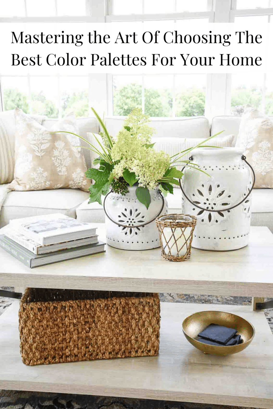
Mastering The Art of Choosing The Perfect Color Palette
One of the best ways to create a beautiful, cohesive room is to choose and use a color palette. Let’s learn about color palettes, why they create harmony in a room or even your whole home, and how to create the best one for you.

Today’s post will be a game-changer! One of the simplest yet most impactful ways to create a cohesive look for any room—or even your entire home—is to create and adhere to a color palette you love. A color palette serves as the essential thread that ties your decor together beautifully.
Whether you’re looking to refresh the colors in your living room, guest room, or throughout your entire home, this guide will help you develop a color palette that reflects your personal style and favorite hues.
I must admit, creating a whole-house color scheme is my absolute favorite! Once you master the art of selecting a color palette for a single room, you’ll find it easy and exciting to extend that look throughout your entire home.
Welcome To Decorating School
Decorating School is a free resource for the everyday home decorator who wants to create a comfortable, beautiful home that meets the needs of their unique family. Every decorating post is filled with tried-and-true interior design tips and advice, broken down into easy, repeatable, and actionable steps.
What Is A Color Palette
A color palette is a curated selection of colors that work together to create a visually pleasing look in your home. It’s like a roadmap for your decor, guiding you in choosing everything from wall paint to furniture and accessories. By sticking to a well-thought-out color palette, you can achieve an attractive and unified feel in any room or even throughout your entire home.
Why Choose Only One Color Palette For A Room Or Your Whole Home
Oh, I love this question!
There are several reasons to choose a cohesive color palette for a room or your entire home.
Let’s take a moment to discuss the benefits of selecting a color palette for your whole house.
The top two reasons for having a unified color palette throughout your home are:
- Your rooms will flow seamlessly together.
- It makes decorating your home much easier.
Here are a few more benefits of choosing a whole-house color palette:
- It’s simpler than selecting different color palettes for each room.
- Items can easily be moved from one room to another.
- Shopping for your home becomes a breeze since you’ll know exactly which colors will fit.
- You can adjust the ratio of colors from one room to the next to create visual interest.
How Do I Know What Colors Work Together
This is a great question. Not all colors get along, and some can actually clash! Some colors harmonize better than others.
Understanding which colors complement each other will help you create a stunning and foolproof color palette for your home. This makes sure that all your colors work together to create something truly special and beautiful.
It’s a smart idea to learn a bit about how to choose colors for an attractive and cohesive color palette.
5 Steps For Choosing A Color Palette That Is Cohesive
There are a few tried and true steps to choose colors for your home that will ensure a successful color outcome.
Ask: How Do I Want My Room To Feel
Ask yourself how you want your room or home to feel. This may seem like an odd question, but it’s the most important one to consider when beginning to choose colors for your home! Color has a significant psychological impact on us.
- Yellow can make us feel happy and cheerful.
- Blue can evoke a sense of calm and tranquility.
- Orange can boost our energy levels.
- Brown can create a cozy and comfortable atmosphere.
- Gray can sometimes feel moody but also sophisticated.
Knowing how you want your room to feel will guide you in selecting colors that best develop that desired ambiance. Try to define the feeling you want your home to evoke by using adjectives to describe the vibe.
Common house descriptions include warm, cozy, airy, moody, bright, happy, clean, relaxing, upscale, homey, and calm. Think about how you want your home to feel. Then, pick two words, like warm and cozy or bright and airy, and create a color palette that brings those adjectives to life in your walls, rugs, and furnishings.
For example, I chose the words airy, calm, and bright to describe our home’s vibe. No wonder I opted for a neutral color palette infused with lots of white and light neutrals.
Choose A Color You Love
You can start creating a color palette by choosing a color you love. It’s that simple! Do you adore a particular color in a painting, a rug, or even in a bouquet of flowers you bring into your home? Is there a color present in something in your home that you cannot change or remove? This color can be a great starting point for building your color palette.
For example, if your home has blue wall-to-wall carpeting in every room (except the bathrooms and kitchen), this blue should be your starting point because it will be a dominant color that you need to consider when selecting a color palette.
Think about other fixed elements in your home, such as flooring, cabinetry, and other permanent fixtures.
Let’s call this your foundation color. This foundation color will serve as the anchor for your palette, helping you choose additional colors that complement and enhance it, ensuring a cohesive and pulled togethr look throughout your home.
Using A Color Wheel To Find Colors That Work Best
A color wheel is your best friend when you want to choose the right colors for your home. It is also not hard to use.
Below is a color wheel that includes shades and tints of each color. The color wheel is divided into:
- Primary Colors: Red, yellow, and blue.
- Secondary Colors: Orange, purple, and green (created by mixing primary colors).
- Tertiary Colors: Blue-green, blue-violet, red-orange, red-violet, yellow-orange, and yellow-violet (created by mixing primary and secondary colors).
Secondary colors are made by mixing the primary colors together, and tertiary colors are made by mixing primary and secondary colors together.
This is a wonderful chart to help you understand the colors on the color wheel.

I like this color wheel because it also adds some of the colors’ tints and tones!

Here are the four main types of color combinations you should look for when choosing a color palette for your home:
Creating a Unified Look with Monochromatic Colors

If you’re hesitant about using color, consider a room with a monochromatic color scheme featuring lots of white and accents of black, gray, or other neutral shades. This approach can create a stunning and sophisticated look.
For example, you could use various tints and tones of green throughout the room, or you might opt for different shades of orange to achieve the look you love.
Create Harmony with Analogous Colors
Analogous colors create beautiful and visually balanced rooms, making it easy to develop a color palette. By using different tints and tones of these next-door neighbor colors, you can achieve a seamless look.
To create an analogous color palette, select two to five colors that are adjacent to each other on the color wheel. The colors naturally complement each other, resulting in a visually appealing and balanced space.

Energize Your Space with a Complementary Color Scheme
Complementary colors are directly opposite each other on the color wheel. These contrasting colors work together to create an energetic feel in a room.
If you’re new to using color, a complementary color scheme is an easy and attractive choice. To achieve a balanced look, add touches of white and a bit of black to your color palette. This will help create a lovely looking space.

Create Balance with a Triad Color Scheme
A triad color scheme uses three colors that are evenly spaced on the color wheel. These colors may seem unexpected, but when used in a room or throughout your entire home in varying proportions—like 60% of one color, 30% of another, and 10% of the third—you can create stunning and balanced spaces.
This color combination allows for versatility in your decor, enabling you to achieve a consistent look with a touch of variety in different rooms.

There are several other types of color schemes used in interior design but these are the most popular and easiest to create a color palette. Ideally, choose 5-7 colors you can mix and match in differing percentages when creating a whole home color palette.
The Importance of Undertones
Can You Mix Warm And Cool Colors is a post that will help you understand undertones. Be sure to check it out.
Most colors, except for pure primary colors, have undertones. Undertones are subtle hues that lie beneath the main color and can influence how that color appears in different lighting and with other colors. I like to think of undertones as the hidden layers beneath a color, quietly impacting its overall appearance. Understanding these undertones is essential for creating a color palette that works seamlessly in your home.
Here is an easy example:

The center block is green. When yellow undertones are added to it, it becomes a much different green—almost a spring green. When blue/ violet undertones are added to it, it also becomes a different green—but a more sage green.
Undertones of different shades and tints have huge effects on color! So, knowing the undertones of a color you choose for a color palette in your home is a must!
WARM AND COOL COLORS

When we talk about undertones, we must also discuss warm and cool colors.
Let’s revisit the color wheel. All colors fall into either the warm or cool category, except for pure white—and even white often has subtle undertones that affect its appearance. The color wheel is a complex tool that organizes colors in a circular format, illustrating their relationships to one another.
For this post, we’re using the color wheel to highlight two important aspects:
- The warm colors on the color wheel
- The cool colors on the color wheel
The color wheel is essentially divided into warm and cool colors. Warm colors include red, orange, and yellow, while cool colors are green, blue,indigo, and purple.
Understanding whether the undertones of a color are warm or cool will help you select colors that work well together in a palette. This knowledge is crucial for creating a harmonious and visually pleasing space.
Identifying the undertones in white, gray, and beige can be particularly challenging. We will delve deeper into this topic in another post.

The 60-30-10 Rule
When it comes to using color in a room, the 60-30-10 rule and its variations are the gold standards.
Here’s how it works:
- 60% of a room should be decorated in one dominant color. This usually includes the walls and other large foundational furnishings.
- 30% of a room should be decorated in a secondary color. Think about using this color for draperies, bed linens, accent chairs, accent walls, and painted furniture.
- 10% is reserved for accent colors, used in throws, pillows, artwork, and decorative accessories.
This rule has many variations depending on your taste and decorating choices. You might prefer an 80-20 distribution, or perhaps a 70-20-5-5 or even a 90-5-5. It all depends on how you want to distribute color around your room.
For a monochromatic color scheme, consider using a few different shades or tints of your chosen color in a 60-30-10 distribution. This approach adds depth and interest while maintaining a cohesive look.
The main point of this rule is to use colors in varying degrees within a room.
When the colors in your palette are equally distributed around a room, the result can often be boring and uninspiring. The 60-30-10 rule helps you avoid this by creating a vibrant and visually appealing balance of color.
Our Homes Color Palette
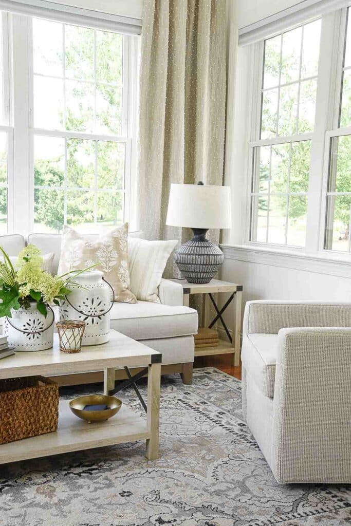
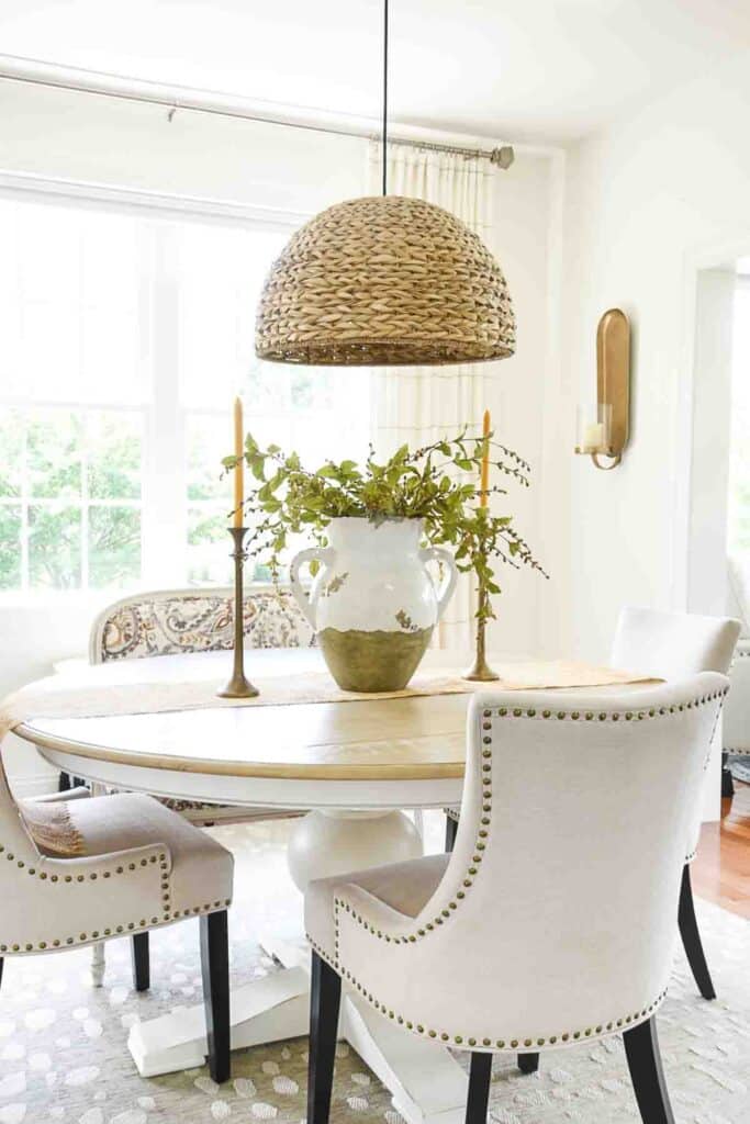
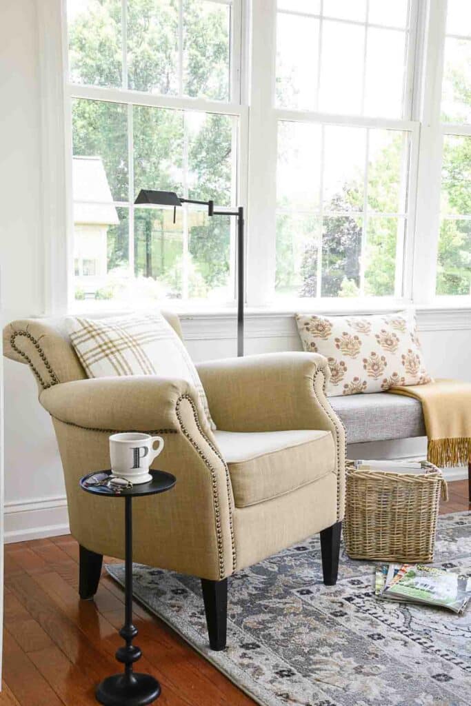
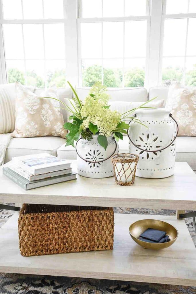
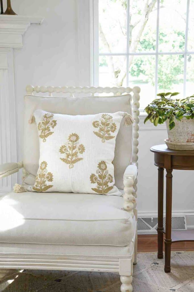
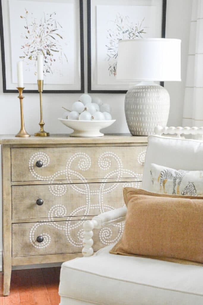
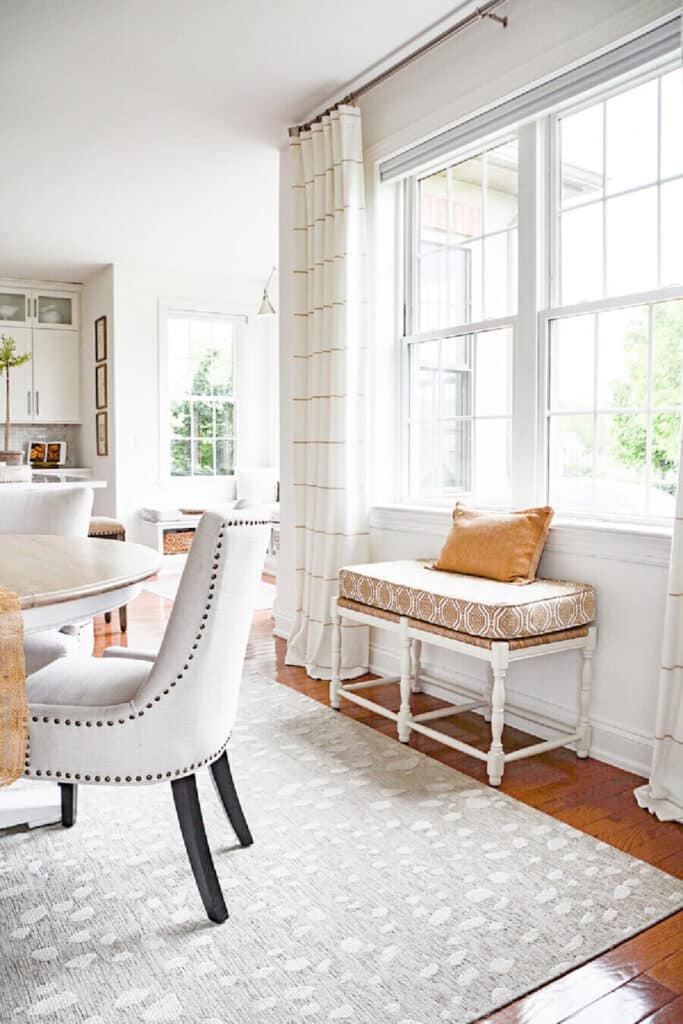
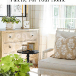
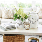
Our home’s color palette is very neutral. Lots of whites, beige, caramel, warm brown, gold, and a little bit of soft, gray. The color palette is warm, even though our walls are white.
It is primarily a monochromatic color palette. Here are the neutral colors in our home…

A lot of white and a touch of black are added to the color palette. I also like to include a pop of color that reflects the season.
It’s important to physically create a color palette rather than just have it in your head. Have a tangible color palette, just as you should have swatches of the paint and fabrics you plan to use in a room. Having these physical samples will greatly contribute to your decorating success!
Last Thougths About Choosing A Color Palette
A color palette should make decorating more manageable, not harder. It should serve as a guide to help you choose everything that goes into a room. If you’re working on a whole-home color palette, you should be able to move furnishings and accents from one room to another with ease. Sounds wonderful, doesn’t it?
If you’re like me, you’ve experimented with quite a few color palettes over the years. So never feel stuck with colors that you’ve outgrown or that now look dated and tired to you!
Changing a color palette takes time and is a process, but it is so worthwhile. Be brave and find a color palette YOU love and inspire YOU.
Common Question about Choosing A Color Palette
How do I start choosing a color palette for my home? Start by picking a color you love. Use it as your foundation. Then add complementary colors for balance and accents for pops of interest.
Should I use warm or cool colors in my home? It depends on the mood you want. Warm colors feel cozy and inviting. Cool colors create a calm and refreshing atmosphere. Choose based on the feeling you want to create.
How many colors should be in my palette? Aim for 5-7 colors. This includes a main color, secondary colors, and a few accents. Add neutral tones like white, black, or gray for balance.
More Posts About Color
8 THINGS YOU SHOULD KNOW ABOUT COLOR
WHY BROWN IS THE HOT NEW COLOR, REALLY?!!!
IS GRAY PAINT COLOR TOTALLY OUT?
Happy Decorating, Friends!

I just had an ah ha moment! By painting the home all one color, I just simplified my life! My office is a soft peach color, the half bathroom is a sage green and the living room and dining room are a soft griege (husky gray by Benjamin Moore which I absolutely love). The office and half bathroom feels off and now I know why! I am getting my paint brush out today to start changing the color. Now my decorating ideas for the rooms have become very clear. Thanks you! Wow!
Yay! You are so right! Paining your rooms the same color will look so more cohesive!
This was a very interesting and informative article. It was a good read and it was nice to see diagrams added in. However, I found it quite disappointing that almost all of the photos that were shown in regards to examples of interiors were white with white and a little more white on top of that. Where was the visual examples of actual color rooms using the teachings of complimentary and contrast schemes?
Sorry! My home is very neutral so images with white and neutral colors are all I have. I’m sure you can find lots of examples on Pinterest.
My Family room has a large brick fireplace. The brick is the a rusty red brick with splashes of black and gray. It looks like someone literally threw splashes of these colors at the brick. The brick wall takes up three quarters of a major wall. My furniture is a mixture of browns some with cool tones and others with a warmer tone.We are going to be changing the flooring and are trying to find a wood vinyl that goes with the dining room which has Teak hardwood flooring. The brick wall is so massive it makes it hard to decorate the mantel and have anything show up. We are open to painting the brick but are not interested in white or a dark color as the room is pretty dark anyway. Any suggestions?
Hi Debi, you might think about a cream or greige or other neutral colors with the same undertones as your flooring and furniture. Hope this helps.
A problem that probably a lot of us has is how do you make the transition from one color pallet to another? After surviving the avocado, then earth tones, then jewel tones over the years all of our furniture pieces are neutrals, with either a soft yellow or a creamy white wall color, and all my draperies are creamy white lined sheers. The first thing I did was paint our front door in a color that sets the tone for the interior – in our case a French blue. Then we purchased a beautiful area rug for our family room in soft blues, creams, etc. New pillows in the family room are blues and creams. Our foyer also sets the tone for the rest of the house with a transitional piece of artwork with all the colors I am transitioning to. The only problem is this has taken several years, and I am still not quite happy with everything. I guess it’s a process. I guess you start with the basics and then go from there. It’s expensive to transition and takes time. I would suggest to any new homeowners to remember to start slow and select pieces of furniture that are neutral, or whatever color you love, and go from there. The other thing I find to be a problem when making a color transition is you have to remove any of your old colored accessories when you start adding new items. In today’s world there are bigger problems to think about, but our home remains our safe place, and we all want it to be a reflection of the people that live there. I think a great subject for Yvonne is a tutorial of how a young homeowner should start the process of home ownership.
You are a wealth of great advice and tips, Lyn! You are so right! And thanks for the suggestion!
Super ideas, Lyn!
My home is very similar in color way to your’s but I picked a dark bronze instead of black. A “touch of black” seemed too harsh with my creams and taupes. I carried the paint color throughout and for the most part the same in both hard and soft finishes. In my bigger guest room, I did deviate as I had bedding in a lovely big floral that I stilled loved and two wing chairs in a blue & linen check. I kept the chairs & throw pillows but went with white curtains, white sheets and a linen mattelise cover. It’s a charming room that harks back to my bigger more traditional house.
I love your lessons Yvonne. They are I depth and must take quite a bit of time and research to put together so I wanted to say Thank You!
Hi Joanna, thanks for recognizing the time (and love) I put into each post. Your color palette sounds lovely!
Enjoyed …loved the color wheel! Enjoy clean fresh white…however, live in the country where the dust blows! I also love color…bright pops of color!
I absolutely love the new rug in your sunroom. Could you please share info about it?
I look so forward to getting your posts. They are an inspiration to me!
Hi Sharon, I found it on erugsales.com
I just finished reading two of your articles. The first is decorating with warm and cool colors and how to pick a color palette. I enjoyed both of them. They are very easy to understand and informative. I have been trying to figure out this for a while now. Unfortunately I am not sure if I am on the right path. I have golden oak cabinets and golden oak fire place mantel with bricks that have dark gray, light gray, some brown, and burnt orange colors. I am not able to change these at this time. I also, have oak flooring and black iron stair railing. I chose SW Conservative gray paint color for living area, foyer, kitchen, hallways. I have a dark charcoal couch and 2 light gray chairs as well as a brown club chair. I love the paint color, but do not know which direction to go next or if I have totally gone in the wrong direction. I would love to hear your thoughts.
Hi Carolyn, I won’t be able to give you my opinion unless I see pictures. Can you email me pictures of your home? Send them to [email protected]
I might not answer right away. I have a house full of family this Thanksgiving weekend.
when painting the fireplace bricks, choose a darker color than your walls, a bronze brown color. also paint the golden oak mantle darker than the brick color… deleting a lot of the golden oak will make the colors of the room pop. ramp up the sofa and brown chair with throws and pillows that bring in happy colors.. painting the fireplace bricks will ground the room with weight. happy decor
Yvonne – in your post you showed 6 circles with paint colors that you feature in your home. Could you possibly post the names of those six colors. Thanks for the wonderful post.
These splotches are not any certain color. They are there to help you see the differences in color and undertone.
These are not any certain colors, like wall colors, but the colors I use in my home.
I so appreciate your articles and your wisdom that you share!
I do have a question though… I have a number of houseplants in my windows – both hanging as well as on the sill. Should I be including the green of the plants in my colour palette for the room?
I love plants too! Green from plants is considered free. Don’t include green unless you want to use it in other ways in a room.
Oh thank goodness! I love my plants but definitely don’t want dark green included in a colour palette for a room!
Thank you so much for your help!
Happy Palm Sunday!
Carolyn
Super ideas, Lyn!
This was so helpful! ????
Hi Laura, I’m so glad!