Can You Mix Warm And Cool Colors In Decor?
Mix warm and cool colors confidently with easy undertone tips and practical decorating rules that keep rooms from feeling off.
Yes, you can mix warm and cool colors in your home, and when done correctly, it creates balance and interest instead of conflict. The key is understanding undertones and keeping large foundation pieces consistent while layering in contrast through accents.
This is one of the most common decorating questions I receive. And the answer is yes, but there is a right way and a wrong way to do it. Let’s talk about how to get it right so your room feels cohesive and comfortable instead of slightly “off.”
Let’s Talk About The Color Wheel

The color wheel is simply a tool that shows how colors relate to one another.
For this conversation, you only need to notice one thing: the wheel is divided into warm colors and cool colors. A rainbow is a perfect real-life example. Reds, oranges, and yellows feel warm. Blues, greens, and violets feel cool.

Warm Colors
Warm colors live on the red, orange, and yellow side of the color wheel.
Think red, rust, coral, gold, mustard, and warm neutrals like beige, tan, cream, and cognac.

Warm colors tend to feel cozy and inviting. They bring visual warmth into a space and often make a room feel comfortable and welcoming.

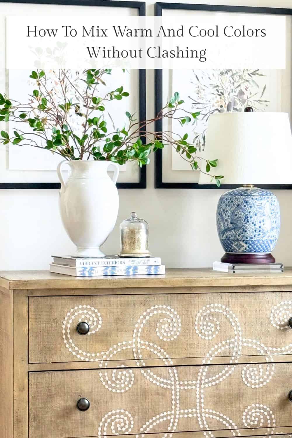
I would consider my home leaning on towards the warm side of the color wheel. Creamy paint, honey-toned wood, beige upholstery. Because those larger elements share the same temperature, the room feels settled and cohesive.
Cool Colors
Cool colors live on the blue, green, and violet side of the color wheel.
Think navy, sage, emerald, lavender, charcoal, and many shades of gray.

Cool colors tend to make us feel relaxed and serene. They are crisp and clean.

It’s important to remember that each color has a different effect on our emotions and reactions. Each color possesses a unique ability to evoke different moods and feelings within us.
Basic Color Info To Know
Before we go further, there are a few simple color facts that make everything easier.
Red, blue, and yellow are the primary colors. Every other color is created by mixing those three in different ratios. That ratio is what gives a color its personality.
White reflects all colors. Black absorbs color. But in decorating, what really matters is how much red, blue, or yellow is hiding inside the color you are looking at. That hidden color is often the cause of decorating problems.
Mass Tones And Undertones
Every color has two parts:
• A mass tone
• An undertone
If you understand these two ideas, mixing warm and cool colors becomes much easier.
Most decorating frustration stems from ignoring undertones. You can have beautiful furniture and lovely accessories and still feel the room is unsettled. Undertones are usually the reason.
What Are Mass Undertones
The mass tone is the first color you see. If you glance at a swatch and say blue, red, green, or yellow without thinking, that is the mass tone. Mass tones are usually easy to identify. Most of us can spot them quickly.
The mass tone tells you the general color family. But it does not tell you the whole story.

Going from top left to bottom right, you would likely say blue, blue, red, pink, yellow, yellow. That first instinct is the mass tone.
Mass tones are usually easy to spot. Even when a color is softened or lightened, your eye can still identify its main color family. If you said red instead of pink, or beige instead of light yellow, you are still seeing the correct mass tone.
The mass tone helps you determine whether a color belongs to the warm or cool side of the color spectrum.
Undertones And How They Affect Color
While mass tones are easy to see, undertones are not often apparent at first glance. And even with a bit of inspection, they can still be hard to figure out.
These undertones can be especially difficult to ferret out when working with neutrals and whites. But that is for another post.
Since all colors are made by combining red, blue, and yellow, the ratio of the colors mixed together to make a new color becomes very important.
Stay with me. Let’s take blue, for example…

The bar going horizontally across the top blocks of the infographic is true primary blue.
In the top bar, a weak saturation of green (cool color) was laid over the primary blue. See how adding a little green undertone to blue changes its color?
And I did the same, using yellow. A weak saturation of yellow was laid over the primary blue color to produce a warmer shade of blue.
The bottom two blocks show how undertones of warm and cool colors have huge effects on primary blue. This is true for any color.
Undertones are major players when it comes to creating color. Blue is still a cool color no matter what the undertones are, but the undertones can make blue feel a little warmer or cooler.
With a little practice, you can figure out the warm or cool undertones of any color. This is so important to know if you want to decorate with both warm and cool colors in your home.
Another Undertone Example
Color theory matters most when you start putting colors next to each other in a room. You can have beautiful pieces individually, but if their undertones fight each other, the room will never feel quite right.
Here is an easy way to spot undertones.
Hold a color next to its truest version. Think of the most classic crayon red, blue, or yellow. When you compare them side by side, you will begin to see what is hiding underneath.

For example, if a red looks slightly orange next to true red, it has a warm undertone. If it looks slightly magenta or bluish, it has a cool undertone.
The same is true for green, blue, beige, gray, and even white.
Undertones quietly influence how colors relate to one another. When they work together, a room feels cohesive. When they conflict, something feels unsettled, even if you cannot immediately explain why.
Here’s an easy way to see what the undertones in a color are.
To find the undertones in a color, hold it up to its mass tone. The truest red, yellow, blue, green, or purple. Think of the truest of these colors in a box of crayons. You should be able to see which colors are hidden beneath the mass tone. Are they warm or cool?
The center blocks in the infographic above are the mass tones for blue, green, and red.
The blocks on the left show what happens when a warm undertone is added to each mass tone. The colors still read as blue, green, and red, but they shift warmer.
The blocks on the right show what happens when a cool undertone is added. The colors remain within the same color family but shift toward cooler tones.
Here is the key idea to remember. A warm color will always be warm, and a cool color will always be cool. Undertones do not change what a color is; they change how warm or cool it feels.
Look at the red blocks.
When you add more yellow to red, the red warms up. Add enough yellow, and that red eventually becomes orange.
When you add more blue to red, the red cools down and moves toward magenta. Add enough blue, and it eventually becomes purple.
That is exactly why undertones matter so much in decorating. They quietly shift a color warmer or cooler, and that affects whether it works with the other colors in the room.

Can You Mix Warm And Cool Colors When Decorating?
Yes, you absolutely can mix warm and cool colors in a room. In fact, most well-decorated rooms do.
The key is balance.
When warm and cool colors are mixed intentionally, a room feels layered and interesting. When they are mixed randomly, the room can feel slightly unsettled.
Here is the simplest way to think about it: Keep your foundation consistent. Add contrast in smaller amounts.
Step 1: Keep your Foundation Consistent
Your walls, flooring, and large furniture pieces set the tone of the room. These elements should lean either warm or cool. This is where most decorating problems begin.
If you have warm, creamy walls and honey-toned floors, then a cool gray sofa with blue undertones may fight the space. If you have cool gray walls and flooring, a pink beige sofa can look out of place.
Start by deciding whether your foundation is warm or cool. Once that is clear, everything else becomes easier.
In my own home, my walls and larger pieces lean warm. Creamy white paint, warm wood, beige upholstery. Because those foundational elements share similar undertones, the room feels cohesive.
Step 2: Add Opposite Undertones In Smaller Doses
Once your foundation is set, this is where contrast makes the room interesting.
If your room is mostly warm, bring in a touch of cool through pillows, art, lamps, greenery, or an accent chair. If your room is mostly cool, add warmth with wood tones, woven textures, brass accents, or warmer textiles.
I love using pillows for this. They are low risk and easy to change.
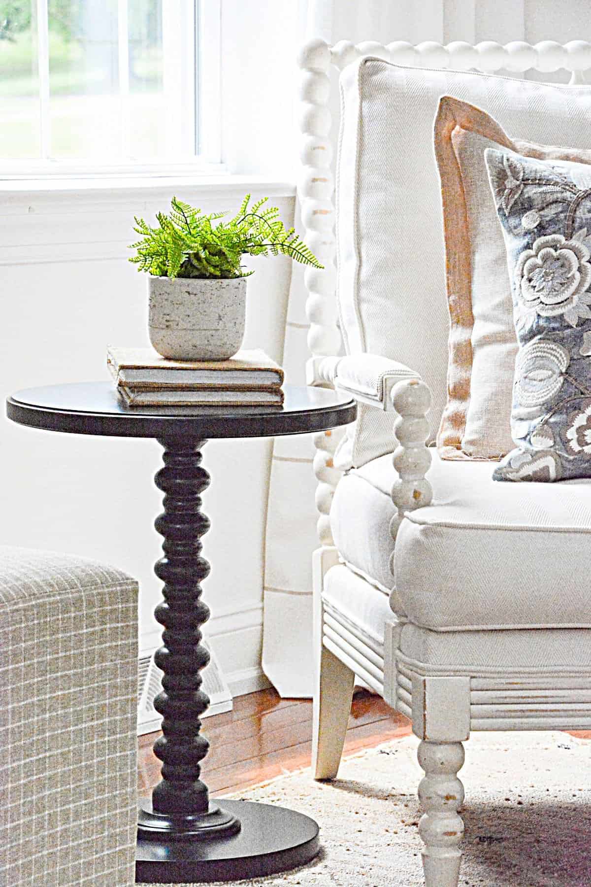
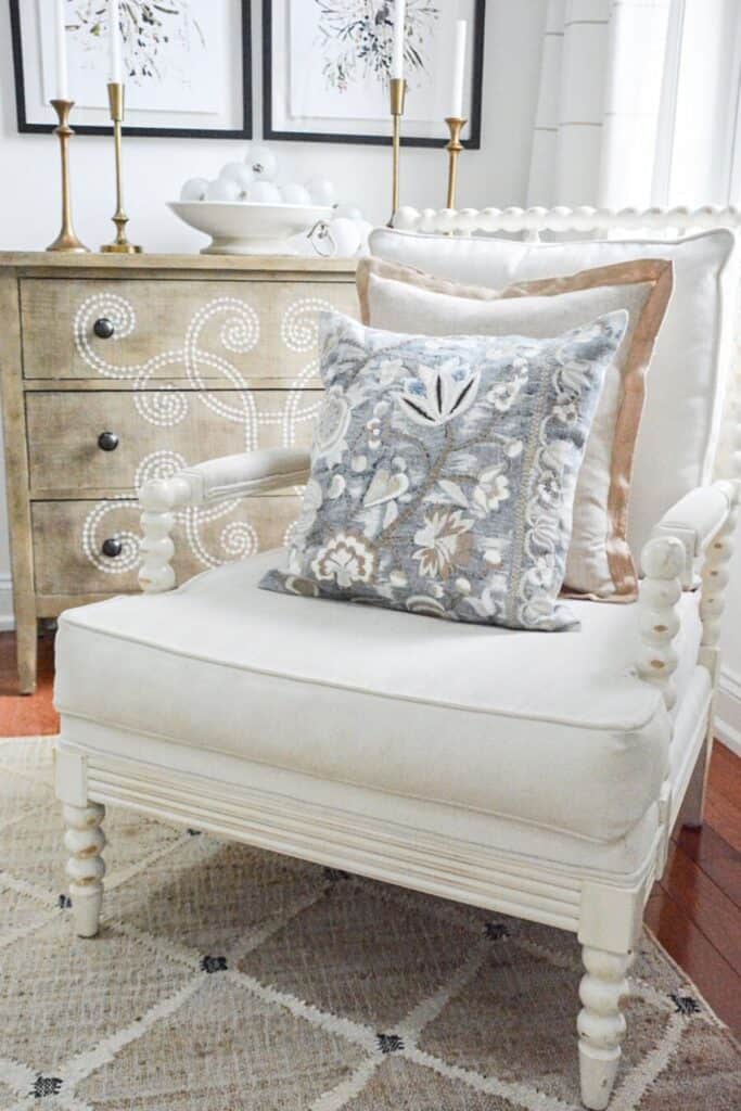
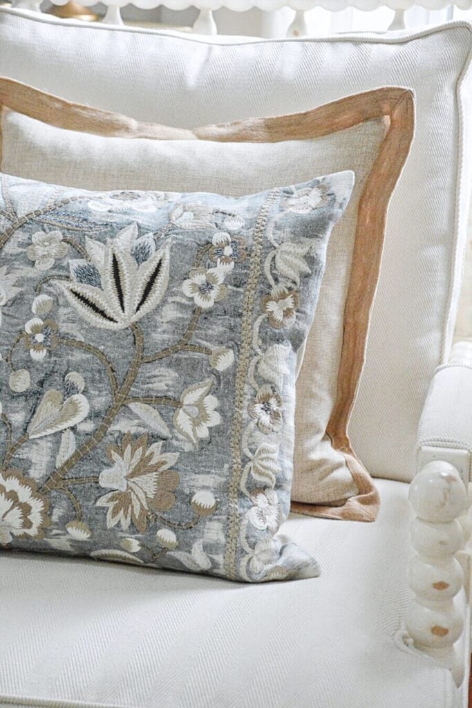
In my own living room, which leans warm with creamy walls and beige upholstery, I added a blue-gray pillow. The blue is still cool, but it has subtle warmth. That subtle contrast makes the entire room feel more layered without looking confusing.
That is the kind of contrast you want. Intentional, not accidental.
Step 3: The 80/20 Rule
A helpful guideline is the 80 20 rule.
Let about 80 percent of the room lean one temperature. Let 20 percent introduce the opposite.
For example, in a warm room:
• Warm walls
• Warm flooring
• Warm upholstery
Then layer in:
• A cool pillow
• A cooler-toned piece of art
• A gray ceramic lamp
This balance keeps the room from feeling flat or heavy. It adds just enough contrast to give the space life.
Practice Finding Undertones In Your Home
If a room in your home feels slightly off and you cannot figure out why, look at the undertones. Undertones quietly influence everything.
Start by looking at your largest surfaces. Walls, flooring, sofas, cabinetry. Do they lean warm or cool? Are they consistent?
Next, look at your textiles and accessories. Pillows, rugs, art, lamps. Do their undertones support the foundation or compete with it?
An easy way to practice is to compare two similar items side by side. Two beiges. Two grays. Two whites. When they are next to each other, the undertones become much easier to see.
The more you train your eye, the more confident you will feel making color decisions. Once you understand undertones, decorating becomes less frustrating and much more predictable.
Mixing warm and cool colors is not about following strict rules. It is about understanding what is happening underneath the surface.
Once you begin noticing undertones and paying attention to proportion, decorating becomes much less confusing. You stop guessing. You start making decisions on purpose.
Keep your foundation consistent. Add contrast thoughtfully. Let one temperature lead and allow the other to support it. When warm and cool colors are balanced well, they do not compete. They make each other look better. And that is when a room feels finished, comfortable, and beautifully put together.
The more you practice seeing undertones in your own home, the more confident you will feel. And confidence is one of the best tools for decorating.
More Ways To Create A Cohesive Home
If you enjoyed learning how warm and cool colors work together, here are a few more decorating guides that will help you create a cohesive, comfortable home. Each one builds on the ideas we talked about and gives you practical ways to put them into action.
Understanding And Decorating With The Color Beige
Beige is anything but boring when you understand its undertones. This post will help you choose the right beige and use it beautifully in your home.
7 Tips For Decorating With Neutrals
Neutrals are where undertone mistakes often happen. This post will help you use beige, cream, gray, and white in a way that feels intentional.
How To Know What A Room Needs
If your space feels off but you cannot pinpoint the cause, this guide walks you through diagnosing the issue step by step.
10 Tips For Creating A Timeless And Curated Home
Color balance plays a big role in creating a home that stands the test of time. These decorating principles support everything you just learned.
Scale And Proportion: Your Key To Better And Easier Decorating
Even when color is right, proportion matters. This post helps you make sure every piece works together beautifully.
Frequently Asked Questions
Yes, you can, but one needs to clearly lead.
For example, if your walls are creamy and your sofa is warm beige, that room is warm. You can absolutely add a cool gray pillow or a slightly cooler lamp. But if you try to mix cool gray walls with pink-beige upholstery, you may end up fighting the room.
Pick your main temperature. Cool or warm. Let the other one support it.
If everything in your room looks fine on its own but feels unsettled together, undertones are usually the reason.
A quick test I use is to put two similar items side by side. Two white paint samples. Two beige pillows. Two gray fabrics. When they sit side by side, you will often see one lean pink, one lean yellow, or one lean blue.
You should be able to tell if the undertones are fighting.
Gray is naturally a cool color. But some grays are softened by brown or beige undertones, which make them feel much warmer.
For example, a blue-gray next to creamy walls can feel sharp. A gray with a hint of brown feels much more comfortable in a warm room. That small shift makes a big difference.
Yes, and I see this often.
A room that is all warm can feel heavy. A room that is all cool can feel flat or stark. That is why I like adding a small amount of the opposite undertone. A cool pillow in a warm room. A warm wood table in a cool space.
That little bit of contrast gives the room life.
Happy decorating, friends…


Thank you for all the information. That was a lot of work to present.
I hope it helps!
Love your post!!!! There is always so much info in them. All of your decorating tips seem so simple, when you break them down. Thank you!! Also, your recipes are delicious!!!!
Can you remind me where your chair came from? I know you have talked about it before but I wasn’t in the market for one till now. I love the gray and neutrals in the print. Thank you.
Here is the link for this versatile chair:https://rstyle.me/+XV4L-JCQw4CDVRgcdf9e1w
right now it is out of stock but will be back Feb 21st. You can sign up to be notified when it comes in. Hope this helps.
Thank you!
Thank you so much, this was super helpful! I love your blog!
?
So glad this was helpful to you!
Thanks, Yvonne. Repainting the main living area is on our to do list. My couch is cream colored and wood tones are warm. Does that mean I need to use a warm paint color on the walls? I was hoping to go cooler, even white, in order to neutralize the warm tones. Just want to be rid of yellow undertones.
You can certainly paint your walls white. Our whole house is white but it is a soft white. It appears white but it actually has some yellow undertones. Just stay away from white paint with gray or green undertones. Hope this helps.
Yes. Thank you so much.
Thanks for your post to explain this all. I never really thought too much about this before. One question I have – if walls are creamy white, what do you think of black color with them? For example – if your table top was black? Would those colors look good with each other?
Black can also be warm or cool. But mostly black will work with both cool and warm colors. Just don’t overdo black. A little goes a long way unless you like very dramatic decor.
Wow! That was so helpful!! Thank you!! Now If only I could grasp this concept ??
I know and I gave you a very simple version of this concept. Color is really a big big far reaching thing and it is not easy!!!! But I hope this post helps.
It did! And those curtains behind that chair? MmMMM! Them are Fabulous!!
Please tell us about the curtains behind the chair and the source. Absolutely love them.
You have a very good eye. These are beautiful curtains and they are on sale. See them here:https://rstyle.me/+vlgyGOiknD03xpTLtRmFIQ
What a great tutorial on warm and cool colors! It was so helpful. Part of choosing colors is intuitive for me, but not entirely. ;). Now I understand my issue when colors aren’t playing nice with each other
Yes, color can be very intuitive… until it’s not! Right? Knowing about undertones makes a big difference.
Thanks for this tutorial. Your posts are always helpful. Do you have the source fir the rug that’s under the stylized floral chair?
I’m so glad it is helpful, Chantel! The rug is a real winner! It’s wool and wears like iron! See it here:https://rstyle.me/+MNbtnCKBrdT7m6QglJAMZw
Undertones!! I think this is the missing piece of the puzzle for me. Thank you for this info and for explaining it in a way that is easy to understand. Choosing color can be such a challenge at times!
I’m so glad this is helpful Theresa! Yes, undertones are so important. And color is a very complex and wonderful thing!
Yvonne that was hands down the best explanation on how to tell the difference between warm and cool colors. I work as a framer and am always trying to figure out the different mat colors in relation to the artwork. Thanks so much for this easy explanation that I’ll be able to apply to work and to my home. Pinning.
Thanks, Mary! I’m so glad it helps.
Wonderful tutorial! I learned a lot about warm and cool colors when shopping for white paint for the interior of my home this fall. I had no idea white wasn’t “just” white! I still don’t have all of the color wheel concepts figured out, but your tutorial answered a lot of my questions. I know it’s not easy to find a simple way to explain the color wheel in a short post, but you packed in a lot of great information! Thank you for helping others create beautiful homes of their own! ~Kristi
Thanks, Kristi! How sweet! Yes, color is a very complex concept. But as home decorators, we can learn the basics to create beauty and harmony in our homes!
Great explanation!
My new home has warm toned orange stain oak floors. My sectional is a cool gray . Should I go warm or cool for the wall tone?
Great question. I too have oak floors and they will have to stay that way. It really depends on how dirty or muted the gray sectional is. I’d put a large cool toned rug on the floor and go a neutral white for the walls. Hope this helps.
Thank you! This is the best source I’ve been able to find on how to utilize both warm and cool colors in decor! You explained it very well!
Thank you so much Elissah!I think if more home decorators knew about warm and cool colors and how to mix them they would find decorating much easier.
Hi
My headboard is a mid tone dove grey and bedroom furniture a lighter painted dove grey with warm oak tops. If i was chosing between grey or taupe/ beige curtains what would ypou recommend? I would prefer to have a ligjt beige tone paint on walls if this would work?
Many thanks Sandra
Hi Sandy, I really can’t give you my best advice without seeing the room and the colors you are working with. Please send pictures to [email protected] and I’d be happy to help.
I bought a cream sofa but in the evening with the lighting it looks like a cool light gray. My walls are darker, like a warm goldish beige with Venetian plaster. We don’t want to change the walls or sofa. What do you suggest?
I would add pillows that work with both colors. And add a light beige throw. Play around with the colors of your pillows to find ones that create a bridge between the wall and sofa color. Also, you might think about changing the color of your lightbulbs. Hope this is helpful.
Help! I had my kitchen cabinets painted Ben Moore Nimbus, which has very strong blue undertones. Sometimes they even look purple along the bottom next to the floor. I can’t have them repainted. Is there anything I can do ( wall color, etc) to tone down the blue? I really wanted just a nice greige. Im miserable with this color!
Oh, Denise, I feel your pain! There is NOTHING you can do that will cancel out the blue/purple tones enough to make a difference.Oh, I am so so sorry! You need to have them repainted. You won’t be happy until you do. Bless your heart! I wish I could give you a big hug!
Thank you! This was awesome. I have been trying to learn about colors and this is the first time I have “gotten” it; at least a little bit. I want to paint my living room soon and I appreciate all the information. I am also going to be looking for a new sofa so I believe I should be looking for a warm undertone as my hardwood floor is yellowish birch?
Yay! I’m so happy this is helpful! Make sure to get samples of the sofa fabric to take home and look at them in your homes lighting and with the color of your floors and walls.
Where did you purchase your curtains
Hi Debbie, you can see the curtains here:https://rstyle.me/+wROjfEIur4sarXmg8oVY1Q
I have always loved the paint in your homes…I have woodwork that is Antique White from Sherwin Williams and my walls are Hopsack ( a paper bag/ caramel looking color) and Kilim Beige on the ceilings…I can’t change the woodwork to white as much as I would love to because my blinds and bath fixtures etc are all the bisque or cream color…How would you suggest I could use beige on the walls and ceilings? Is there a beige that would work with Antique White?
Hi Peggy, if I were you I would paint my ceilings white. That would make your room look crips. Antique white is a pretty creamy color that has a bit of yellow undertones. I think a warm white on your walls would be beautiful. Because your woodwork is beige I would not put another beige on my walls. Paint your walls a soft white also with a tad of yellow undertones.
Beautiful! Your designs are amazing. Can you share where you purchased your wooden floor lamp? Thank you
The floor lamp came from Kirklands. Hope this helps, Pam!
I am stuck. The tutorial was super helpful but I’m still not sure what to do. My living room is presently a light tan color that opens into my kitchen/dining room that is “warm” blue with off-white (not yellowish) cabinets. I want to paint my living room and was leaning towards gray. But it’s just not working out. I’ve tried 3 different shades—the first was too blue. The 2nd (which I thought was going to be more of a greige) kind of looks purple. The 3rd is the gray my daughter picked out for her room and looks great for her space. Luckily, I only painted large splotches in different spots to see how it blends when you look into the kitchen. I’m not impressed. Should I just go back to another light tan or off white? (my wannabe teenage designer daughter thinks it is passé) Right now my furniture is brown but that will definitely be changing (not sure to what yet). I just wanted to get the walls done first.
Gray is such a hard color. You were the victim of UNDERTONES! I would stay away from gray with your warm blue and off white and choose a pretty warm white for your walls. Hope this is helpful. By the way, you might want to read why Beige is the next big thing in decor:https://stonegableblog.com/what-you-need-to-know-about-the-color-beige/
Thank you for this post! I am in the process of choosing flooring, cabinets, countertops, backsplash, and paint color for a new home and I am so afraid of getting this wrong! For the paint color, the builder uses Kelly Moore Swiss Coffee for the whole house. I can upgrade the wall color and the one the designer suggested was Feather Stone. I will have white cabinets, dark floor, light and grey countertops. I am scared the Feather Stone is too warm and could clash with white cabinets/white and grey countertops but you said above that a grey wall paint would not feel good to you (and I agree). Do you think it would be better to stick with Swiss Coffee for ceiling, walls and trim or go with Feather Stone for the walls? Thanks for your feedback!
Goodness, that is a very heavy question! I really am not very familiar with those paints so I don’t want to say. My best advice is to be very careful about the undertones. And get a sample of the countertop. I did that and thank goodness! The countertop I originally picked did not work with my cabinets. How exciting to have a new kitchen!
Hi! Just found your blog and this post has been so helpful! In my living room I just got a new rug and it is a warm toned beige and ivory, but it is making the couch (grey/white) look way too cool toned. Is it possible to warm up the couch with pillows or will it always clash?
Thanks again for the post!
You can warm up a cool sofa with warm tone pillows. Just make sure there is a little bit of the color of the cool sofa in them too. Hope this is helpful.
I recently replaced my Formica countertops with granite. I didn’t feel the need to replace cabinets, which were already installed when we bought our house,19 years ago. They are like new, so I kept them, not sure of the color name but a warm brown. My new tops are Blue Dunes, leathered and quiet busy, and I’m looking for a backsplash. I’m beginning to think I really messed up! I have looked a LOT for something to pull the two together and not having much look! I’m pretty angry at myself for being so uninformed BEFORE I chose my granite! Is there any hope?
Yes, however, I would have someone from a stone and granite place come in to help you. You need something quite calm. Hope this helps.
Thanks so much for putting all of this info in such an understandable way. This post, as well as the one on focal points, has helped immensely in correcting what’s been “off” in our living room. I do have one question. Do you have the source for your “arrow” pillow? I’ve searched quite a bit to find one, to no avail. Thanks, again!
Hi Debbie I’m so glad you are finding these posts helpful to create a beautiful home. I picked up the arrow pillow years ago at a local shop. Sorry I don’t have a source.
Thank you for this – I feel as though I learn a lot reading your blogs.
Yvonne, Wow when is the last time you slept? What a thorough and information packed post THANK YOU! I appreciate all you do. Love that blue-gray pillow. Do you recall where you purchased?
Hi June, thank you. Click on the link and you can see more about the pillow; https://rstyle.me/+v7dR36xWYEmuJGX-CX-u_w
Can you give me the link for the leopard pillow long lumbar
Hi Linda, you can see the pillow here:https://rstyle.me/+gux2JnW9NnHzLYfRZhxXTg
I have oak cupboards ,dining table and china cabinet in the kitchen dining family room area. I think that all this oak furniture igives a very heavy bulky feel to the rooms but I really cannot afford to replace them. I have cream color leather sofa,love seat and recliner in accompaning open living room What can I do to soften the look of these rooms? Is oak a warm or cool color?
Your oak is probably a warm color tone. You should probably break up your oak dining set. I had a mahogany dining set and wanted a lighter look so I kept the table and got different chairs and took off the top part of my china cupboard and painted the bottom. Try switching out a few pieces. I know this might seem hard at first but it will make such a big difference. It seems to need to create a color palette for these rooms that will work for you. Here is a post you should read, I think it will help:https://stonegableblog.com/color-palette-and-decorating-style/
Yvonne could you link the website you found your brown, gray, cream oriental looking rug? Perfect for my family room.
You can see it here:https://esalerugs.com/3132758
Color is very tricky with all the different undertones, hard to get right.Your post has a lot of good information.
Thanks, Doreen
I agonized over paint color trying to be very careful to choose a warm , calming and not gray color and ended up choosing accessible beige but now that it’s on the walls I’m seeing gray . Did I make a mistake ? Would you consider accessible beige cool or warm?
Oh it is warm.
Hi Yvonne,
Your color wheel post helped me so much with picking out colors for a new sunroom. My walls are sonnet in the house and all my trim is white.( just like your stone gable house)! I wanted to continue the sonnet in the new room and wanted to add a gray marble around the fireplace. I was so confused until I read your post! It all blends because the furniture and beams are all warm colors just like the sonnet paint color. The trim of warm gray marble will bring in a balance of warm and cool. Thank you for your help! My sunroom renovation is starting in 2 weeks!
Yay! So glad the post helped!
I have never been an experimenter with color for my walls, because if I didn’t like something after it got painted I would have to live with it and I wasn’t willing to re-paint so I had to make sure and pick a color that I could live with, mostly lights or whites and I was happy with my choices….I always used colorful accessories and window treatments to make the room colorful….
Wow oh wow! What a ton of great info to unpack! Using this information will surely make the difference between a nice room or space and a great, unforgettable and inspiring one. Thanks for making it so understandable.
Thank you for bringing so much clarity to color!
I always enjoy your blog.
Thank you so much, I have bookmarked this article for easy access!
Hi: The floor in my bathroom is dark grey slate with Carrara marble walls. The adjacent bedroom carpet is a warm cream/white.
I want to change the bathroom floor to get rid of the dark grey. Not sure what color to use on the floor to tie rooms together.
You article is very helpful and informative.
Thank you.
I’d change my floor to work with the walls in the bathroom. Hope this helps.
This has been the clearest explanation I have ever read about cool and warm colours. I can actually understand how to find the undertones of a colour, that info in itself is enourmously helpful for me.
Thank you so much for this article.
Turina
YAY!!! So glad this has helped.
That was so informative!! Thank you for taking the time to explain in such a detail.
I have a question though and maybe you know the answer.
Recently, a kitchen designer was showing me color samples for the kitchen cabinets. And a color that seemed to be light blue for example, turned into an obvious grey when she placed it next to another color. So she insisted that I have to take into consideration the surrounding colors because I could buy a light blue kitchen and end up with a grey one. Now.. A few days later, I purchased white zellige tiles for the bathroom. I wanted them to be white with cool undertones. Unfortunately, when I layed them down to check them out the undertones were beige. I remembered what happened with the kitchen designer and the light blue sample and I wonder if I can use that to my benefit. So is there a color I can use for the grout or the floor tiles or the lighting that could bring out the cool tones in the tiles?
Thank you,
Natalia.
Hi Natalie, this is hard to answer because I would need to see the tiles in person. Undertones are tricky. My best advice is to go to the store you bought your tiles and pick out some grout samples and bring them home. Place them in your bathroom and see how they look. Hope this helps.
Just found this via the Southern Hospitality blog. Fantastic explanation of undertones! I love color, am a life long crafter but, struggle so much with color and undertone. I was always frustrated with nail and lip color when folks talked about red with too much blue 🙂 I finally have a better understanding, thanks to you!
So glad this helps, Mandy! I think color is all about undertones.
❤️you are a genius; while looking at your room colors, I see how cool and warm colors work together. So there are no burgundies, reds, or yellows. I have a psychotic childish dilemma. have a situation where I’d like to use my favorite fire lava, color prop pieces…..…. But in a cool blues, greens, whites, grays, blacks framework backdrop. It won’t work will it.
All blessings and grace strength to you.
Thank you Willie!
This was so helpful for me thank you. I’d love to read more on how to distinguish undertones when working with neutrals and whites!
I love your blue/grey pillow with flowers. Can you give me the source? Thank you, love your sense of style.
Hi Monique, click on the link: https://rstyle.me/+v7dR36xWYEmuJGX-CX-u_w
Here you go Monique: https://rstyle.me/+v7dR36xWYEmuJGX-CX-u_w
I enjoyed this tutorial so very much.
Your explanations were so clear and informative!
Thank you so very much for sharing this with us all.
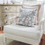
Could you tell me where you purchased the grey/blue and tan floral pillow that is on your chair in the living room. It is the one in the main post. Thank you so much!
Here you go Michele; https://rstyle.me/+v7dR36xWYEmuJGX-CX-u_w
Thank you! I hope they look as good in my house as yours!!!
What a great post! I’ve always struggled with this but never seemed to be able to find info. Thanks!
Great info. I remember learning the opposite of this, though. “White is a mix of all colors. And black is the absence of color.” Was I taught incorrectly? Thanks!
You are so welcome
In reference to undertones I have a new build and ALL the walls and ceilings were painted frosty white which supposedly has beige undertones! In the main living area the ceiling is vaulted and from the front door you see to the back patio. Not a lot of ability to change paint colors. Also I still love all my furnishings! In the main living area there is so much light that the cool colors of my furniture ( blue chartreuse chair and beige read well. But the dining room which I use as my sitting reading room has warm furnishings. Doesn’t seem to feel right! Thinking about painting the tray ceiling a color to warm the room up! Any suggestions? You have the most recent posts on Pinterest that I can find. Hope this post isn’t too long!!! Thanks for sharing.
Hi Pamela, It sounds like, from what you are saying, that you might have want to pull some of those cooler colors from your living room into your dining room. I would not paint the tray ceiling first, though. Since you already have a room that you like, take a clue from your living room and create a complementary color palette in the dining room. Hope this helps.
Is the beautiful brown/bluish pillow available anywhere? Those are my colors!
Here you go Amy:https://rstyle.me/+v7dR36xWYEmuJGX-CX-u_w
We have Fabuwood cabinetry in Timber with white oak look LVP (Provenza Road Trip) and have narrowed down paint color for color drenching to SW white heron. Does that work or what other color do you suggest?
Without seeing your choices I really can’t give you a good opinion. Sorry.
I’m a bit confused. If the big pieces in my home are all cool toned, are you suggesting I add in pieces (like throw pillows) that have warm mass tones with cool undertones? Or cool mass tones with warm undertones?
Choose a few items like a pillow or throw or accent decor that has warm undertones to give interest to your room.
I just came across this as I’m struggling to find a balance in my living room. My floors are warm since they are brick flooring, my walls are Accessible Beige which is considered to be a warm green grey, and my couch has more cool tones & grey in it. I just put down a neutral jute color rug to help tie in the warm floors, but I just can’t seem to get my couch to look right with any throw pillows. Should I repaint the walls a warm color also and leave the couch? I have no idea what to do……
Hmmm. Without seeing your room, it’s hard to tell. I think your sofa is probably the culprit. Consider recovering it or replacing it. Also, add a bit of color- gentle color that works with your neutrals. And be very careful of undertones.
I truly enjoy reading your articles. I recently moved into a new home with an open concept. My family room is decorated with warm beiges on the walls, floors, and sofas. I actually have the same pottery barn blue/gray pillow that you do and I love it! My kitchen is all white and I’ve struggled with how to warm it up. Have you done a post on white kitchens or, if not, would you consider one? Thanks for any guidance! Mary
Congratulations on your new home, Mary. I think a post about how to warm up a white kitchen would be perfect. I’m in the middle of ordering wallpaper for it so it probably won’t be for a month or so. Thanks for the idea.
Yvonne
Cannot wait to hear about your solutions! Thanks!