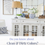
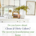
Clean And Dirty Colors: Undertones Are The Key To A Cohesive Home
Every home decorator should know about clean and dirty colors and how they work together to make a room look interesting and attractive. With tips from this post, you can seamlessly mix clean and dirty colors in your home.
The concept of clean and dirty colors is one of the most overlooked decorating concepts—and one of the most important.
Creating a cohesive home begins with understanding the subtleties of color. The concept of clean and dirty colors, along with their undertones, plays an important role in achieving a balanced, unified, and attractive look in your decor. By understanding the visual interaction between clean and dirty colors and their undertones, making the correct color choices in your home becomes so much easier.
Affiliate links included. See our Discloser Policy. As an Amazon Associate, I earn from qualifying purchases.
Here’s everything you need to know about clean and dirty colors when you decorate.
What Are Clean And Dirty Colors?
Color is such a complex subject. You can study it for a lifetime and still have so much more to learn. Here at StoneGable, my goal is to break down Interior Design concepts into easy-to-understand processes you can repeat in your own home. Recognizing the undertones—whether they are cool or warm—within these colors can help you make informed decisions when selecting paint, fabrics, and accessories.
Here is a good working definition of a clean color…
Clean Colors: Clean colors are bright and pure, often giving a fresh and crisp appearance. They contain little or no black or gray.
Dirty Colors: Dirty colors have a muddier, muted quality, providing a warm and cozy ambiance. They have been dulled down because they contain gray or black.
Both clean and dirty colors can range from very light to very dark in tone and shade.
Let’s look at a couple examples of clean and dirty colors. I think they will be easy to see.
Which red block is the cleanest color? Which block is the dirtiest color?


If you said the block on the left is a cleaner color than the block on the right, you are correct.
How about these? Which is the cleanest color and which is the dirtiest color?


If you said the left is the clean color and the right is the dirty color, you are correct. Even though the right block has a lighter blue tone, it still has more gray added to it, which makes it muddier looking. Remember, the words muddy and dirty are interchangeable.
Last one. Which is the cleanest color and which is the dirtiest color?


This was a sneaky question. The colors are both a bit dirty. However, one is more than dirty or muddier than the other. Now let me ask you this, which one looks more gray? If you said the right one, you are correct. Even though it is lighter in color, it has a lot more gray in it, making it dirtier.
So, when compared, the right block is the cleaner color, and the left block is the dirtier color.
So here’s an important thing to know…
Clean and Dirty Colors do not exist in isolation
It’s easy to pick out clean and dirty colors when one seems so clean, pure, or vibrant, and the other is dirty, dulled down, or gray. But there is a lot of subtlety in color! It’s often a matter of degree!
Why Do Clean And Dirty Colors Matter So Much

Think of decorating like a dance. You need to match the right partners to create harmony on the dance floor. If we pair up people who can’t stand being near each other, they will probably clash and won’t dance well together!
If we don’t understand which colors coordinate and which clash, our rooms will always look lackluster. Ignoring the balance between clean and dirty colors and combining them incorrectly can make a space appear drab, dingy, and off. Paying attention to these nuances is essential for creating a beautiful and cohesive room
Clean colors naturally pair best with other clean colors, creating a fresh and bright look. Similarly, dirty colors harmonize beautifully with other dirty colors, resulting in a warm and cozy ambiance. This principle holds true in the world of color and decorating.
Respecting this fundamental rule allows you to create spaces that feel cohesive and visually appealing. Mixing clean and dirty colors without understanding their interaction can create a conflicting, clashing, and unbalanced look.
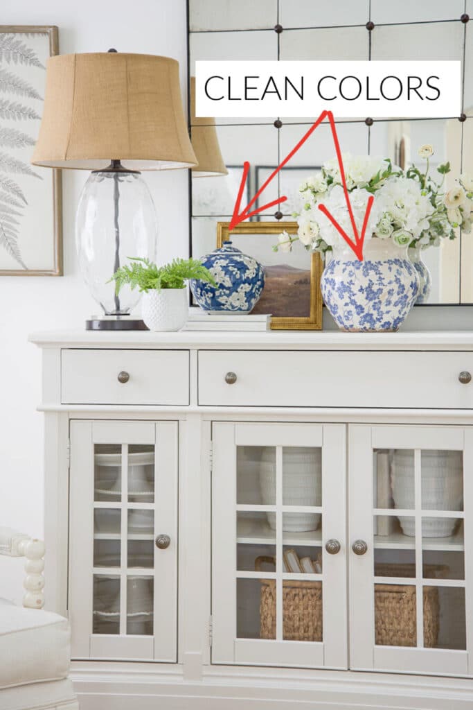
The clean blue and yellow look so striking and pretty together, especially on this post’s white background.

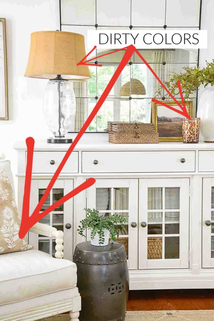
But add in the dirty green, and the colors begin to fight with one another! Just think if the walls in a room were painted this green and the accent colors of the decor were blue and yellow.

Now look at how nice the dirty colors below look together in the blocks below. The colors both colors have about the same amount of gray added.

Now let’s add a clean color to the mix…
The colors fight, and the color palette looks dingy! Would you want to decorate a room with these colors?
How Undertones Affect Color
Understanding undertones is important when selecting colors for your home, as they significantly impact the overall look and feel of a space. Undertones are the subtle colors, or hues, that hide beneath the main color and change how it looks and interacts with other colors. Undertones make a color clean or dirty.
For instance, white paint might have a blue undertone, giving it a cooler, crisper appearance, or a yellow undertone, making it warmer and cozier. Recognizing these undertones helps create a complementary color palette that creates beauty and cohesiveness in your home.
Undertones in color are something, as home decorators, we also need to understand. You might want to read CAN YOU MIX WARM AND COOL COLORS IN DECOR. This post will be so helpful when read along with today’s post.
Real Examples Of Clean And Dirty Colors In A Room
One of my favorite bloggers, Jennifer from Dimples And Tangles, has created the most gorgeous home using a plethora of clean-ish colors that work beautifully together. Her style is over the top, girly, and just so pretty! Her home is a brilliant version of the Grand Millennial Style.

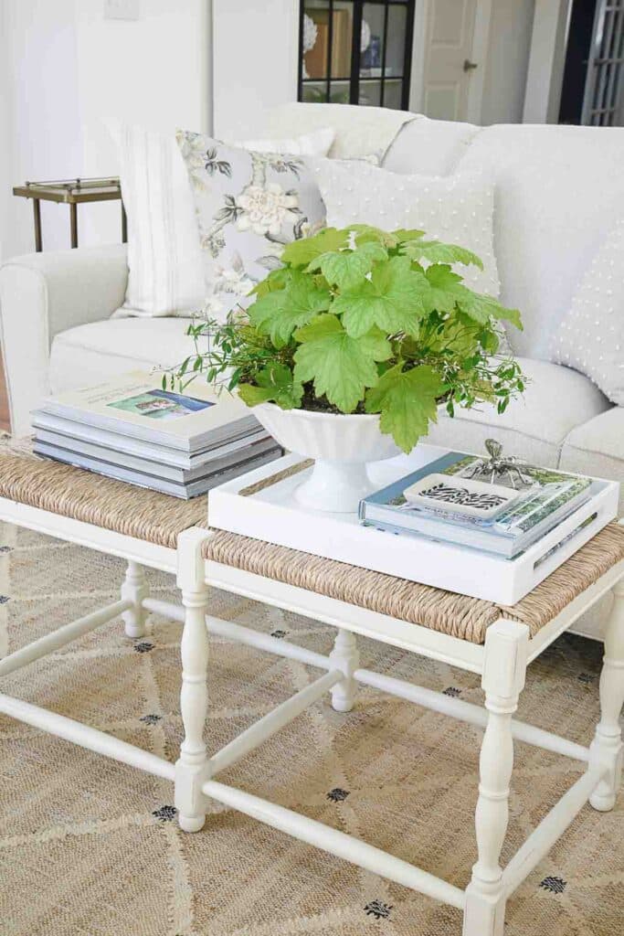
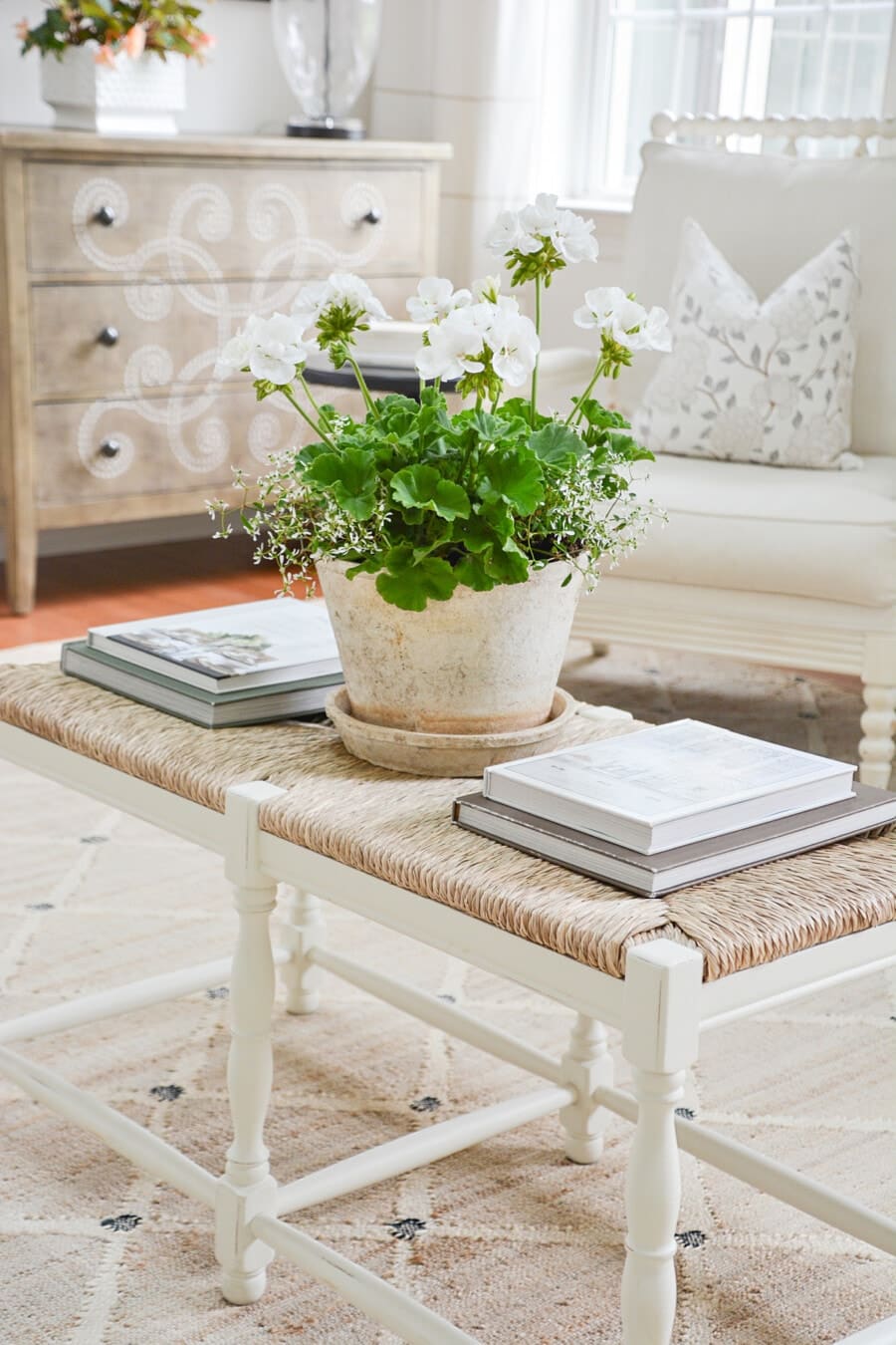
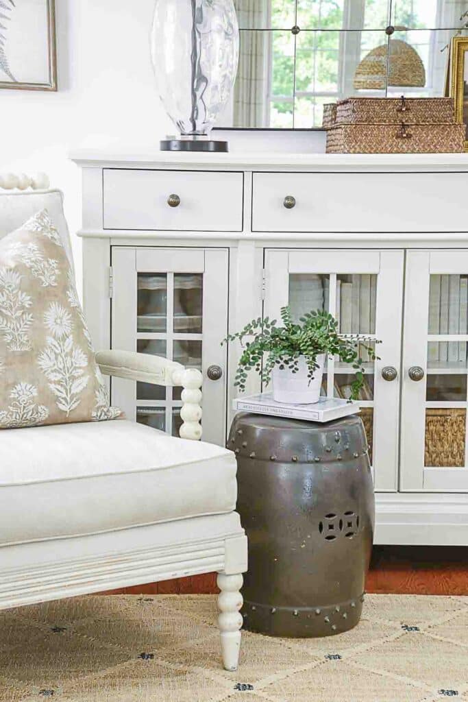
And I am a study in neutral dirty-ish color.
Can Clean And Dirty Colors Work Together?
There is always an exception to every rule! The answer is yes, clean and dirty colors can work together. To successfully blend clean and dirty colors, make one color palette, either clean or dirty, predominant and introduce accents in a small amount from the opposite group.
The key to decorating with clean and dirty colors together is to ensure that the undertones of the colors complement each other, avoiding clashes that can disrupt the harmony of the design.
By paying attention to the balance and proportion of clean and dirty colors in a room, you can achieve a cohesive look that reflects your unique style. Mixing clean and dirty colors thoughtfully creates a richer, more layered, and more interesting room.
Just remember, a very little goes a very, very long way!
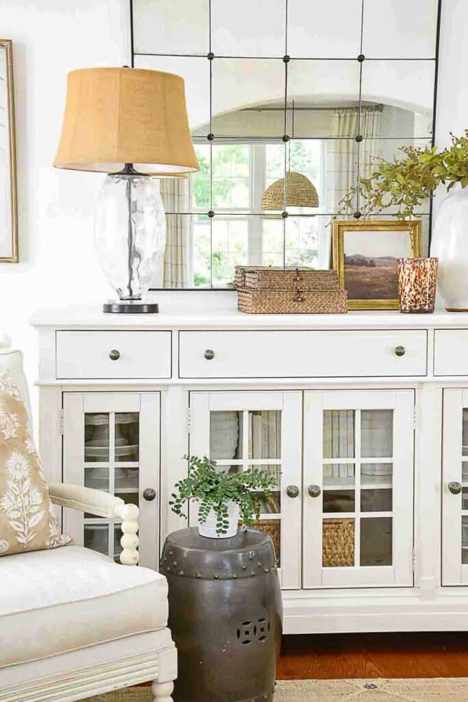
Use Pattern To Introduce Both Warm And Cool Colors
Patterns can be a great tool for mixing clean and dirty colors. They work as a bridge connecting clean and dirty colors, creating a cohesive and attractive look and feel. For example, a patterned fabric that uses both bright, clean colors and muted, dirty colors can seamlessly blend these tones in a single element, like a pillow, and look so interesting in a room.
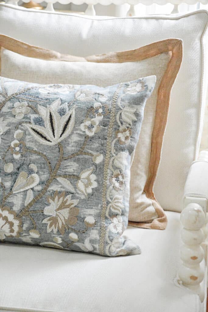
Using patterns strategically can balance clean and dirty colors in a space. A floral pattern, like the pillow above, mixing blues with browns, evenly distributes these colors, preventing clean or dirty colors from dominating.
By choosing patterns that blend clean and dirty colors, you can achieve a cohesive and balanced look.
More Helpful Things To Know
Here are a few things you should know about decorating with clean colors or dirty colors…
Understand Undertones: Identify the undertones of your colors to ensure they complement each other, avoiding clashes.
Balance Proportions: Use clean colors as a base and introduce dirty colors as accents, or vice versa, in very small amounts to create interest.
Test in Different Lighting: Check how colors appear in various lighting conditions to see how undertones change.
Layer Textures: Mix different textures, like glossy surfaces with matte finishes, to enhance the interaction of clean and dirty colors.
Create Focal Points: Use clean colors to highlight focal points (they naturally call attention to themselves) and dirty colors to add depth and warmth around them.
Limit the Palette: Stick to a limited color palette to avoid overwhelming the space.
Mix and Match Accessories: Use accessories like throw pillows, rugs, and artwork to introduce both clean and dirty colors.
Understanding which colors work well together is essential in decorating, and recognizing whether a color is clean or dirty will simplify the process, making it so much easier to decorate your home!
Common Questions About Clean And Dirty Color
How can I make colors flow in a home?
The best way to use paint to make the rooms in a home flow together is to establish a color palette for your entire home. Pick one paint color that is part of your home’s color palette. Doing this will help the rooms in your home flow together seamlessly.
What makes a color clean?
A clean color is the pure colors on the color wheel that have no black or gray added to them.
What makes a color dirty?
A dirty color is a clean color that has black or gray added to it to give it a muddier look.
Other Posts You Might Like
CAN I MIX WARM AND COOL COLORS WHEN I DECORATE
7 DESIGNER TIPS FOR DECORATING WITH NEUTRALS
WHAT YOU SHOULD KNOW ABOUT THE COLOR BEIGE
HOW TO MAKE A MOVE TO A MORE NEUTRAL COLOR PALETTE
HOW TO CHOOSE THE PERFECT COLOR PALETTE FOR YOUR HOME

Yvonne, I always learn so much from you, thank you!
Yvonne, This is a very interesting subject. I think we are naturally attracted to certain colors and though I never thought of them as dirty or clean this is a great definition. I have always been attracted to the colors of nature and therefore like a bit of dirt in my color scheme when decorating. The only time I find myself using clean colors are in the summer when I like to add in a little turquoise with my neutral familyroom and some bright lemons in the kitchen and late summer I bring in sunflowers. Of course fresh flowers can be all kinds of colors and never seem to clash when not over done.
Happy Mothers Day
Thank you Kathy. Happy Mother’s Day to you too!
Thank you for this very enlightening post! I had never once thought about it like this, but it makes perfect sense on why I choose what I do for my home and why I stay away from certain colors! As always, I enjoy your posts. Thanks for sharing! I have learned a lot from you!
Knowing about clean and dirty colors is a game changer!
Great post! I learned a lot about clean versus dirty color today. I do have one question though. My colors are obviously dirty as I have a very neutral home (taupe, grey, tan & cream) but I’ve added white in my spring vignettes. Is white not a clean color? If so, why does it seem to work?
A pure white or warm-ish whit works with dirty colors. I use lots of white in my home.
I love your curtains with the white dots. Where did you get them? Thanks.
Hi Karen, I found them at Ballard Designs. Hope this helps.
Can you please tell me where you find the best artificial flowers? I love flowers but do not want to buy fresh all the time and need some great looking artificial ones.
Thank you
Look at Etsy or Pottery Barn. I’m always pleased with their faux flowers.
This blog was amazing. I honestly had never heard of clean or dirty colors but it makes absolute sense. It really helped me to understand why I am so drawn to blue/white chinoserie and sharp, exact colors (I do swoon over light pink and white decor but I digress…). Thanks so much for continuing to share your info, experiences and advice. This post was an eye opener for me!
So glad this helped.
You are so welcome! I’m so thrilled that lightbulb above your head lit up!
This makes so much sense! Does this mean grey is always dirty? What colors work well with grey countertops? White cabinets.
Remember no one color can be clean or dirty. They must be compared to another color. Select the colors you want to put in your kitchen or where ever your countertops are and see how they look together.
Thank you for all your hard work, Yvonne. I’ve found this post very helpful and informative. It’s funny I’ve never thought of clean vs dirty colours when decorating, but I do a bit of watercolouring and I’ve been aware of it with that media. I just realized how this concept also translates to my wardrobe. No wonder some items seem like they should go together, but just don’t quite work. ?
Thank you Yvonne! I love the color mixes that you posted, and thank you for the tips as well! The pillows inspired me to think about redecorating.
Thanks, Rachel!
I am always learning from you. You certainly do have the Superpower of breaking down Interior Design concepts so that we can learn how to make our Home look the best it can be.
Thank you so much.
Lorri
Thanks!
I love these explanations! I feel I do it somewhat naturally but I never knew why. I didn’t go to design school so I absorb your posts. Thank you!
I’m so glad you liked this post, Kristi! Good for you that you have a natural eye for color! It’s a gift!
Yvonne, Thank you so much. You are a wonderful teacher and you explain things so well. Thank you for all that you do for us.
Your home is always lovely. I would so enjoy having you as a close friend that I could settle onto your couch and enjoy your window view.
Have a blessed day.
Thank you againl
laurie
You are so sweet Laurie!
I love your choice in pillows. I am trying to change up my pillows on my couch, but I’m having difficulty not spending a ton of money.
Any suggestions on sites to order from that are not outrageously priced?
Hi Sheryl, try looking at the pillows on Etsy. Some of the pillow makers are quite reasonable. Also try HomeGoods if you have one in your area.
Thanks for the updated information
Hi,
Would you happen to have a link for the two blue pillows? They are just so pretty!
Thank you
Here you go Jody: Find the pillow on the white spindle chair Here: https://rstyle.me/+v7dR36xWYEmuJGX-CX-u_w
and the pillow on the sofa HERE: https://rstyle.me/+g6PwVulugFF6mWy4QIA3fQ
Ah ha… so that is why sometimes I think my rooms that I decorate are “off”. I change a few things and then it looks better. That is why I seem to decorate
with muted colors with pops of clean colors. Light bulb moment… Thank you Yvonne ?
This is very helpful. Now I understand why my color pallet is a bit “off”. I’ve mixed dirty and clean colors by half. Thank YOU!
You will see a big difference when you change that percentage.