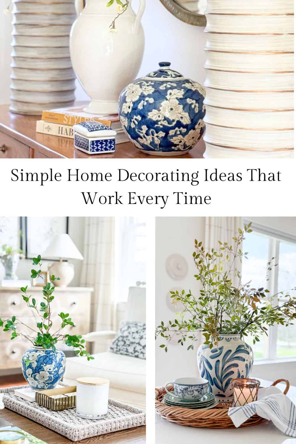
How To Make Your Home Look Cohesive Using Simple Decorating Ideas
Learn how to make your home look cohesive using simple decorating ideas like repetition, contrast, and color.
Have you ever looked around a room and felt like something just isn’t quite right, even though you like everything in it? That feeling usually has nothing to do with buying more decor. It has everything to do with how the pieces in a room work together.
A cohesive home feels calm, comfortable, and pulled together. Your eye moves easily from one area to another, and everything feels like it belongs. The good news is you don’t need a designer or a big budget to create that look.
The secret is learning how to use a few simple design ideas in your home: repetition, contrast, rhythm, and movement. These may sound like designer terms, but they are very easy to understand and even easier to use once you see how they work.
I used to pore over the images of beautiful rooms in my favorite decorating magazines and wonder how I could make the rooms in my home look like that.
Over time, I learned a few simple design ideas that made all the difference. They were easy to understand and even easier to use in my own home. That was a turning point for me. Once I began using these ideas, decorating felt simpler, and my home started to look more cohesive and attractive.
Here’s what I learned and how you can use it in your home.
Why Some Rooms Feel Right, And Others Don’t
Some rooms just feel good the moment you walk in. They feel calm, comfortable, and cohesive. Other rooms can feel a little off, even when you can’t quite figure out why.
Most of the time, the difference isn’t what’s in the room. It’s how everything works together.
When a room feels right, your eye moves easily from one area to another. You notice connections without even realizing it. Colors relate to each other, shapes feel balanced, and nothing feels out of place.
When something feels off, it’s often because there is no connection between the pieces. Colors may stop and start, shapes may compete, or everything may look too similar and flat. This is where a few simple decorating ideas make all the difference.
By repeating elements, adding a bit of contrast, and paying attention to how your eye moves through a room, you can create a space that feels connected and comfortable.
You don’t need to change everything. In fact, most of the time, small adjustments make the biggest difference.
Decorating Tip: If a room doesn’t feel right, start by looking for what is repeated and what is not. Then make one small change to create a better connection.
The Easiest Way To Make A Room Look Pulled Together
If you try just one idea from this post, let it be this.
Repetition is the simplest way to make a room look cohesive. It connects everything, so your space feels calm and organized instead of scattered, and it’s so easy.
Repetition means using the same element more than once in a room. This could be a color, shape, or texture. When your eye sees something repeated, it naturally moves through the space, and everything feels connected.
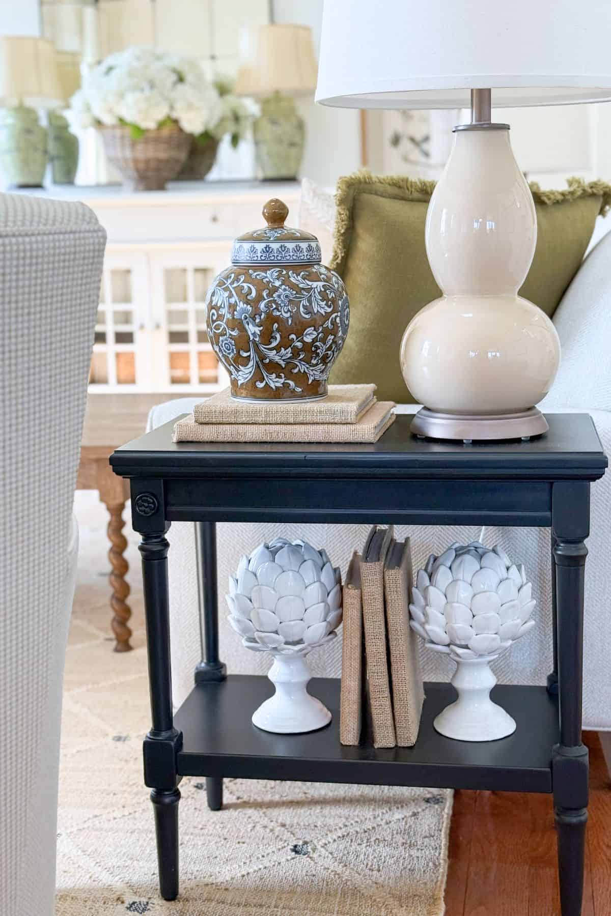
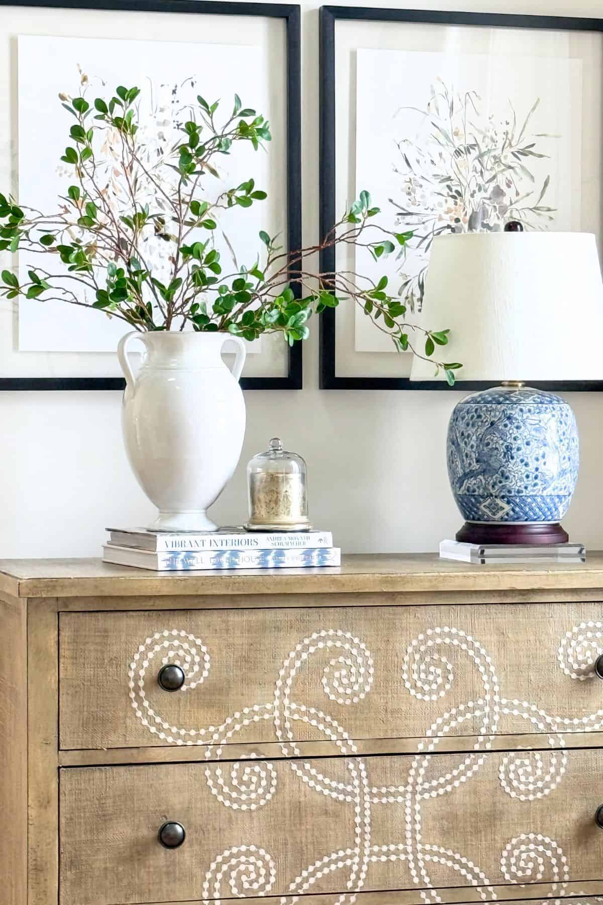
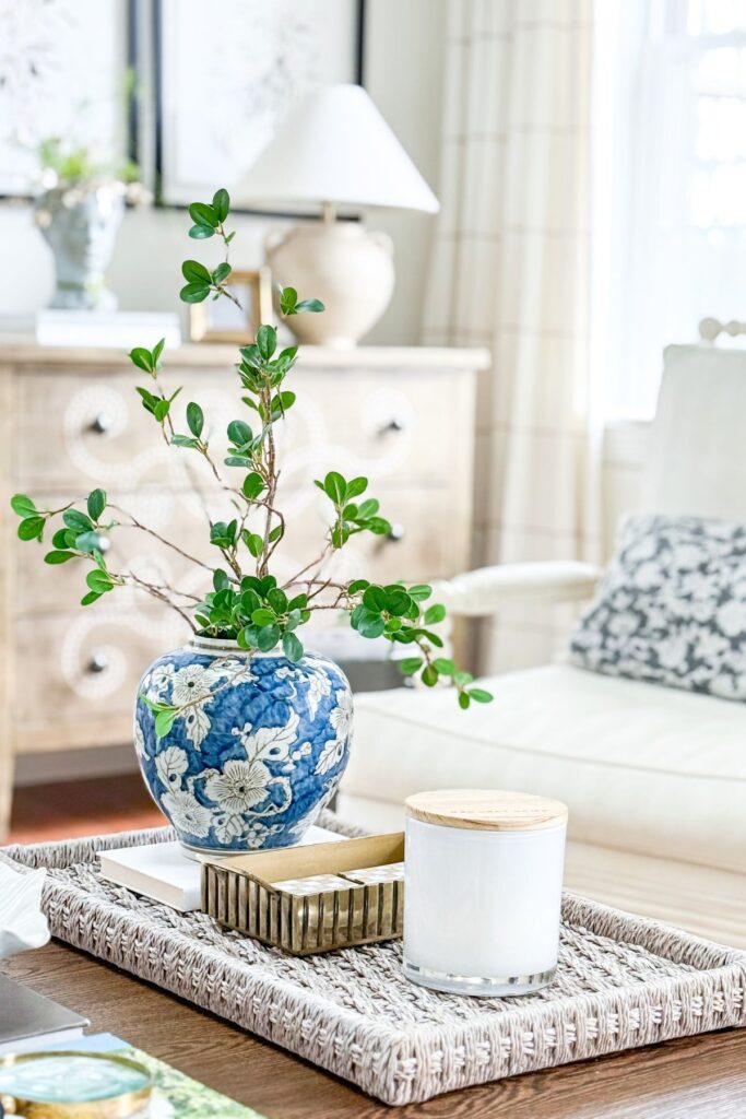
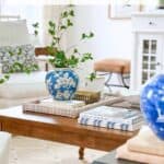
The easiest place to start is with color. When a color shows up in a few spots around a room, it feels deliberate and helps tie everything together.
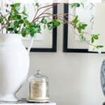
You can also repeat shapes or textures. If you have a round item, use that shape again. If you love wood or woven pieces, use them in more than one place so the room feels layered.
Keep it simple. Choose one thing and repeat it a few times. It’s that easy. That small change can make a big difference.
Decorating Tip: Repeat something at least three times in a room so it looks planned and not accidental.
How To Add Interest Without Making A Room Feel Busy
Once you start repeating elements, a room can feel connected. But if everything is too similar, it can start to feel flat. This is where contrast comes in.
Contrast is simply mixing things that are a little different, so your room has interest. It keeps your eye moving and adds life to a space.
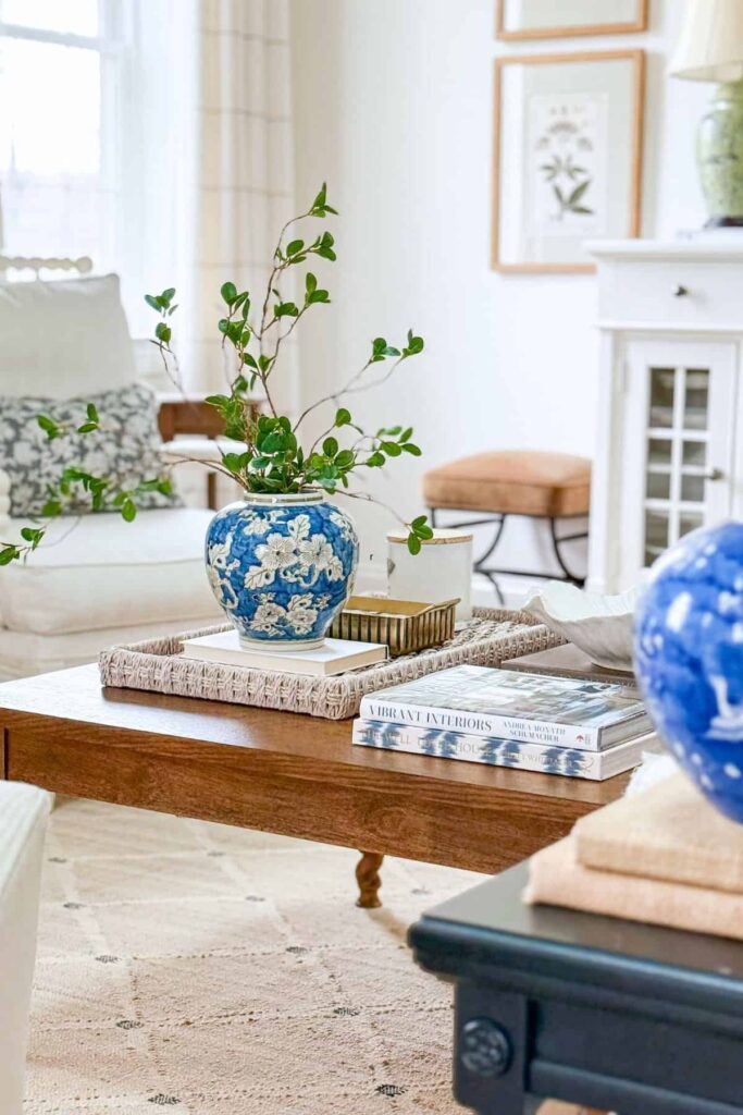
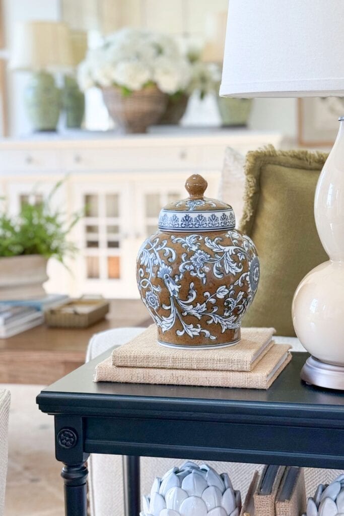
An easy way to add contrast is by mixing light and dark. If your room is mostly light, add something a bit darker to ground the space. Our home is filled with light and warm neutrals. When I add something dark, like a vase or a stack of books the contrast creates beauty.
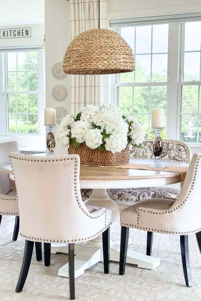
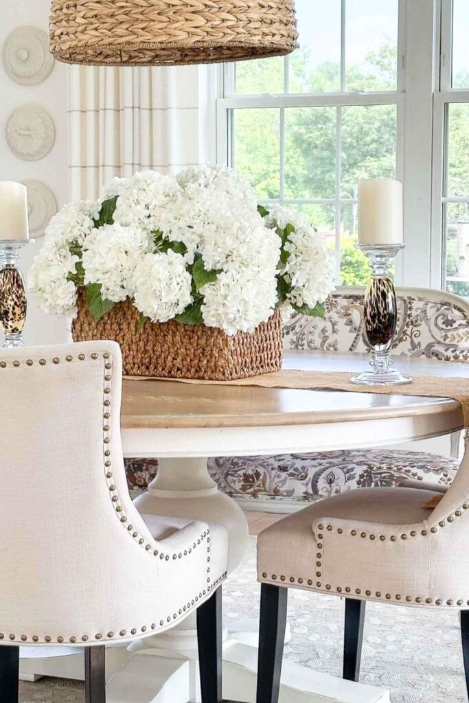
My dining room felt more cohesive when I replaced one of my dining chairs with an upholstered bench that had a very different shape and style. It became a statement piece, adding more character to the whole room.
Texture is another simple way to add contrast. Pair something smooth with something a little more textured to create balance.
The key is to add just enough difference so the room feels interesting, but not so much that it feels busy.
How To Create Flow So Your Room Looks Finished
Once you begin repeating elements and adding a bit of contrast, the next step is to think about how your eye moves through a room.
This is what creates rhythm and movement.
Rhythm occurs when your eye notices a repeated pattern and begins to move from one spot to another. Movement keeps your eye traveling comfortably around the space rather than stopping in one place.
You don’t need to overthink this. It often comes down to placing things so your eye can easily move across the room.
Creating Rhythm and Movement In Three Easy Ways
One simple way to do this is to spread repeated elements throughout a space rather than grouping them in one area. This tip works every time. Repeating an element and spacing them around a room helps your eye travel naturally from one side of the room to the other.
You can also create movement by varying heights. When items go from low to medium to tall, your eye moves up and across instead of staying in one spot.
Another easy idea is to avoid having one area that feels too heavy while another feels empty. When things feel balanced, your eye moves more comfortably around the room.
Think Decide Do
Think: Where does my eye stop in this room?
Decide: What can I move or repeat to guide the eye
Do: Rearrange one area to create better flow
Questions To Answer About Making Your Home Look Cohesive
Decorating can feel confusing until you know what to look for. These common questions will help you use these ideas with confidence in your own home.
Start by repeating a few key elements throughout your home, like color, shape, or texture. This helps everything feel connected. Then add a little contrast so the room does not look flat, and arrange items so your eye can move easily from one area to another.
Repetition is the easiest place to start. Choose one element, like a color or material, and use it in a few places around the room. This simple step helps your space look more planned and balanced.
A good rule is to repeat an element at least three times. This helps it look deliberate and not random. The repetitions do not need to match exactly; they just need to relate.
Add contrast. Bring in something different in shape, color, or texture. Even one contrasting piece can give a room more character and make it feel more complete.
Too much contrast or too many unrelated items can make a room feel busy. Try removing a few things and instead repeat what you love. This will help your room feel calmer and more organized.
Step back and look at the room as a whole. Does one area feel heavy while another feels empty? Try spreading out color, shapes, and visual weight so your eye can move comfortably around the space.
More Easy Decorating Ideas You’ll Love
If you want to keep building confidence and create a home that looks and feels its best, these posts will give you even more simple and practical ideas you can use right away.
How To Develop Your Decorating Eye
Learn how to see your home differently so you can make better decorating decisions with confidence.
60 Decorating Mistakes And How To Fix Them
Find out what might be making your home feel off and how to fix it with easy, doable changes.
5 Easy Ways To Update A Room That Make A Big Difference
Simple updates that can quickly make any room look fresher and more pulled together.
12 Decorating Rules You Should Never Break (Or Almost Never)
A couple of tried-and-true guidelines that help create balance and keep a room looking its best.
Decorating With Color, 8 Color Lessons Every Home Decorator Should Know
Easy ways to use color so your home feels connected, calm, and well planned.
What To Put In The Middle Of A Dining Table, Easy Centerpiece Ideas
Simple ideas to style your dining table so it looks finished and inviting every day.
Smart And Practical Kitchen Organizing Ideas That Really Work
Practical ideas to help your kitchen feel tidy and work better, which makes decorating easier too.
You don’t need to buy anything new to create a beautiful, comfortable, thoughtfully decorated home.
Start by repeating what you already have, add a little contrast, and pay attention to how your eye moves through the room. These simple changes can make a space look more balanced and complete.
The more you practice these ideas, the easier decorating becomes. You’ll begin to see your home differently and know exactly what to do to make it look its best.
Happy decorating, friends…

i just love your baskets/trays. I look and look for the exact ones and dont seem to have any luck.
This was a great article. Will read over and over……
Hi Tracey! I love writing about interior design. As I have said I am passionate about sharing with my readers, who love to decorate, these designer concepts. The will make a huge difference in the way we decorate!
Hi Yvonne.
About the curtains…..
I usually appreciate your designs and ideas but not this time. I do not wish to offend. I am not a fan of those drapes . I had to listen to my gut…. ok… it feels like the curtains have been a “bad boy” and been relegated to being stuck in a corner. They do not breathe. It feels like they are choking. The curtains are fine. The rods are so short and stocky which also adds to the heaviness. So change the rods and have them go to other end of the window. Do this for both windows. It would have been nice to see what the windows look like when you lower the shades…..
I ever knew it was called rhythm in decorating world but I know I like to echo shapes and colors in my rooms. When ever a decor doesn’t seem just right to my eye this always seems to do the trick.
Have a great 4th even though quieter this year and as always thanks for all you do to help us make our homes a good place to spend so much time in.
Thanks, Kathy! We are spending time with immediate family! Yes, it will be a lot quieter, but we will be celebrating! My family has served our country and I am a Air Force brat! We are so proud to live in this blessed country!
I love your posts…I learn so much. One thing I don’t believe I have seen is some advice on personal photos. Do you have ideas on creative ways to display? I’d love to make a photo wall, but looking for a way to do this to make it look good.
Hi Barb, what a wonderful idea! I have my personal photos in my study and bedroom. Instead of a photo wall I have them en mass on a couple of shelves. Much easier to switch out or add more photos to!
Great post as always. I always learn so much.
I learn from you too!
I love your blog!! Thank you for sharing all your knowledge. Where did you get the lamp in this post?
Hi Kris, many of the lamps came from Pottery Barn and the one on the chest is from Wayfair.
I learned alot and pinned. Thanks for all the great advice and info! Your home is always pleasing to the eye!
THanks, Deb!
Thank you for your post and your website! I always love reading your blog! Could you tell me where you purchased your light colored chairs with nailhead trim pictured in the image above with the woven pendant? Many thanks!
Hi Jenn here is the link for our dining room chairs:https://www.birchlane.com/kitchen-dining/pdp/dremil-arm-chair-rdba1878.html
Thank you so much! They are beautiful!
The repeated elements you taught me today are very helpful! I never really thought about that in decorating a room.
Where did you purchase the metal cage lamp on the buffet?
Julie
Hi Julie, I’m so happy this post helped. The lamp came from the Pottery Barn a few years ago.
Wow, what great information. I will never look at my home the same. Thank you so much. Now I need to apply these principles to my home.
I love this design series – I’m reviewing them all now. Well done!
By which I mean revisiting…
Thank you Diane!
This is so helpful, thank you for sharing all of your design wisdom. May I ask where you purchased the mirrors over the chest, they are so unique!
Thank you,
Vicki
Hi Vicki, that mirror is so old! I found it at HomeGoods years ago. Check Wayfair for something similar.
Oh ….I am so happy that you are here to help us all decorate our homes… I look for your post every day! My vignettes now have rhythm!
Good for you Candice!
Thank you so much for this it has opened my eyes and brain. it all makes so much sense the way you broke it down.
Hi Rose, this just thrills me! Happy Decorating.
Love your posts! Rhythm and symmetry makes so much sense. I often use your techniques in my own decorating. Can you tell me the plant you show on your dining room table?
Debbie
Hi There
I’ve been enjoying your site every day for awhile now. Thanks soooooo much. I’m going to be doing some major work in the spring and you’re the star of the show.
Who knew! I’ve been decorating this way for years but didn’t know they were design principles! Thank you for sharing your knowledge!
I’ve read others comments and well… I love the drapes and the way you’ve hung them! In fact, we’re doing a major renovation to our master suite this coming fall and our bed will be between 2 windows… I plan on using my drapery in exactly the same way! I think it frames the focal point beautifully.. in your case.. the fireplace… in my case the bed! Thanks for the wonderful inspiration!
You are so welcome Marcella!
Great article, Yvonne! I learned a lot through your examples, and it has me thinking about changes I want to make to our living room. Thanks for sharing! Hugs!
So glad this got you thinking, Chrissy!
Sooooo informative and helpful! Your exquisite taste inspires me to try new things!
Love your color choices… can you share where you purchased your rug??? I love it!
Thank you, Mary! The rug is so beautiful in real life and beautifully made. See it here:https://rstyle.me/+hu3rWsVZtbqK_gl1j73K8w
Wow. I hav been following u fr quite a while and I hav tried to emulate your style. It’s the epitome of everything I hope fr in my home. Your use of color, texture, & content tops all others that come across my feed. Please know u r appreciated!
Oh, Debra! Thank you for the most lovely compliment. I post about my home and decorating techniques to help others, and your comment make me so happy that StoneGable is helping you!
I love your sheer drapes. Would you please tell me where you got them?
Thank you!
Hi Mary, these drapes are such nice quality. Here you go:https://rstyle.me/+dDnQ1V1rkqiZ2YxPpwDTcw
I’ve got rhythm, I’ve got music, I’ve got Yvonne, who could ask for anything more?? Thank you for the primer Mrs. Yvonne. Very helpful.
I giggled out loud! So cute.I hope this helped you.
Yvonne, I just love your posts! You are a fabulous teacher and decorator. I have learned so much from you. Thanks for always sharing your ideas with us. Our homes are more beautiful because of you! I appreciate you so much. Have a blessed week.
You are just the sweetest, Mary Ann! Thank you.