How To Add A Pop Of Color To A Neutral Room
Adding a pop of color to a neutral home is one of the most satisfying decorating decisions you can make, and knowing how to choose the right color makes all the difference in how beautiful your home feels.
A neutral home is a true decorating gift. It is calm, timeless, and endlessly flexible. But even the prettiest neutral room can start to feel a little quiet after a while, and that is exactly when one well-chosen pop of color changes everything. Today I want to show you how to find yours, how to make sure it works beautifully with your specific neutrals, and where to use it so your home feels warm, finished, and completely you.
And while this post is written with neutral homes in mind, these same ideas work beautifully in any home that is ready for a little fresh color.
My Tanglewood Color Story
I have enjoyed a neutral color palette in our home for almost ten years, and I would not trade it. The beauty of a neutral base is that almost any color can be added to change its look and feel whenever you are ready. For many years, I loved the calm, collected feeling of our rooms and let seasonal decor do all the color work.
When we moved to Tanglewood, something shifted. I wanted a real accent color, something that would live in the rooms year-round. But choosing one turned out to be harder than I expected, even following good decorating principles. Our open concept floor plan and the large windows that look out on the ever-changing views of our golf course created a real color block for me. I was afraid that adding color would stop the eye from traveling through the room and out to the beautiful landscape beyond.
Blue was my first instinct, and it was wrong. It did exactly what I feared. Instead of drawing the eye forward, it pulled it to a stop.
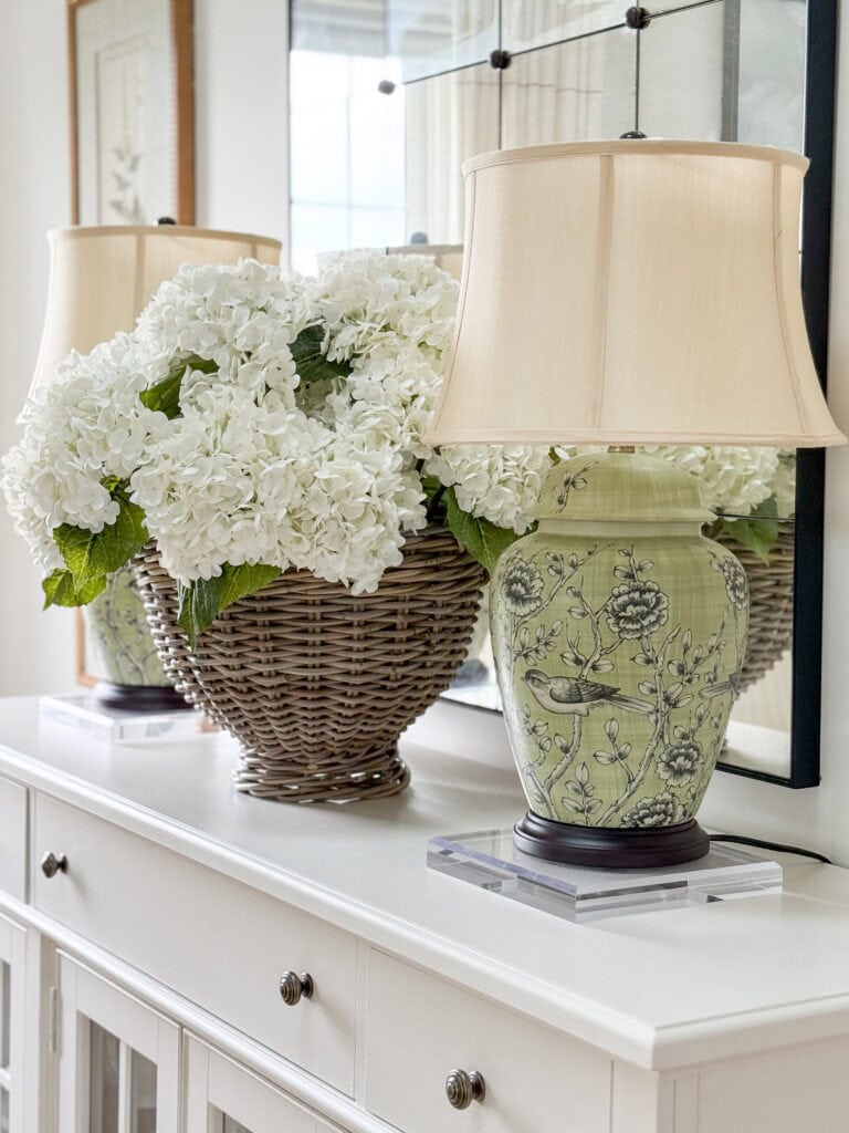
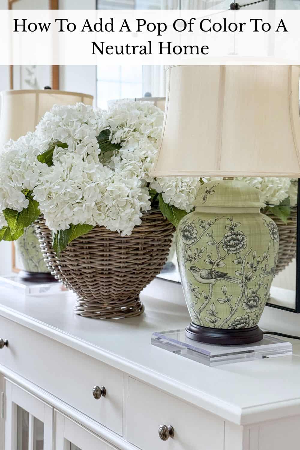
Green changed everything. The moment I introduced green as my accent color, the rooms felt happier and more welcoming, and the color actually worked with the view rather than against it. Eventually, I discovered I could layer in a touch of blue as well. The green connected our interiors to the landscape outside, and the blue added another quiet layer of beauty without competing with it.
That experience taught me more about choosing the right pop of color than years of decorating ever had.
The Beauty Of A Neutral Home As A Base
A neutral home is not boring. It is brilliant. When your walls, large furniture, and foundational pieces are all working in a calm, cohesive palette, something wonderful happens: every color you bring in looks intentional and beautiful. A pop of green feels fresh. A touch of blue feels classic. Even a simple bowl of lemons on a kitchen counter becomes a decorating moment.
A neutral base also gives you the most decorating freedom of any color palette. You can shift your accent color with the seasons, try something new without repainting a single wall, and change the entire feeling of a room with something as simple as a new pillow or a fresh bunch of flowers. That flexibility is one of the greatest gifts a neutral home gives you.
But here is what I have learned: a neutral home is only as beautiful as the color you add to it. Not a lot of color. Just the right color. And finding the right color, one that plays beautifully with your specific neutrals, is the real game-changer.
For me, that came down to one thing: undertones. Once I understood the undertones in my own home and chose a color that worked with them rather than against them, everything clicked. The rooms felt complete in a way they never had before.
That is exactly what I want to share with you today.
How To Choose The Right Pop Of Color For Your Neutral Home
Choosing a pop of color sounds like the fun part, and it is! But it is also where most people get stuck or make a choice they regret. These three steps will help you get it right the first time.
First, Know Whether Your Home Runs Warm Or Cool
Every neutral has an undertone, either warm or cool, and that undertone is the secret to choosing a color that feels like it belongs in your home rather than one that just landed there.
Warm neutrals have undertones of yellow, red, or orange. Think creamy whites, beiges, tans, and warm grays. Cool neutrals have undertones of blue, green, or purple. Think bright whites, cool grays, and greige tones that lean more gray than beige.
The easiest way to identify your undertone is to look at your largest neutral surface, usually your walls or your sofa, in natural daylight. Does it feel warm and cozy or cool and crisp? That feeling is your undertone talking.
This is such an important topic that I wrote an entire post about it. If you really want to understand undertones and use them confidently, I would love for you to read Can You Mix Warm and Cool Colors in Your Decor. It is one of the most useful things you can know as a decorator.
Then Choose A Color That Works With Those Undertones
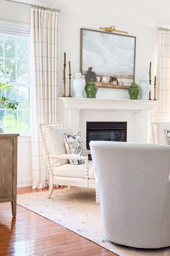
At Tanglewood, my home runs warm. That is exactly why green worked so beautifully as my accent color; its warm undertones feel completely at home with my creamy whites and natural wood tones. I use quite a few shades of blue, some with no green in it at all. But I use just enough of it to create a little tension in the color palette, that slight contrast actually makes the whole room feel more interesting and alive. Too much would have fought with the green. Just a touch makes everything look more intentional.
Then Choose A Color You Can Actually Live With
This is the part no one talks about enough. A pop of color is not a trend. It is something you will see every single day, so it needs to be a color you genuinely love.
My best advice is to look at what you already own and love. A piece of art, a favorite fabric, even a beloved piece of clothing. Is there a color and undertone that makes you happy every time you see it? Start there.
Then ask yourself: Will I love this color in every season? A good accent color works with your spring florals, your fall plaid, and your Christmas greenery without missing a beat. Green does that for me beautifully. It feels fresh in spring, rich in fall, and completely at home at Christmas.
If you are nervous, start with a softer, dustier, or muddier version of the color you love. It is easier to live with and just as beautiful in a neutral home.
Think, Decide, Do: Adding A Pop Of Color To Your Neutral Home
Adding a pop of color to your home does not have to be overwhelming. Breaking it down into three simple steps makes the whole process feel manageable and even fun.
Before you buy a single thing, think about how your rooms connect and what feeling you want them to have. Decide on one color first, just one, and introduce it in two or three spots before adding anything else. Then do the most important thing: start small. A pillow or a vase is all you need to test a color before committing to anything larger. Your gut reaction after a few days will tell you everything.
Where To Use Your Pop Of Color
Once you have chosen your color, the question is where to put it. The simple rule is this: use it in two or three spots in the same room, at different heights and scales, and the room will feel finished and intentional.
Pillows And Throws
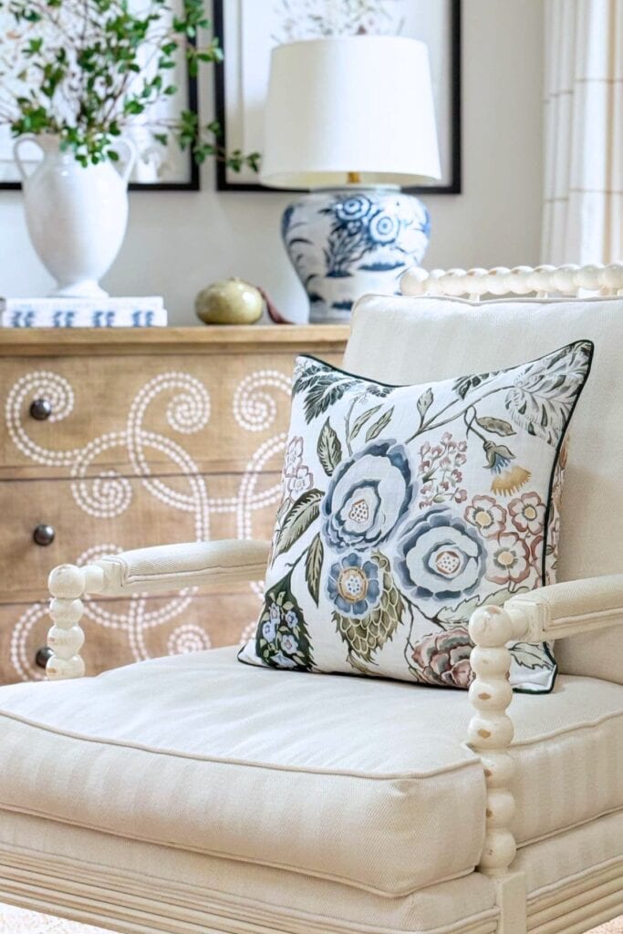
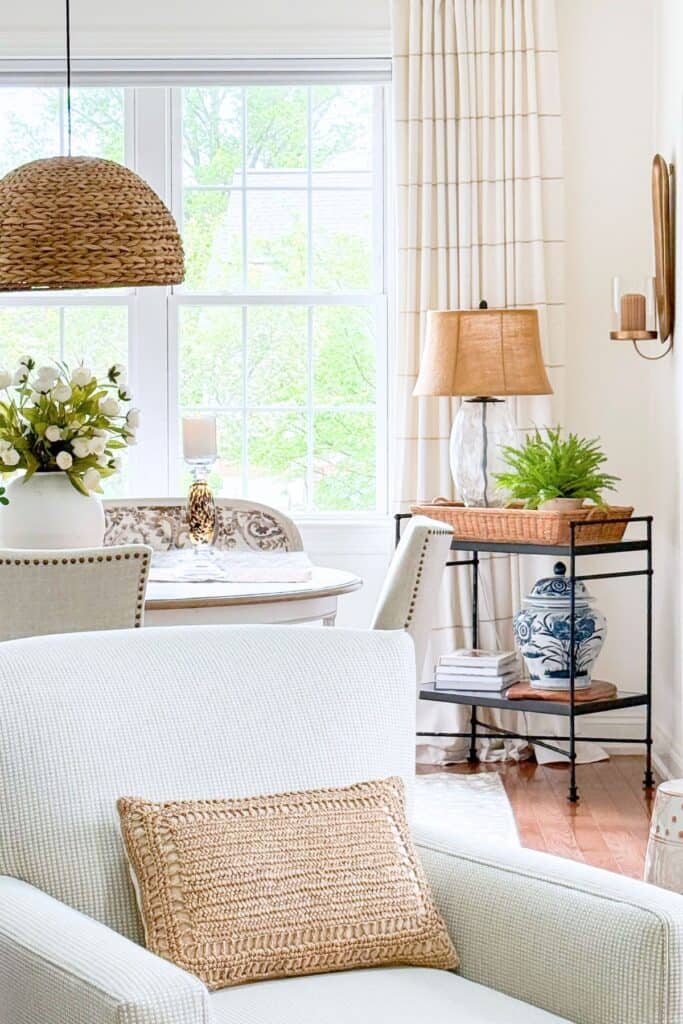
This is always my starting point. Pillows are the lowest-commitment, highest-impact item in decorating. One or two pillows in your accent color on a neutral sofa will immediately tell you whether the color belongs in that room. Throws work the same way.
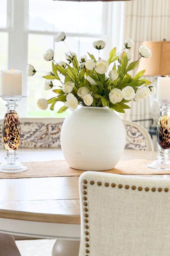
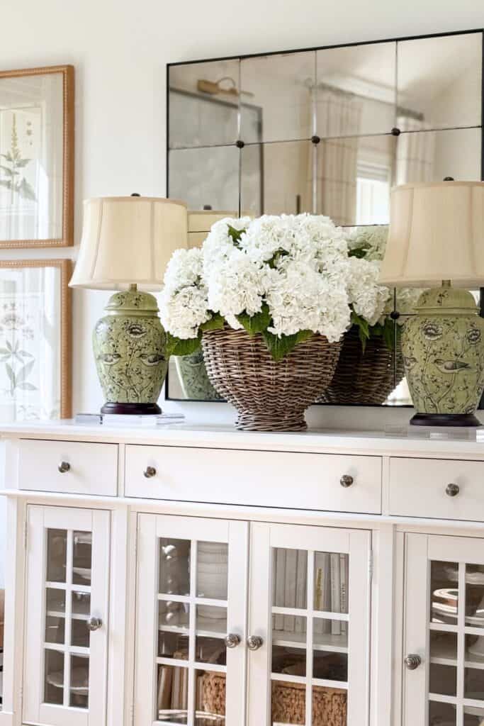
Flowers And Greenery
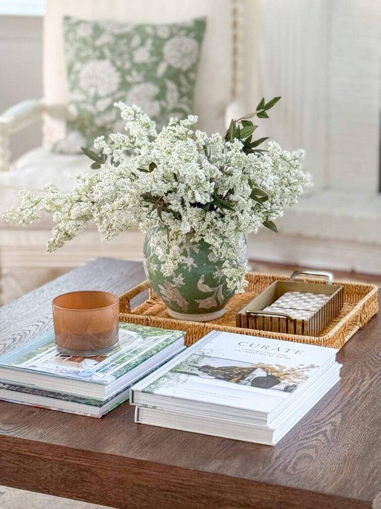
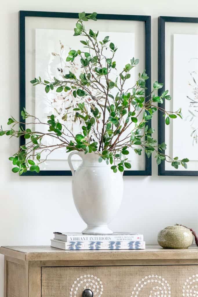
Fresh or faux flowers in your accent color bring something no other accessory can: life. A bunch of green hydrangeas, a pot of flowering herbs, a simple stem in a pretty vase. Flowers change with the seasons and cost very little, making them one of my favorite ways to play with color.
I especially love using greenery, both plants and flowers, as a smart and easy way to bring green into our home in the most organic way possible. A vase of leafy branches, a potted fern, a trailing ivy: green is already there, already beautiful, and it asks nothing of you except a little water now and then. And here is the best part: even if green is not your accent color, plants and flowers work beautifully with every color palette. They add life, warmth, and a little bit of the outside world to every room they live in. I would never decorate without them.
Rugs
A colorful rug anchors a room beautifully and does double duty by adding texture at the same time. A pattern that includes your accent color is a gentle, natural way to bring it in without it feeling like a bold statement.
In our open concept home, I keep our rugs very neutral. With so many rooms visible from one another, a colorful rug can stop the eye rather than move it through the space. However, if you have a room that is not open to others in your home, a rug with a touch of your accent color can be absolutely magical. It anchors the whole room in the most beautiful way.
Accessories And Artwork
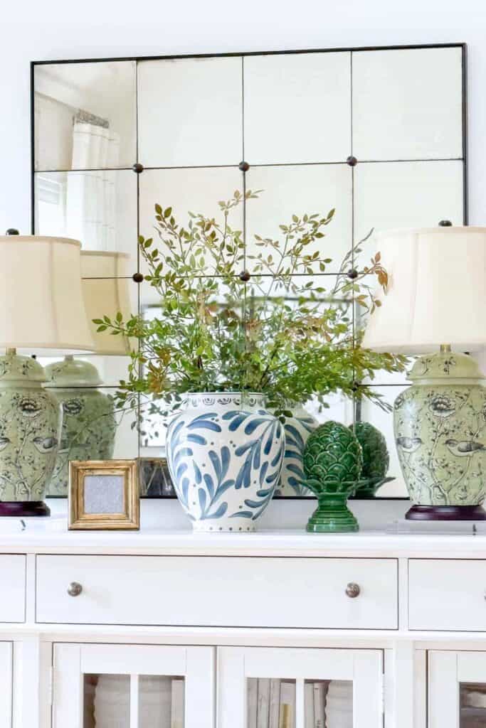
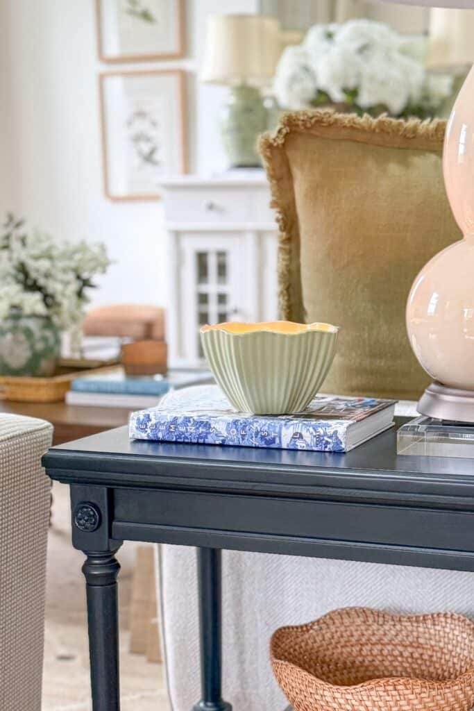
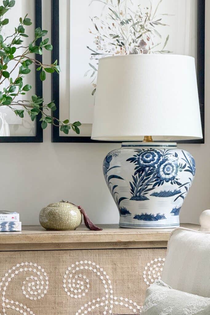
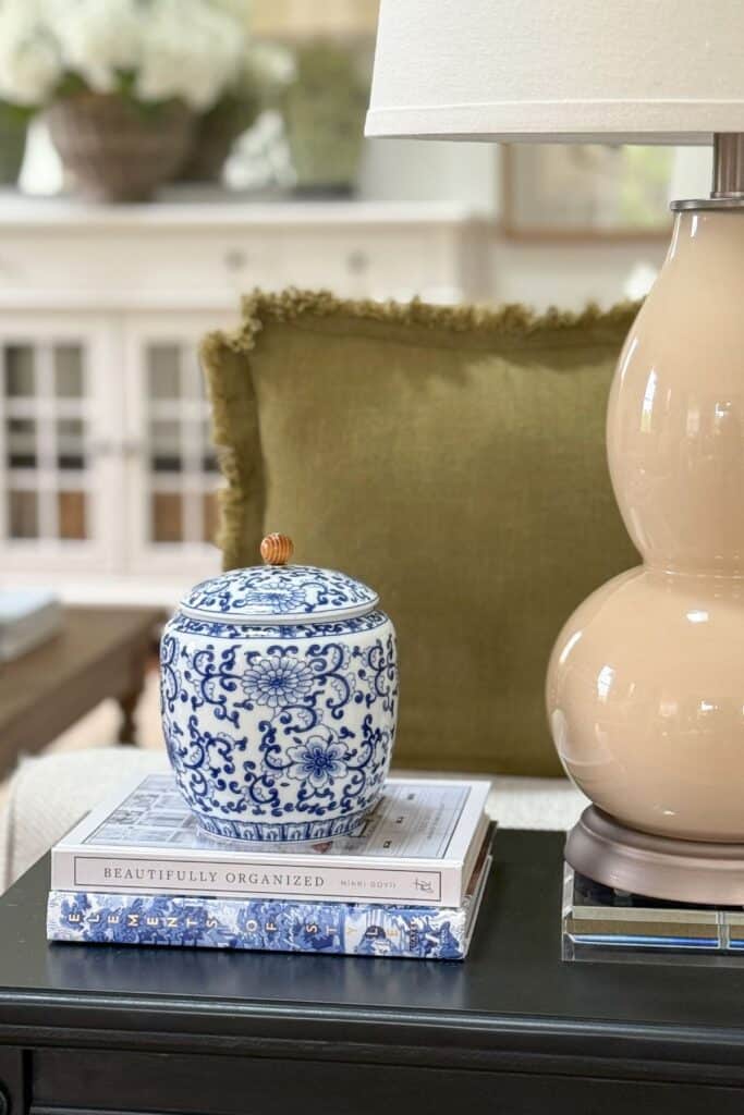
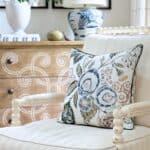
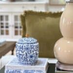
A ceramic vase, a stack of books, a piece of art that contains your color: small accessories grouped together carry more color weight than you might expect. Cluster them rather than scatter them, and they will look collected and intentional.
I use every one of these ideas in my own home (except the one about rugs), and they work every time. A pillow here, a pretty vase there, fresh flowers on the kitchen counter, a piece of art that makes me smile every time I walk past it. Each one adds a little color and life to a room in the most natural way. Just remember to spread your accent color around the room in two or three spots rather than concentrating it all in one place, and do not overdo it. In a neutral home, a little color goes a very long way.
A Few Things I Have Learned About Living With A Pop Of Color
Use the same accent color in more than one room. When your color shows up in the living room, the kitchen, and the hallway, even in small ways, the whole house feels connected and thoughtfully designed.
Do not use your accent color in equal amounts everywhere. Let it be a little more present in one spot, maybe a grouping of accessories or a beautiful piece of art, and quieter in others, maybe just a single stem in a vase. That variation keeps the eye moving and the room interesting.
And change it up when you are ready. The beauty of a neutral home is that your accent color can shift with the seasons without touching a wall or a piece of furniture. That freedom is one of the best things about living in a neutral home.
Simple Answers To Common Pop Of Color Questions
get these questions all the time, and I love them! Here are the ones I hear most often.
One is always enough to start, and honestly, one is often all a room needs. If you want to add a second color, use it very sparingly, just enough to add a little tension and interest without competing with your first color. That is exactly how I use blue at Tanglewood.
A pillow or a bunch of flowers. Bring your color in at its smallest scale first and live with it for a week. Your gut will tell you everything you need to know.
You swap it out and try again! That is honestly the most liberating thing about a neutral home. A pillow is not a commitment. A vase is not a commitment. Nothing is permanent, and that is the beauty of it.
Absolutely. Any room in any home can feel fresh and beautiful again with one well-chosen pop of color. These ideas work everywhere.
Keep Decorating With These Helpful Posts
If today’s post got your decorating wheels turning, these posts are the perfect next step. Each one will help you feel more confident and inspired in your own home.
The Quick Start Guide For Decorating Your Home Like A Pro — Everything you need to start decorating with confidence, all in one place. A wonderful companion to this post.
Decorating With Color: 8 Color Lessons Every Home Decorator Should Know — If today’s post has sparked your curiosity about color, this one goes deeper in the most approachable way. One of my favorites.
How To Live With Decor You Don’t Like — We have all been there! This post will help you make the best of what you have until you are ready to make a change.
Layering Decor: The Art Of Decorating A Room — Once your accent color is in place, layering is what makes a room feel truly beautiful and finished. This post shows you exactly how.
Adding a pop of color to your neutral home does not have to be complicated or expensive. It just has to be right for you. Take your time, trust your instincts, and start small. The right color is out there waiting for you, and when you find it, you will know it immediately.
I found mine at Tanglewood. Our home looks warmer, happier, and more like us with a pop of green and a touch of blue woven through it. Those two colors have become our signature, and I love that. In fact, I am already looking forward to adding a bit of wallpaper to our kitchen that brings in just a touch of that same green. It feels like the most natural next step.
I hope you find your color too. And when you do, I would love to hear about it!
Happy decorating, friend…

Good morning Yvonne, Up very early and enjoying my coffee with you. Certainly your ideas for adding color to neutral are perfect and easy. Makes such a difference to change out area rug and pillows .I have even switched out some of my artwork to lighten my family room and add a touch of spring. The blues and greens will easily coordinate when summer beachy accessories are added to the room.As you often say easy peasy is what we want for warm weather decorating. Have a wonderful day.
I could not agree more about easy peasy in warm weather, Kathy! You are right on point!
Yvonne, accessories are “my thing”, so this post is right up my alley! They are the last stage in the decorating process, and they should make a room come together! Accessories are where you can let your personality shine!!! I love to add a bit of whimsy to my rooms with colorful accessories. This was a great post on adding color to a neutral room, and most of your suggestions were in the accessory department…”the icing on the cake”!!!
Happy Mother’s Day, belatedly!
Happy Mother’s Day to you too, Bunny! You are so right about accessories! You should write a blog!
Hi Yvonne! Love your tips about color alongside a neutral palette! Even though I do love neutrals, I crave color! I recently painted all of my rooms except for my twins’ rooms, more neutral colors. They’re warm and cool and it is such a breath of fresh air! Therefore, all of my accessories, rugs, and furniture are the color! I do need to change my pillows though. We are going to be moving this year and I’m trying to save money so I will used the same base just get different pillow covers! Thanks for sharing all these tips!
You are so so smart! Congrats on the move!!!! I love color too but I work with it all day with clients and now my new shop that I need a home that is restful!
Love your neutral palette Yvonne! You do it so well and especially with the ways you add color. Our home is neutral also and I’ve added color is some of the ways you have and it works so well!
So glad to hear, Karen!
I love how you add pops of color into your home. Thank you for all of the great tips! I feel like you are my own personal decorator!
Oh, Carol! How nice of you to say. That is just what I want to be!
Yvonne,
I love the gold pillow sham with the stripe in the bed. Could you tell me where you got it?
I love that rug you have in the kitchen. Where did you find it?
I’m so glad I’m able to read again. I’d forgotten about your color. Blue dishes. The chair and bench. I’m loving the fun rugs out now. I can have lots of fun and create a fun room just around a rug. They aren’t the huge commitment of even ten years ago. I like the idea of the fresh flowers. I’ve not done that this year because of other reasons. I guess I did do daffodils but my cutting flowers are lacking. We lack rain to keep the flowers going and it’s been so hot already. I will try to get zinnias in! They add color. I also liked that vivid ceramic bowl in your book case. I think because it reflects the light it seems to give off more color impact! Those cereal bowl stacked looked great and just a towel under the stack of dishes in a basket. How fun. I want to remember this. Even a napkin can work for me. It seems I’ve forgotten how to do things and your posts are helping me. Happy spring day!!
Love neutrals and adding a bit of color.Sometimes the small things can make a big impact.
Great suggestions!
Any chance that the blue/white pillows on the bed can still be found somewhere?
New shop???? So exciting! How did I ever miss this news? I live nearby so I can’t wait to check this out!
LOVE that chair!!! What new shop are you referring to?
See tomorrow’s post!
I love the rug in the first picture of this blog. It is beautiful with the sofa. Would love to know you purchased it.
Thank you,
Sandy
Hi Sandy, I found it on rugs.com
Thank you for your daily inspirations … from decorating to spiritual!
Have appreciated your encouragement to use “vignettes”! They have been fun to create on my kitchen table and coffee tables!!
Hi Yvonne;
Your Blog has been inspiring in many ways and appreciate your many wonderful ideas. I have been following your Blog for a few years and never tire all that you share. We moved a year ago and we are now remodeling our family room. Only one item left to purchase to complete the look and that is a coffee table. I just realized the light colored coffee table in your living room is the style we are looking for. Where did you find yours? Any suggestions would be helpful. We retired a couple years ago and the transition to a new location has not been easy but exciting at the same time. One day at a time. Thank you.
You have a good eye Julia! The coffee table was an investment piece from Ethan Allen. I’m not sure they still carry it but you might want to take a look.
Hi Yvonne,
I love using red as an accent but generally save it for the season, especially with white and tan. I change pillows and throws in my bedroom for the seasons – bed linens as well. I use subtle bits of yellow in the spring/summer and then revert to sage green in the fall, adding the deep red for the holidays. As hard as I’ve tried in the past to adopt a different color scheme for the holidays the closest I’ve come is to use the sage green in my former blue dining room mixing in bits of tan and brown for a woodland feel. We are getting ready to paint our main room after the holidays- leaving the neutral gray for a bluish hue to go with new area rugs. Love looking at your designs gleaning ideas for a re-do.
Love how you add your “pop of color” to any room, such great idea’s you have…love your posts!!! Can’t wait to see your “touch” on Tanglewood!!!!
If I could just find all my decor!!!! Working on it this week!
I just stumbled on your post! Love it! Husband keeps asking me what I’m doing (staring at your photos and then at my rooms). Planning! Where did the black, white, cream striped rug come from in the dining room? I’m wondering if it’s still available. Thanks!
Hi Celeste. The striped rug does not work with my new home. I found it at Wayfair. Not sure if it is still available.
Love your posts and so grateful for your spiritual comments and thoughts. signed up for your decorating book but when I try to confirmI get a page that says the page does not exist. Can you help. And again thank you for your wonderful presence in our lives.
I don’t have a book, Lyn. At one time I had a book contract but had my foot issue so I declined. I am busy and love being a blogger! That is more than I could have ever hoped for!
Where did you get the brown & green watercolor looking pillow on the white chair?
This is my newest pillow and I just love it! It works so well with my neutral home. It’s made beautifully and very reasonably priced. You can see it here:https://rstyle.me/+r6KvHai1R-1xOSskrV-bng
I love your decor but I’m using your ideas in reverse. My sofa is dark, my rug deep colors, woodwork oak. Being recent empty nest I cannot replace everything so I am adding neutrals! Light curtains, creamy pillows, white picture frames, flower pots, lampshades..and I love the way my home feels so much fresher and brighter. Most new items are yard sale finds too. Thank you!! You are so encouraging and it’s easy to try your ideas.
Yes, I’m an empty nester now, but we have lots of family here. So it’s really not an empty nest but now I have lots of different birds in it!
Rose, I’ve been doing this too! I have LOTS of red/gold remnants/decor from my “Tuscan” phase, and other things that were my grandmother’s, great grandmother’s and mothers…things that I still love and not yet ready to part with. I have lightened up bigger ticket items as I’ve needed to replace them – rugs, drapes, etc. I’ve used a lot of Yvonne’s design principles and have just gradually changed to more neutral pallettes, vignettes to capture smaller things, the rule of three and more negative space than I’ve used in the last 20 years. I have an entire system of decor storage boxes out in the garage so I only bring a few things out at a time, rearrange them at least monthly. Being retired now, I have more time for this past time and it gives me great pleasure!
Yay! I’m so thrilled StoneGable is helping you Carol!
Great post, Yvonne! Terrific ideas! Love the chairs! Love your bedroom! Even the post itself has a new life with the pops of color! You always give the best advice!
The bright pink rug with a cat sitting on it. Where could I find that?
Oh, Lynda! This image is a stock image to show you a big pop of color. I’m not sure of the source. Sorry!
Great ideas! Thanks for sharing!
I really love this article about adding pops of color. Lately I’ve been using French blue and beautiful shades of green to add color to my neutral palette. I also love pillows and find that that is one of the easiest ways to add beautiful color to my home. ?
Pillows and flowers….easy peasy! Thx
I am on the same page —adding pops of color! I love changing things up. Just by changing throw pillows and other small accent items we can change the look and feel of a room….
Thanks for your wonderful tips.
I love this reminder! I learned the hard way many years ago when buying a couch in a bold color. I loved the style of couch but got tired of the color after just a year or two. If I would have just went with a neutral couch fabric and added the color in accent pillows I would have been so much happier.
Color is my middle name! I love adding pops of color. You had me captivated with that rug! The newest thing out there that I have yet to try is removable wallpaper/peel and stick wall paper. Just last night I saw individual peel and stick brush strokes for your walls (in a neutral tone)! I have got to tell my daughter about those for her laundry room! Color in my home makes me feel like I’m being hugged. I love color! Thanks for your tips and ideas!
I always enjoy reading your posts. Adding pops of color via pillows, artwork and rugs are easily changed out with the seasons.
I love the idea of adding a pop of color in pillows and throw blankets!
I love this idea. Thank you!
Yvonne, you are a fantastic person and decorator.
You’ve taught me so much.
For that, I’m so grateful! ???
I treasure your taste…Such great advice!
never been a fan of “color” perse but now i know how to add it cautiously. lol!!
This is my decor philosophy exactly. Neutrals with pops of color.
I am loving these posts and look forward to using the tips when I switch over to my Fall decor!
Love your posts. I sure did add a pop of color this month. Have a new red couch. Love it – love red. Keep up the great posts – I so enjoy reading them.
Thank you for all the great ideas.
I am a great lover of color and sometimes have problems with too much color. Following your posts have helped me in subduing the background for the pops of color I love.
Love your suggestions
I loved your subtle floral sofa pillows with the neutral ones. The cat looking up on the colorful rug was beautiful.