6 TIPS FOR FINDING THE PERFECT PAINT COLOR AND STONEGABLE’S COLORS
I get lots of emails asking about the colors of my walls and trim at StoneGable. Even though I found my perfect paint color I did not always make the best color choices! I used to almost get sick in the pit of my stomach when it came to making a paint color decision! It seemed so daunting! What if I painted a room and did all that work and didn’t like it? Believe me, that happened more than I like to admit. Then I’d repaint the room… and sometimes repaint it again! But I’ve been learning a lot over the years about finding the perfect paint color. Now I’m not nearly as fearful and I can say I almost enjoy the process of finding a perfect paint color! Here are 6 tips that helped me and I hope they will help you too!
1. FIND INSPIRATION
Even though most people find it hard to pick a paint color, it helps to have a little inspiration! What colors do you love to live with? What are the predominant colors in your wardrobe? Is there a painting you love or are you drawn to certain pictures in a magazine or blog? Look for things that have colors that you find pleasing to and start there!
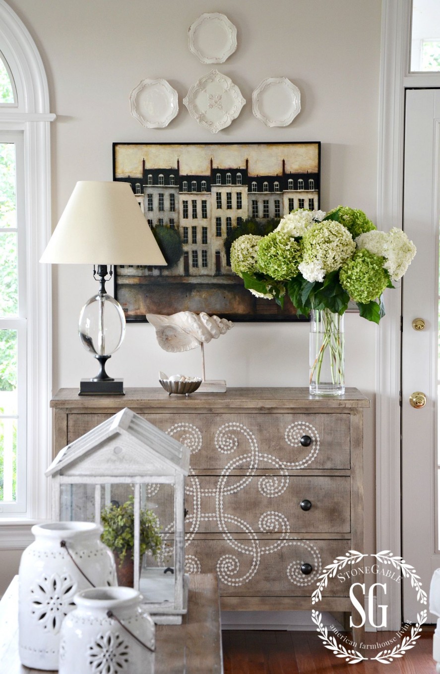
The inspiration for the walls in most of my downstairs came from the Daniel Kessler painting above. It’s called Paris On The Seine. I was so infatuated with the way the neutral colors worked so beautifully together!
I’m certainly in my “neutral” decor phase now. I love whites, but I knew that white walls would drive me a little crazy. I was drawn to what a call “barely flax”. A soft beige/white.
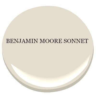
Benjamin Moore SONNET was the perfect color for most of our downstairs. It’s light and soft and a wonderful backdrop for my decor!
2. HOLD UP PAINT CHIPS NEXT TO SOMETHING WHITE
Not all paint colors are created equal… actually none are. If you are choosing a color, lets say blue, it may have a green tint to it or a red or even a yellow or gray. And the undertone color may be very hard to see…. until you get home and paint your walls.
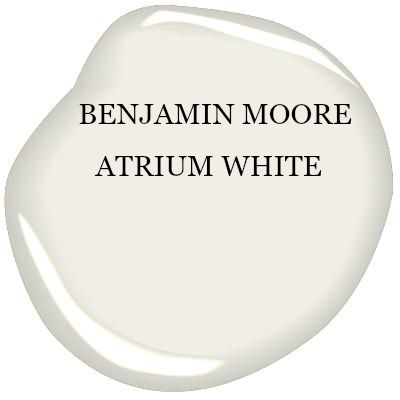
Our home’s woodwork and cabinets and wainscoting and vertical planking are all painted Benjamin Moore Atrium White. It has the slightest pink tint to it making is soft and gentle and a tad warm. How do I know what direction a paint is tinted? I hold a paint chip up to a white piece of paper and really look at the color. Often times you can see the undertone tint. Knowing that will be such a big help in choosing the right paint color!
You will be amazed at the undertones you can pick up if you compare it to something that is white!
3. SAMPLE PAINT COLORS
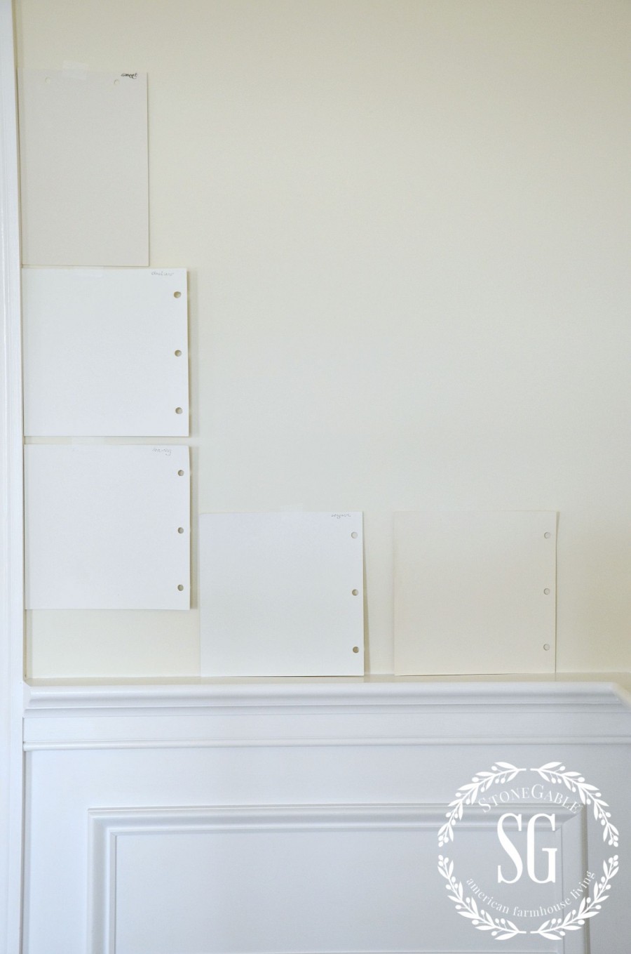
Sample lot of paint colors on your walls! And test them on many places on your walls too! Paint is so effected by light. You need to see a nice size swatch of color to get a real idea of what will work in your room!
I brought home big paper samples and taped them to the wall. Then I chose my 3 favorites colors and bought inexpensive samples and painted them on my walls. After living with a multicolored wall for a several days I knew that Sonnet was the one I loved! It’s worth the effort to get it right!
4. LIGHTING EFFECTS PAINT COLOR
Lighting likes to play with wall color! Depending on the type of light in your room, your wall color can look very different than the color you thought you chose!
Sunlight will show the purest color. BUT depending on the direction of the sun coming in your windows and the time of day even sunlight can skew the color! Incandescent light throws a yellow light that will intensify warm colors and dull cool ones.
Halogen light is white light and mimics sunlight and it’s effects. Florescent light is a blue light. It intensifies cool colors and mutes warm ones. Soft white light can dull colors while full spectrum light will intensify them!
All this to say… make sure you look at the paint samples painted on your wall at different times of a day and using different artificial light.
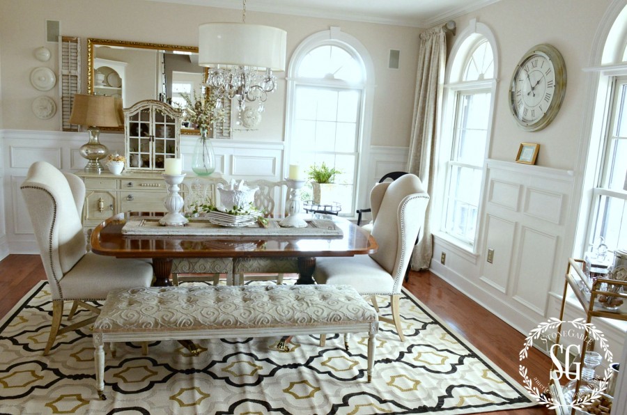
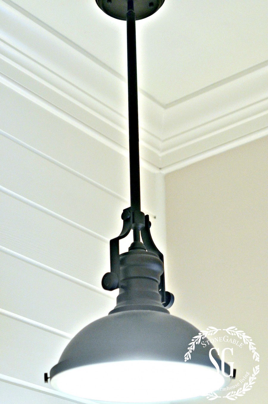
Our downstairs powder room is also painted with Benjamin Moore Atrium White and Sonnet. The colors looks so much different in a room with no windows and a pendent light.
5. BUY MORE PAINT THAN YOU THINK YOU NEED
If you buy a custom color to paint your walls, make sure to buy more than enough! A custom color is hand tinted and even thought different cans of it may look the same, it can be subtly different. It would be such a shame to paint a room to find out that the color varies in the room. YIKES!
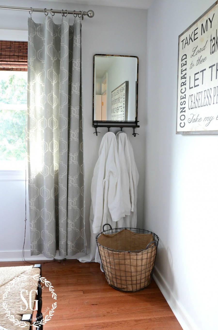
I recently painted the guest room above with Sherwin William’s Silver Mist. It’s a blue color with a gray tone. I have enough paint left over for touch ups. Do you walls get dinked as much as mine?
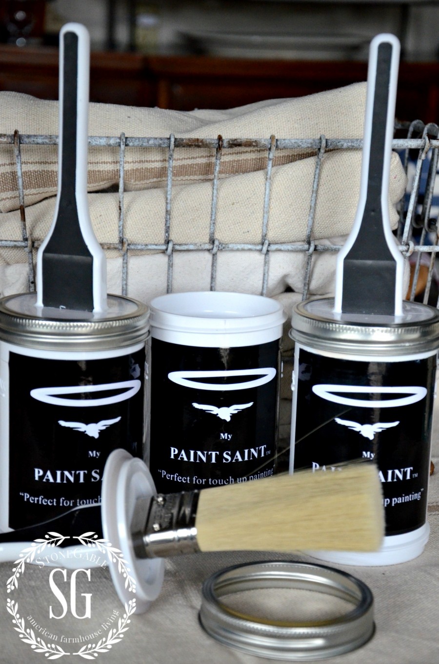
Speaking of touch ups, here is the BEST touch up gadget! I’ve been using MY PAINT SAINT for a few months and I highly recommend it!!!! It’s a container to store touch up paint in that has a great built in brush and more!!!! To read more information about MY PAINT SAINT or to get one, click HERE.
6. TAME YOUR FEARS!
If choosing a paint color terrifies you… I UNDERSTAND!!! It’s the hardest thing I do when it comes to decorating! But, now that I have a few great tips under my belt I’m getting much better!!!
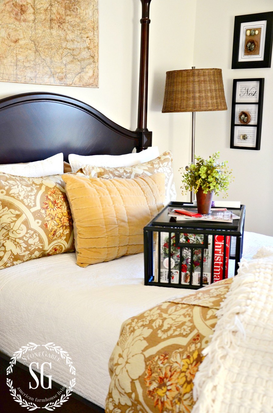
The guest room above is painted in Benjamin Moore Simple White. I warmed up the white walls with lots of gold, siena, and brown decor.
Don’t let a little paint psyche you out!!! I say… just go for it! Use these 6 tips and you can conquer your paint fears AND choose the perfect wall color!!!!
If you like this post you might like to see 6 MUST HAVE THINGS TO HELP YOU PAINT A ROOM LIKE A PRO!
Remember to pin this to your Pinterest PAINTING or HOME DECOR boards. You can follow me on Pinterest and see all the great things I’m finding to pin HERE.

I received 3 My Paint Saints to try for this post. There is a possibility that I could gain financially from MPS. I love MPS and the opinions are 100% mine.
What I like to do is purchase a stretched canvas from Hobby Lobby or Michaels. Then I buy the little samples from the store and I paint the canvas. I can move the canvas from wall to wall and see how I like the color. When I’m finished with that color I’ll cover that color with a white base and paint it a different color. I have six framed canvas and keep reusing. I figure one of these days I may pull a Picasso and just put some interesting colors together and frame and hang the canvas. I love your ideas Yvonne and right now I am trending more to neutrals.
Marisa, you are so so cute! Make sure to sign those canvas’. Thanks for the great tip!
I really like Marisa’s idea – I’m off to local craft store to buy some canvas! Trying to decide on wall colors that “flow” from one room to another…
In number 5 when buying more paint then you need. if you buy more then one can you should mix them together because each can be subtly different even on the same day.
Super tips, Angela!
I have had it happen.
Great guide! Thanks for sharing this—it’s been very informative! I’ve been thinking about painting my home, so I’m glad that I’ve stumbled upon your article. I think you’re absolutely right: you’re supposed to sample many colors—it’s important to know what color you like best. I’ll also follow your recommendation of getting more paint than I need. Hopefully I can find a color that I like for my living room!
I never start a new can of paint in the middle of the wall, always paint the entire wall to the corner, then if they are slightly off it isn’t as noticeable as the corners of the room have different shadows than the flat walls.
Brilliant tips Sheri!!! Thanks!
What a great tip, Sheri. Thanks!
I love your paint colors. Everything you do is beatiful. You are so talented. I love the comforter in your guest room, Have been looking for one in those colors. Do you recall where you purchased it? Thanks for all your helpful decorating tips.
DEBORAH! Thanks so much for your very kind comments. The comforter came from our local Pottery Barn Outlet a few years ago. Hope this helps!
Great information. I love all your color choices. I so enjoy viewing your home…the guest bedroom turned out great. Can you share what you chose for the bedding in the last picture…the colors look great with the neutral wall.
Thank you.
KJ
Hi KJ! All the bedding for that bedroom came from our local Pottery Barn Outlet. Hope this helps
Yes. Thank you.
Thanks for the tips. Love the color on your walls in all your rooms, especially in your living room. After living in apartments for yrs. I have learned to dislike white walls and kitchen cabinets, but after seeing your home done in warm white shades I like it ! I would even consider using in my home again. . Thank you for showing me white can be warm and inviting.. 🙂
Be Blessed
StoneGable is number one on my blog list! Thank you for sharing your home, heart, faith and talent.
When we bought our first home 10 years ago I painted a few walls in strong colors because I was being influenced by the trend to do so. I should have stayed true to myself. I’ve always loved neutrals; I find them soothing and comforting. It is easier and cheaper to add color with decorating items.
I have a question: When you say your home’s cabinets, wainscoting and vertical planking are all painted Benjamin Moore Atrium White, are you talking about your kitchen cabinets?
Joy!!!! What a kind thing to say! To answer you question, yes the kitchen cabinets were also painted Atrium White. It’s nice to have that common element running through our home.
Hey Yvonne. I am wanting to paint my basement living room, right now it is bare naked drywall and there are NO windows. I know I need to pick a light color but I also need to pick one that will reflect light. Is this a color problem or is this the actual type of paint I select that will help with making the room feel bright when it isn’t? Obviously I know I need lamps and lightening of all kinds I just am stuck on how to go about selecting paint without natural light. Thank you so much! Love your blog and the bHome app!
Marisa,
I have a room like this and my local paint store told me to go with something in a yellow tone. It worked!
This large space was a game room for my boys…never heard a complaint.
Oh I love this topic! My hubby and I went through this process a few years ago when we built our home (yes, we are very blessed) and I had to decide all the paint colors. A trick I learned in addition to the ones Yvonne posted is to get the paint formula. At Sherwin Williams I could find them on the reverse of the paint chip cards. Then you can know what colors are predominant. For example, if it’s blue but it has some red in it, watch out for a purple tone when the light hits it!
Carry around the paint chips with you when you shop for furnishings to go into your space. I cut off a business card sized part of the paint chips, punched holes in the corner. attached a spring ring and carried the palate of paint colors around with me for months as I looked for rugs, artwork, etc. We recently went shopping for outdoor furniture and we were able to make the best match to our exterior by having the little paint chip with us.
If you go with gray, be aware that one with a little bit of green will go much better with natural elements such as stone and slate. This is true for both interior and exterior paint choices. Also, with an exterior gray, the sky will add a lot of blue to the color so blue-gray will probably look a lot more blue than you might want. (And I live in Oregon!)
Also, if you’re starting from scratch, the single most important thing to decide first is whether you are going with WHITE or OFF-WHITE in your trim and molding If you’re going with white, you can use clearer colors for furnishings and accessories than if you go with OFF-WHITE or CREAM.
Hope all of this helps. I’m happy to pass along what I learned!
Oh my goodness Janet, WHAT FABULOUS TIPS!!! Thanks so much for sharing. YOU ROCK. I adore hearing from my readers!!!!!
Janet,
Great ideas…I need all the help I can get …I lack confidence in picking paint colors.
How ironic that Yvonne’s post today was about paint. I am currently remodeling the first floor of my home which includes a kitchen, living room, dining room and foyer. I have painted sample colors on my walls, taped up upholstery fabric, you name it. Had my niece over today because she rocks when it comes to working with color and design.
After reading Yvonne’s post today and your tips – I’m feeling more confident.
Thank you for this insightful post. Off subject here, I love the “Take My Life” frame you have.
Where oh where did that come from? I have to have one.
Hugs and thanks again, Patti
You have such a beautiful home Yvonne:) I love the colors! Thank you for sharing your tips:)
Yvonne,
You are one of my most favorite blogs! Your home is beautiful, I love to see what you come up with. Thanks so much for sharing your tips.
I have been coveting the lamp, (acrylic and black), on your 3 drawer chest in your living room for a while now. Would you mind telling me where you found it? Many thanks!!
The lamp is from Restoration Hardware. I painted the lampshade recently with black chalkboard paint! https://www.stonegableblog.com/upcycling-a-lamp-shade-using-paint/
Thanks so much! And I did see you painted the shade in your post. Looks great both ways!!
Another tip: The same color may look different depending on the sheen you choose (flat, eggshell, semi-gloss, gloss). Often times, the small samples are flat. My painter (because I was pregnant) noticed that the eggshell paint I purchased for my daughter’s nursery was darker than the flat paint sample I had on the wall. Thank goodness he contacted me. Otherwise, that soft “Ballerina Pink” nursery would have been the BRIGHT pink color of a certain medicine some people take for upset stomachs!!!
Best,
Michelle from simplysantabarbara.blogspot.com
Wonderful tips Michelle!
I love your dining room! Can you tell me where you got the rug? It ties it all together so well.
Thank you,
Shara Mays
The rug came from Ballard Designs. It’s an indoor/outdoor rug! Works great!
Wonderful and sound advice, thanks Yvonne. As always, you wow with me with your expertise and INCREDIBLE home.
♥♥♥
Oh, the Dining Room in our new house is SW Silver Mist and I love it! I would never have been able to make all my paint choices if it had not been for the super guidance of my designer. Your home is absolutely gorgeous!!!!
I love all your paint! My son and daughter in law are moving into a new house and want to paint the kitchen cabinets and mantel white or off white. I was wanting to know what color you used to paint your cabinets and the wood in your dining room. They look beautiful! Did you have to sand your cabinets before painting? I sent them all the info on painting and it has really help them to make decisions.
I bought 3 panels of 2′ x 3′ foam board from Staples and painted them with Benjamin Moore samples. Brought them, along with a cabinet door, when it came time to select granite. Extremely helpful!
Great tip list! I had never heard of My Paint Saint. You can bet I’ll be checking them out. I have swatches all over rooms to catch the light to make sure of the color before painting. Easier than repainting. Have a good day. Linda
Hi Yvonne. I never tire of looking at your lovely home; we seem to share so many “likes”!! Regarding Janet who said know what color rhe baseboards will be is a super tip and Michelle who said the finish (flat, semi gloss, etc) can influence color was great too. I find your suggestion of holding white paper next to a color is a huge help. I do that everytime I shop for paint.
I normally freeze when it comes to picking a “real” color, such as a blue, green, lavender, etc. but once read in one of our Canadian decor magazines that when picking a blue, yellow, etc., try to choose the dulled down or “dirtied” version. It isn’t easy at first but your eye learns to see the difference after looking at a few paint chips on EITHER side of the original color you thought you wanted. . For example, when wanting a pale lavender room, a dirtied/greyed down version will result in a lavender that looks less ” babyish” and cheap looking. The room will have a more sophisticated, elegant look.
I also liked Marisa’s suggestion of painting an artist’s canvas and must say since taking up oil painting as a hobby, I am now seeing colors much better and the undertones of each – whether a blue, for example, is a greenish blue or a reddish blue.
Thanks for sharing your beautiful home with us!
What a lovely article! I absolutely enjoyed your 6 tips. Time is your best friend when making a color decision; no need to rush into it! I would also like to include my agreement when you said that lighting affects the paint. I remember sitting in my room a long time ago and seeing the varying shades from the sun (morning and evening rays), to turning on my lights. It was there that I was saddened that my room didn’t look how I originally hoped for. For this reason, I am glad that you touched on lighting, especially on different types of bulbs. If you don’t mind me asking, what type of bulb do you prefer to use?
I like to use a soft white. No harsh lighting for me!
Completely understandable! It’s funny how we fall in love with a certain style of lighting. I appreciate your response!
Thanks for the tips! I’ve been looking through a bunch of paint chips that look very similar. It’s kind of difficult to tell the differences between each shade, so your tip to hold them up to a white piece of paper will really help to distinguish how each color is different. That will help me choose the right color for my kitchen depending on which shade has warmer or cooler undertones that will make the room look more pleasant.
I love the look of your rooms! Thanks for the great tips on choosing paint. I have a couple of questions though. Do you recommend painting the ceiling the same as the walls when using a neutral color? Also, do you like using a flat, satin, or semi-gloss paint?
Yvonne,
You have a great eye for design and I really love your home. It’s very elegant, but looks so comfortable at the same time! The upstairs doors and trim in my house have never been painted. I like the patina of the old wood, but one thing I found important when picking paint colors, was to consider that woodtone when picking paint colors. I went with Sherwin Williams Realist Beige in my bedroom and downstairs in my office. It looks lovely with the wood trim and the pure white trim in my office. The color looks different depending on the light, the reflection from the ceiling, from the adjacent wall, etc.
I brought home a “swatch book” of paint chips from the paints store to make it easier to match paint colors and did a section of the wall to live with. Any laundry room suggestions???
Without seeing it, I don’t dare make a suggestion. Sounds like you are doing a fabulous job!!!
I painted my bedroom with Silver Mist a couple of years ago! I love it! A very relaxing color.
I, too, wondered about your ceilings. My painter recommended adding some of the wall color (Silver Mist) into a white ceiling color. Looks great, with just a touch of color. I always choose egg-shell, or semi-gloss for my walls.
My den/kitchen area are all painted SW Straw Doll (soft yellow). I still like it, but am thinking of making a change. My problem is that my floors are a natural stained hardwood. They have a warmth about them, so I know I need to stay with a ‘warm’ color instead of a ‘cool’ color. Just not sure of a color that would work well with them. Any suggestions as to a color family?
Where can i find an area rug such as the one pictured in the dining room – 6 tips for picking paint color post?
Hi Deborah, I got the rug from Ballard Design. It’s an indoor/outdoor rug. So look under that catergory.
These are some great tips, and I appreciate your advice to buy more paint than you think you need for your project. My husband and I are going to be doing some renovations to our living room and dining room, and I want to paint both the same color. I’ll definitely look into buying more than I think I need so I can have some extra on hand that I can use for touch ups. Thanks for the great post!
Next week, I am going to have some painters come and paint the inside of our home. However, I am still trying to finalize a couple of the colors that I would like to have painted on my walls. I am really glad that you demonstrated the Benjamin Moore Atrium White color, because I think that it would be a perfect color for me to use. However, what are some other colors that would go well with that paint? I am looking for good accent colors to paint several pieces of wooden furniture as well and would want them to compliment the wall.
Thanks for the tip on checking the lighting effects before finding a paint shade. I didn’t know that the direction of the sunlight could skew the color based on the time of day! My wife and I are looking into repainting our house, we’ll have to be sure to take the lighting into account before making any final decision.
Hi Jeff: just to give you an idea of natural light coming through the windows, when we bought our last house, due to higher ceilings & a two-storey open foyer, we hired a painter as he was more willing to balance on scaffolding than hubby. But, of course, his labor was not cheap! When I saw our chosen paint go on, I was almost sick to my stomach. It looked terrible! It was an open-concept home. When the morning (East) sun entered in the dining room at the front, the walls (at first) looked a pale green tone. The kitchen was in the middle of the house & the same paint looked tan. When the (Westerly) sun entered the rear French doors & windows & shone on the living room walls, it looked a pale dirty looking Djon mustard shade. I absolutely panicked as I was convinced I’d made a big mistake & would have to live with it due to the costs! However, once the furniture was brought back in the room with curtains hung & once I had a chance to look at the paint’s many variances (due to the cool East & warm West sun) I absolutely LOVED it! (I since have had many people ask me the color.)
Thanks Elaine! What a great story!
Last year, I tried painting several rooms in my house and made the mistake of not paying attention to how the lighting would affect the color. Long story short, it looks horrible and so I really appreciate your advice about looking at paint samples on my walls at different times of the day. I think that I’ll do that this time so that I can know what colors I want to use for sure before I turn the project over to the painters.
I really look forward to all the news and new from StoneGable! Love your dinning room decor and have the rug featured; (Hobby Lobby carries a similar fabric). I’m desperate for help in updating my nearly 100 year old home. It has cherry wainscoting (4’6″) in the entire downstairs and newly refinished hardwood floors. Do I paint chairs, table, and buffet dresser “linen” in order to accent neutral theme or black? Please advise.
Hi Joyce. What a big question! I say that YOU need to decide what will be best for you and your home and how you use it. I know some people are so adverse to painting certain woods, but painting the cherry wainscoting white might be a great first step. Then work from there.
thanks for your useful tips. Really great post and nice pictures.
Beautiful home! I am especially drawn to the dining room. Can you please share where you found your curtains? They work so well with the paint!
Hi Emily! I made the curtains for the dining room. The fabric came from Ethan Allen. Hope this helps.
I really appreciate this post. I’ve looked at many different paint colors trying to find something that would work for our mountain home. I know that grey/greige is popular, but those tones look terrible in our house! I realized that I really wanted something more neutral and classic, came across your blog, and went straight to the paint store for a sample of sonnet – I’m now in love with a paint color (my husband is sighing with relief). I used white cardboard to paint the sample on.
I know! I think Sonnet is beautiful!!!! So glad you like it too!
Nice post. Have you ever followed Maria Killam’s post? She is a color expert and teaches everything you ever wanted to know about undertones. She has a download able book called It is all in the undertones. I am a designer and wish that I had been taught her method while in college. She now teaches classes in the U.S. Check her out if you haven’t already.
You are a good teacher and love reading your posts!
Oh, Wow, thanks so much Lucy! I’ll check out Maria’s posts.
The best thing is to always do samples and watch it during different light periods. Do several samples if need be.
What an absolutely delightful site you have conjured up! I stumbled across “Stone Gable” and was enthralled with its entire countenance! Now ……………. where to start …………………
You can’t go wrong with your colors…so easy to blend in other colors.
Finding inspiration sounds like a wonderful idea. It seems like it makes choosing the color to paint your house easier. Getting an outside opinion from a painter might also help.
Where did you buy the rug in the diningroom? I love it and it would work in mine. I’ve been shopping and can’t seem to find one that works. Love your blog!!!
I love your blog! I have so much trouble deciding on a paint color. I am so afraid of making a mistake and not being happy with my choice. Needless to say I moved into my new house nine years ago and the bedrooms and bathrooms still have not been painted. I wish I could hire you to pick my colors!
I love the color Sonnet! The undertones are so pretty.
Love Sonnet!!! It’s on the radar for this spring for my living room and very long hall!!
Not happy with my living room color.It’s in the beige
family but appears more yellow.I do like Sonnet,looks
like it has a bit more brown in it.Could be a redo in
my future !
Love your home and ideas. Was wondering where you purchased the back and gold rug?
Thanks so much! Very informative and helpful. Really great tips from readers too!
“For flat walls and ceilings I almost always use an 18-inch roller because the coverage is so much more even and you’re done in a third of the time.” In his home, he uses a color by Benjamin Moore called Decorator’s White.
Great tip! Thanks!
Thank you for your paint ideas. When I lived up north, ceilings were lower and I had no trouble hopping on a ladder and changing a color. Now, in our down-sized home in Florida, the ceilings are too high for me to deal without professional help. So it’s more of an investment to change colors with more worry about making a mistake.Thanks for your guide!
Thanks for sharing what you have learned the hard way by choosing the wrong color. I really appreciate it. Years ago, I begged my husband to paint our kitchen yellow and he told me he thought it was the wrong shade. I didn’t listen. After he painted it, I hated it. The color looked great on a small paint swatch but after it was on my walls, it looked like a yellow duck. My poor husband repainted the entire kitchen.
I really like your tip about using sample paint colors. That really is one of the best ways to figure out what kind of color is best for your home. My husband and I have been wanting paint our home for a while now so we will have to keep these tips in mind. We are really excited to start looking at different colors!
What a lot of good info. Thanks to you and your readers!
Your tips on choosing paint colors are terrific..especially white. Years ago I painted all the rooms on my first floor white that turned out to have the slightest greenish tint. I hated the greenish understone, especially when the rooms were flooded with natural light coming in through the windows. Had I held a sample board painted with the color first and placed it against a pure white board when the drapes were fully opened to let the natural daylight in, I probably would have detected the ugly green understone and kept looking for the ‘right’ white.
I recently had my whole house repainted, except for the kitchen, and am happy with the colors that I choose (which surprised me). I love neutral colors and white trim, but stepped out of my comfort zone and had my bedroom painted a shade of burgundy that matched one of the colors in my quilt. I was amazed that I love it. Love the idea of the paint saint. We had our electrical outlets changed after the painting (which was a mistake) and there are a lot of areas where the paint was scraped off around the outlet. I should have done that the other way around, but I learn very well from making mistakes. Thank you for all of your tips. They will help in choosing a color for the kitchen.
I’ve been thinking about painting my bathroom, as it is this old yellow color, and doesn’t match the theme of the rest of my home. You wrote in your article that there are various tins of colors, like white, that make it soft, gentle, and warm. I would love for my bathroom to have a similar feel to it, so I’ll have to find a good paint shop that carries a variety like this. Thanks for the read.
I agree with your tip about sample a lot of paint colors and testing them on different places on your walls as well. Last summer when my husband and I were painting our guest room we had to test paint a few areas on the walls because the light was different in each spot and we had to be sure the color we wanted was what showed up on the walls. I will be sure to share these tips with my husband for our next interior painting project.
Thanks for all the great paint tips ,Yvonne. I wish that I had read this blog BEFORE I chose the color for my dining room with west facing windows. I discovered the yellow undertones after it was on the wall above the wainscoting.Freda
Yvonne, Thank you so much for posting this information. I am usually behind-the-times until I change anything and did so just a few years ago using the bolder browns, gold, green. Of course, I am tired of these colors now (for over a year, actually!) and am looking for colors to repaint our home with. I appreciate your guidance and suggested colors – perfect timing. I love the fresh, clean and bright look!
I am one of those that hates the commitment involved in choosing a paint color. These are really great tips. I have found tip#2 to be crucial. I learned it the hard way when we painted our fixer upper. I thought the store had given us the wrong paint color…turns out our trim was more of an almond that a true white. Once the trim was painted white, the paint color looked as it should. Thanks for the helpful info.
We recently decided to repaint our bedroom walls, and I had it all calculated out, and bought the appropriate amount of paint. I can attest to point #5 of needing to buy extra paint! I ended up having to go back and buy more, because our calculated amount did not do the job!
Wow, I never thought about light affecting the color of the paint that you use in a specific room. We have a lot of different lighting arrangements in our home so that might be someone that we will have to talk with the painters about. I think that Halogen lights that you talked about might be worth investing in if we want to use the same color in multiple rooms. Thank you for sharing!
Thank you for the tips; I didn’t even think about how lighting would affect the color of paint. My husband and I have been wanting to repaint our living room and we’ve had a tough time figuring out what would look best. We do have a lot of natural light in the room. We’ll have to talk with our interior painter and see which color would look best.
When you pick a white color for the walls they will pick up slight hue from the surrounding objects such as reflections off the floor or carpet. If you want to make the room warmer with a slight touch of red/brown and if you want to make the room feel more open and cool that at a slight bit of green/blue.
Hope this helps in your room painting paint color selection. If you need any more information don’t hesitate to look us up at mississaugahandyman.com
I’ve been thinking about getting some interior painting done for our home, and I think that your tip to be able to buy more paint than necessary is huge! I tried to repaint my daughter’s bedroom a while back, and I learned this lesson the hard way when I ran out of paint before I finished. I’m going to have to see if we can make sure that we have plenty of paint, and maybe look into hiring an interior painting service to be able reduce the stress about it all around!
Good idea!
For a big job, I highly recommend having it done professionally.
It is amazing how different a paint color can look in different lights, and how paint chips can fool you! When we built our house, I chose a bedroom color that looked absolutely awful on the walls, so of course we had to repaint it. When we had our kitchen redone a few years ago, I bought many sample cans of paint and tested them on different walls before deciding. As the painters were painting, it looked like baby blue, though it was a soft gray. Eventually, when the room was done, it was perfect and I was very happy. But lesson learned–always try it on the walls first!
Great post. We are getting ready to do a paint makeover. We may be selling our home in a couple year so I want to select my favorite colors. We’ve had SW softer tan and basket beige for years and I am tired of it.
How do you feel about painting your ceilings? I always painted mine a shade darker than the wall paint but not sure I want to do this again.
Debbie, can I give you a little loving, unsolicited advice about painting your walls if you are going to move in a couple years. If you are going to have your walls repainted again before you put your home on the market then paint your walls whatever color you love. BUT if you are not going to paint them before you sell your home you might want to paint them a neutral light color. Your home will sell so much better. Believe me!!!!!! I know it might be a little boring to you to have white or beige walls but you will probably do much better when it’s time to sell your home! As for ceilings I love white ceilings. And for resale they work the best. Just my humble opinion!
OMG, what great tips. You are so right about how to avoid, “throwing $$ out the window”. All to often I’ve selected paint, loved it in the stores, got how, with great excitement started painting, once finished, I hated it! Off to the store again. Repeating this many times. Not thinking about lighting. Not thinking about the many shades of whites or other colors. Thank you for your suggestions/tips on how to properly select the correct paint shades…
I love finding new products and MPS looks like something I need.
Great blog article–a topic we all find challenging. I especially appreciated the segment on lighting and how it affects whites. I learned to also ask what the recipe is for a shade of white I’m attracted to. If I have lots of natural light from big windows it isn’t so important, but if a room has few windows I keep recipes with much black in them to a minimum. Some white paint actually absorbs light instead of reflecting it back into the room. I love your blog posts–thank you for putting so much work into them. Julie W.
HI Julie, thanks for the tips and letting me know you are enjoying StoneGable!
Boy have I made mistakes! Recently I buy a small quantity and paint a large poster board ,live with it in different areas of the room and observe it as light changes during the fay.
I have never heard of MPS and will certainly buy a few cans:) . Keeping paint cans organized is such a hassle. I enjoyed your post and thanks for the tips.
Yvonne, This post is so very timely for me! Thank you for the great tips. I am in the process of picking new colors and several areas are painted with a maybe color. Our hardwood floors are red oak in gun stock, a reddish brown. Your floors look similar and I really like how your neutral colors look. What color are your floors, if you don’t mind my asking?
They are about the same as yours. If I could I would paint them white. But I don’t think that would work if we would ever decide to sell StoneGable.
As always, so fabulous. Everything!
I’m a little late in asking, but who is the floral bedding by?
Hi Anita, it is from The Pottery Barn, however, I have not seen it for a while. Boo-hoo!
Does Benjamin Moore give you the paper samples or was it another store that supplies those?
Benjamin Moore does give out paper samples and you can buy little pots of paint too. I opt for the paint because it will give you the truest color.
Oh wow, I’m blown away, Yvonne with your advice on using white paper with paint chips. I’m trying to pick paint for my living area which is one big room- living area at one end with the kitchen and dining area at the other. I’ve had two shades of gray for 3 years now and my husband is totally fed up with Neutrals. So, I’m trying to pick a blue that will complement both a new rug and our stone fireplace which is shades of gray with bits of rust here and there.
I’ve just taped all the paint swatches to white paper and can’t believe the green undertones on one of the strips. I have one wall of windows with a lake view so there is a great deal of light in most areas but I do have a dark area of stairway to contend with. Your advice has been great. We are also contemplating putting wallpaper on one small feature wall that is 5 feet wide. Again, my husband’s choice is a bit on the wild side with a print that looks a bit like a watercolor of animal print in shades of blue on a mixed beige background. But I am so chicken to do this !
I can’t seem to pin down my style anymore. I have bits of country, modern, and traditional decor and just don’t know where to go with this mess. Do you suggest that the undertone match all the elements in a room? I’ve put white paper down on the rug but don’t get really get any specific tone coming through. But I think I’m in the right color family. You are right when you say this is so hard.
Yvonne, I’m making myself crazy trying to decide on whites for my house. I want to keep things simple, but I’m realizing white on white is not at all simple.
I think I love atrium white. Would that work throughout the entire house and then would Chantilly lace coordinate for the baseboards and doors?
And then what about sheen?
Thanks for your help.
Hi Julie, I love atrium white but it as a bit of a warm pink tint. I can’t really see it. Try Benjamin Moore Simply White. I have it in four of my upstairs bedrooms and I love it. I think walls and ceilings should be painted with a flat paint and woodwork satin or semi-gloss. But that’s me
Helpful….sort of. but you’re not really choosing COLOR! You’re choosing neutrals. Although some of your tips apply….I need COLOR not beige, tan, griege , ivory, off white, cream, taupe….. COLOR! (the Florida Girl in me) you know ROY G. BIV. COLOR!!!!! Can you help with that?
This info applies to any color. And neutrals ARE color! And they are even harder to get right than ROY G BIV!
Hello. I’m leaning towards Carrington White, not sure what white trim would look nice with it. Do I do the ceilings the same as trim. Thank you for your time.
I’m not familiar with Carrington White. However, the ceiling can be painted many colors depending on the “look” you want. Wish I could help you more!
Silver Mist rocks! We painted our entire former home in it. Gorgeous with white trim.
Now we’ve been blessed with a new-to-us home on a golf course-hubby’s dream -which also needs painting. Going to start with Silver Mist again & go from there. (Last time we bought about 15 samples ?) It’ll be interesting to see how the greens of the golf course reflect on the paint through our large windows.
I’ve been following you for years and love your home!
Blessings to you and your family!
Karen
Karen, you hit on something so important… the trees and grass really do make a difference in the paint color on the inside! Make sure you check out the colors on your golf course home!
Forgot to mention that hubby cut Silver Mist by 75% as our home had much smaller rooms and windows than yours. With our northern exposure and grey skies in Oregon it was perfect.
I couldn’t agree more about the effects of lighting on paint color. I changed out my bulbs in my kitchen for LEDs and was so disappointed about how the color changed that I returned them. Maybe I should have just took it as an opportunity for a new fresh look by repainting.
Could you tell me what color floor you have in these pictures???
Hi Bridget, the floor is gunstock oak. Hope this helps.
Pretty cool
With all the colors referenced in this blog, what color do you use for your ceilings?
Hi Karen, we used Benjamin Moore Simply White on our ceilings, the same color on our walls. White, for me, is the best color for a ceiling. Any nice, bright white would also work. Make sure it is flat paint. Hope this is helpful!